 Most marketers have an intuition when it’s time to give their website a makeover. The reason could be as simple as its look being outdated or as problematic as visitors having no conversion opportunities. Though, like other marketers, you want the extra reassurance before you reach out to your CEO to ask for a budget to hire an inbound marketing agency or allow for internal resources to work on the project.
No fear, we’ve created seven questions you can ask yourself before deciding to dive in to the website redesign process.
Question 1: Is the design outdated?
Usually, a key indicator it’s time for a redesign is the current design feels outdated. You begin to cringe as you visit your own website. Trust me, if you feel that way, your potential customers also mimic the feeling.
If your website is guilty of poor or no use of whitespace, unreadable fonts, unpleasant color choices, no navigational hierarchy, it uses Flash or it’s too slow to load, a new website should be around the corner.
Today, a website should take more into consideration than just look and feel. Graphic designers use a “flat” design approach with imagery and iconography that focuses on the user experience and easy navigation to improve visitor interaction with each page of the website.
Question 2: How does your website compare to your competitors?
As an initial step before beginning a website design, I ask clients to show me their competitors’ websites. We walk through them together and I ask them to point out what they like and what they don’t.
If you start to feel like you are falling behind how your competitor’s website functions, it’s another indication you’re ready for a redesign. First impressions matter in the digital world, too. While you may have better products and service offerings, if your website doesn’t convey that, you may be pushing potential customers away. Websites that users find difficult to navigate or that don’t address buyer pain points, can be reasons why a lead doesn’t convert in to a paying customer.
Question 3: Is your website responsive?
Many of us inbound marketers are guilty of toggling a browser screen size to do a quick responsive test of a website to see if it will respond in size based on the screen dimensions. For an actual responsive test, we recommend using Google’s Mobile-Friendly Test tool.
The true purpose of responsive design is to give your website visitor the best experience with your website no matter what device and screen size they are using. Plus, with Google’s algorithm changes that went into effect on April 21, 2015, your website will be penalized in searches if it doesn’t meet Googlebot’s mobile-friendly criteria.
Question 4: What are your website’s analytics like?
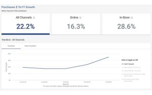
Speaking of search engines, how is your website’s organic search traffic? With analytical tools like HubSpot and Google Analytics, looking at data can give you the cold hard facts that you need a new website. Some key indicators include:
- There’s a dropoff in monthly traffic
- There’s a dropoff in leads per month
- There’s a decline in search rankings/your site isn’t bringing in traffic from organic searches
- Visitors only come to your website one time and never return
- Visitors don’t stay on your website for more than a few seconds
Question 5: Are there opportunities for visitors to convert into leads?
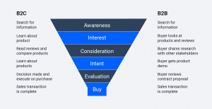
Part of the inbound marketing methodology is to provide visitors options to convert into leads on your website no matter what stage of the buyer’s journey they are in. If your website only includes more bottom of the funnel offers, like talking to a sales representative or requesting a demo, you are missing an opportunity to nurture leads who may be in the research phase. Your new inbound website should provide content offers that address pain points and offer solutions to their challenges.
Question 6: What do your visitors think?
Visitors to your website can be the most vocal with their feelings, especially if they’ve had a bad experience visiting the site. You just have to know where to go to find their opinions. If they’ve had issues running into a form submission error or being sent to 301 redirected page, they may reach out through a contact form. However, you can also use user testing tools to ask for feedback. Tools like usertesting.com, usabilityhub.com and hotjar.com can provide you insight to how visitor’s use your site.
Question 7: Is it easy for you to make updates?
Sometimes, we just want to make simple changes to a website, like fixing a typo or swapping out a homepage banner image. Yet, because the content management system (CMS) is outdated, you’re forced to send off simple requests to a developer. A current CMS will allow you to easily access the backend of your website where you’ll be able to make content edits in a text editor, with little html knowledge.
For many of our website design customers, it’s a culmination of these questions that make them realize it’s time for a redesign. Whether you need to undertake a full redesign or use the growth-driven design approach to make small changes over time, we can walk through your thoughts and challenges about your current website with you.
(155)
Report Post


