They come in many styles, they come in many colors; they come in many sizes, and you’ll need them to get followers. Ok, that rhyme may be a bit of a stretch, but I never claimed to be a gifted poet.

When it comes to social media sharing buttons, your choices are as abundant as shades of paint at Home Depot (call me crazy, but ‘spring meadow green’ and ‘neon celery’ look exactly the same to me).
There’s tons to consider with social buttons, from positioning, coloring, size, wording, and style. Don’t worry, we’re here to help you suss it all out.
1. Button Positioning: How Low Can (Or Should) You Go?
When it comes to positioning, you have many, many options with social media buttons. You can put your social share buttons at:
- Top of Post. It’s very common to place social media buttons at the top of blog posts.
Some challenge this logic, asking “will readers share a post they haven’t even read yet?” Bizarrely enough, some studies have shown no real correlation between sharing a post and reading it. It’s very possible that users see an entrancing headline and decide right on the spot whether or not it’s something worth sharing. Having social media buttons at the top of the page can also act as social proof and encourage readers if you have tons of shares. If I see a post with +1,000 shares, it reinforces my belief that this article is awesome and worth taking the time to read.

social share buttons on TechCrunch
- Bottom of Post. Another popular positioning, this placing allows social media buttons to be strategically placed for clicking as users finish reading a blog post.
The downfall here is that putting social share buttons at the bottom of your posts means that the buttons will be competing with many other elements, from comments to related posts. They can easily get overlooked or lost in the crowd.

The Moz Blog keeps their social buttons at the bottom of posts
- In-Line with Post. Some bloggers elect to put social sharing buttons within the middle of the blog post. Usually this is an added element, done in conjunction with having social buttons at the top or bottom of a post. This can cleverly be executed after delivering an especially powerful statistic or moving quote – if a certain line excites readers, they may be encouraged to hit a well-placed share button placed strategically to capture users in the heat of the moment.
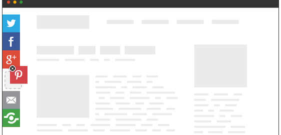
- Floating Bars. Having floating social buttons alongside the left column of a blog is another popular positioning. Floating bars don’t have to vertical (although that is the most common design).

Most websites don’t just choose one of these positions, but instead mix and match according to personal preferences.
Upworthy has an especially unique design, which I’m assuming must work for them, as social shares are their bread and butter.
Upworthy puts a subscription form, Twitter button, and Facebook share button combination box that sits towards the top of the post.

Then, once you scroll past the share/subscription box, a Facebook share button floats in the top bar.

By the way, for those wondering, there is no way in hell Sansa Stark is the real Game of Thrones hero. Just putting it out there.
Some extra quick general rules when it comes to button placement:
- Don’t put your social buttons too close to the navigation. You don’t want to have users accidentally clicking share buttons when they are trying to do navigate someplace else.
- Place buttons close to the content. When buttons are farther away from the content, users become more confused about what it is that they are sharing.
- Keep buttons visible. Don’t burry your buttons where no one will ever encounter them. Unless you’re giving out Cadbury Mini-Eggs, this isn’t an Easter egg hunt.
2. Social Media Button Size: The Bigger the Better?
You’ll find that most sites (especially those focused on virality) utilize large social share buttons. The more prominent your social share buttons are, the more likely users are to click them.
Large buttons can come off a bit needy, but there’s no denying that they’ll get clicked more than the smaller, more discreet buttons. The squeaky wheel gets the oil, as they say.
 Social share buttons from RRSSB
3. Custom Social Buttons vs. Classic Designs
When taking stock of the various social sharing buttons scattered across the web, you’ll notice that some sites use their own original social media button designs, while others stick to the standard, official buttons.
There are advantages and disadvantages to either method. Customizing your buttons can help them stand out and be a bit more eye-catching than the standard social buttons we’ve all seen a trillion and one times. However, if the buttons look too foreign and unrecognizable, readers will pass right by them.
Let’s check out some examples of social media button variations.
In this example, you can see that ExactTarget, the Salesforce blog, features greyed social buttons. These desaturated grey shades go hand-in-hand with the site’s design and give an added air of professionalism.

Many other sites modify the button style or shape, but will stick to the colors associated with each social network to make them easily recognizable – royal blue for Facebook, light blue for Twitter, red for Pinterest, etc.
These buttons on Pat Flynn’s blog aren’t the standard button style, but are very close to the originals.
![]()
BuzzFeed does something similar, with customized button designs that stay very true to the originals.

This collection of social buttons takes a lot of artistic license, creating very unique social media buttons. Users might hesitate to click these buttons, as they appear quite unfamiliar, but they also add a dose of originality to your site.

4. Too Much Of A Clickable Thing: Don’t Go Overboard on Buttons
At first thought, you might easily assume that more social media buttons would be better, as they allow readers to easily share your post on any social network that they desire. The more the merrier, right? Not exactly. Here’s why.
1. Too Many Choices Are Overwhelming
The choice paradox has proven that us humans are a fickle, indecisive bunch. Just shopping for breakfast cereal can be a trial, deciding if we want multi-grain, chocolate, honey nut, or plain Cheerios. Yes, it’s a first world problem, but it’s still a problem nonetheless!
In fact, it seems that too many options can be just as paralyzing as too few.
When users can’t decide if they want to share your post on Tumblr, Pinterest, Facebook, Twitter, Reddit, StumbleUpon, LinkedIn, or Buffer, they may ultimately choose to not share your post at all! Oh, the horror!
Social button overkill is also obnoxious as hell, as The Oatmeal artfully illustrates.

2. Lots of Buttons = Social Slow Mo
Having too many social buttons can dramatically slow down your page load times. Social share buttons use JavaScript to communicate between your website and the respective social networking sites. More buttons means more scripts, which slow down your site to a snail-like pace.

With Google using site speed as a ranking signal, it’s important to trim the fat wherever you can. For optimal SEO, you need to be as speedy as Sonic the Hedgehog.
Choosing Which Buttons to Keep And Which to Scrap
No doubt it was painful to rush towards the Intro to Acting bulletin board in high school, only to find that you didn’t earn the role of Puck or Oberon in your school’s production of A Midsummer Night’s Dream, but instead must play the less-than-riveting role of Laughing Fairy #3. Sadly, cuts need to be made, and your social media buttons need to get the same harsh but fair treatment.
In order to decide which social media buttons are worth including, check out your analytics and see which social sites you regularly get the most referral traffic from. Those are likely the social buttons you’ll want to keep close at hand.
It’s also smart to think about what social networks your target demographics use, and which social media buttons generally get the most action. Research from TrackMaven shows that, unsurprisingly, Facebook and Twitter account for the most social sharing, so it’s a good bet that you’ll want to keep those guys around.

What Is The Goal Of the Page?
When considering which (if any) buttons to include on various site pages, definitely take some time to think about the intent of the page. Blog posts whose main aim is traffic and reach will probably want to include some social buttons.
It’s a different story on product pages or conversion-oriented pages. When a conversion is the key goal, social buttons can be distracting and can lead users away from your funnel.
One case study from Visual Website Optimizer shows how a product page increased conversions by 11.9% after removing social buttons.

Could a social button scrape increase your conversions? It’s something to consider.
5. Should You Keep Score With Share Counters?
Another element you’ll want to consider for your social share buttons is whether or not you want to include share counts for your buttons. Share counts can be a double-edged sword – if you have high share counts, those numbers will build social proof and will reinforce the belief that your content is high-quality and worth reading.
However, low share counts may dissuade a reader.
 womp womp
If your blog has a solid, active audience that likes to share your stuff, go ahead and put up share counters. If your audience isn’t as large, you may want to stay away from share counters, at least for now.
One genius solution to this little conundrum can be solved by the New Internet Order share plugin. It lets you set the minimum displayed number of shares. That means I can program the plugin to show no share counter until I reach at least 50 shares. Once I hit 50 shares, the share counter will activate, helping build social proof. It’s a pretty sweet little tool!

When there are more shares, a share number appears before the bracket shape
6. Calls-to-Action for Social Media Buttons: Ask and Receive
CTA’s are vital for PPC ads, form completions, and even blog post headlines, so naturally they need to be considered for social media buttons as well. There are several different approaches you can take for implementing calls-to-action with your social media buttons.
Option 1. Transform Sharing Button Into Text
One option is to turn the entire button into a piece of call-to-action text. This is becoming a more popular trend on sites that limit their social sharing buttons to just a few key social networks.

Mashable social share buttons
Option 2. Add Call-to-Action Text Around the Buttons
Another option is to add text above or around the social share buttons, and simply ask users to share point blank.
Shareholic has a plugin that allows blogs to add call-to-action text above buttons, encouraging eyes to linger a bit longer on share buttons.

Sometimes the best way to get what you want is to simply ask. It’s been shown that tweets asking for retweets outperform those that don’t – Buffer took it a step further and showed that including the word “retweet,” as opposed to “rt” resulted in 23x more retweets!
Adding call-to-action text to your social media buttons is definitely a smart idea to test for increasing social shares.
7. Testing Makes the World Go ‘Round
There are thousands of social media button variations you can choose from, and unfortunately there is no single 100% best social button system that outperforms across all sites.
Instead, the best way to find out which social media buttons will perform best on your site is by testing. Test sizes, colors, styles, positioning – any variation you can think of! It may seem like a tremendous task (and to be honest, it is), but it’s the only surefire way to discover your ultimate social button design. Remember, it’s all about the shares.
Do you have any social media button best practices or suggestions? Share your thoughts and deepest, darkest feelings in the comments.
(272)
Report Post