Every day, 68.53% of potential sales are lost on e-commerce sites due to abandoned shopping carts. It means that for every 100 potential customers, only 31 will proceed to make a purchase.
There are many reasons why shoppers leave without purchasing and the most common is unexpected costs. 56% of abandoned shopping carts are due to finding shipping fees, taxes, and other charges that weren’t listed originally on the product page on a checkout page according to Baymard Institute’s 2015 statistics. .
36% of shopping carts are abandoned because potential shoppers found a better price elsewhere. People won’t think twice of abandoning a cart if the same product can be bought at a lower price from a different seller.
Having issues shopping cart abandonment? Get a FREE cheatsheet with 7 steps to reduce shopping cart abandonment and generate more sales.
What can you do to avoid having abandoned shopping carts that significantly affects your bottom line? We list down 7 simple steps to reduce its occurrence.
Implement exit-intent popups
An exit-intent popup is a message that displays on a visitor’s screen just as they are about to close a page.
If the reason for them abandoning their shopping cart is due to your prices being too expensive or they are presented with unexpected costs, offer a limited time coupon code on your exit-intent popup similar to this one from Curlformers.

If all of a sudden they feel uncertain buying because they cannot physically analyze your product, use a free return or a money-back guarantee decal on your exit-intent popup.
And if shopping cart abandonment is due to fear on a seeming lack of security, use customer testimonials on your exit-intent popup to attest to your site’s social proof.
Exit-intent popups is your second chance to convert a fleeing prospective customer. When used and timed properly, exit-intent popups can increase conversions up to 10 to 15%.
Schedule an email recovery campaign
It is important to keep in mind that while some customers purposely abandon their shopping carts, some may do so without meaning it. Websites can crash and time out. In some instances, internet connectivity plays a role as well.
This makes an email recovery campaign a powerful and effective way to re-engage lost potential customers.
In an ideal email recovery campaign, one to three emails should be sent out at set intervals.

The first email should be sent within 24 hours after the shopping cart was abandoned. The second email should be sent in two days and the third email within one week.
Considering that 46% of all emails are opened with over a third of clicks leading to a purchase back to the site, including an email recovery campaign as part of your shopping cart abandonment recovery strategy is wise.
And to make your email recovery campaign truly effective, check out the following tips:
1. Be creative with your subject line. Aside from catching their attention, your potential customers should know immediately what is in it for them once they open your email, like this subject line from Chubbies Shorts.

2. Keep a friendly tone in your copy. Aside from reminding them of the items they left in their shopping carts, an email recovery campaign is a good opportunity to show your brand’s personality and friendly side. Check this one out from Doggy Loot.

3. Use product images in the shopping cart. Using product images is a great way to show your potential customers the items they are missing out on instead of just listing down the items, the quantity and its corresponding prices. Check out the Doggy Loot execution again for an illustration.
4. Create a sense of urgency. By adding an expiration date to the recovered shopping cart, you are encouraging people to act and complete their purchase faster, like this shopping cart abandonment email by Grove.

5. Make your call to action clear. Whether it’s ‘Complete Checkout’ or ‘Go Back to Your Shopping Bag’, make it stand out on the email and make sure that it will link to the correct checkout page.
Allow multiple payment methods
Did you know that 25% of people abandon their shopping carts because their preferred payment option was not available?
With Cash on Delivery, PayPal, debit payments like eNets and Master Pass and easy-to-integrate payment acceptance APIs such as helloPay and Paymill, there is no excuse in offering a diverse range of payment options to your potential customers.

Back in the day, only large e-commerce sites had the advantage of having multiple and secure payment portals. Today, even small businesses can offer diversity in their payment methods.
Remember: Communicate all your accepted payment methods on the shopping cart page. Do not simply list them with a text. Use its corresponding logos for easy recognition.
Offer free shipping & show all fees
One of the many reasons why shopping carts are abandoned is because not everyone is willing to pay for the shipping.
As a marketer, there are two ways to solve this – offer shipping for free or mention the shipping amount even before visitors start exploring your site.

Free shipping works wonders for any online store. Aside from increasing cart conversion rates, free shipping encourages 93% of shoppers to buy more items.
You may feel a bit reluctant offering shipping for free, but you can make it profitable by establishing a minimum order value, like this one from H&M. Orders $ 50 and above are qualified for free shipping.
Another way to make free shipping profitable is to offer it only on selected products, like this one from Overstock.

Lastly, free shipping can still be profitable by adjusting your prices. The price increases will make up for the actual cost of shipping.
And although free shipping is a great motivator, there is also nothing wrong in charging shoppers with the shipment of their goods.
To avoid surprising them with an expensive bill, mention the shipping fee early into the site. Also, calculate the shipping fee plus taxes so your potential customers already know what the final amount is even before they proceed to checkout.

Address any customer concerns
It is common for a lot of ecommerce sites to provide help at different points in the site. Help can come in different forms as well, such as an FAQ page, a live chat or a popup invitation that provide answers to a user’s question.
However, majority of that help vanishes once the customer reaches the checkout page, increasing the chances of shopping carts being abandoned.
Although the hotline number and the live chat button could have been made more noticeable on the page, Nike shows a good example of help being available at the checkout page.

Remember: The checkout page is just as critical a place for providing customers with help. It is the stage in the buying process where people may suddenly feel doubtful of the product they are buying or feel concerned about their payment details’ security.
Abandoning your customers at this point may lead to them abandoning their shopping cart. Whether it is providing help through phone or live chat, do not make it hard for a potential customer to communicate with you. Treat this as an opportunity to save a sale.
Provide a guest checkout option
Forcing visitors to register their details before they can proceed to checkout is a common reason why shopping carts are abandoned.
Although in reality it takes less than two minutes to register, for some, it may seem like too much effort.

Cut the conversion process short and place a Guest Checkout option, similar to Apple. With Guest Checkout, users can proceed to buy their items and create their Apple ID later on.
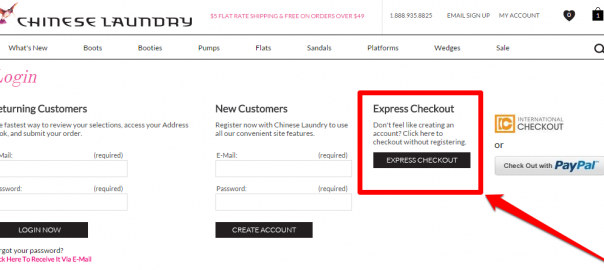
You can also have an Express Checkout option similar to Chinese Laundry.

The Express Checkout applies for shoppers who do not want to create an account or register any details at all and just want to proceed to pay for their shopping cart items.
The checkout process should not be long and inconvenient. Provide a Guest Checkout and Express Checkout option to appease the different wants and needs of your potential customers.
Optimize the checkout page
To say which one works best between a single-page, multi-page and accordion layout has long been the subject of debate. After all, checkout page optimization does not work as a one-size-fits-all approach.
With a single-page layout, the fields are quicker to fill out and customers do not need to wait for a page to refresh to proceed to the next step.

There is also a little psychological boost in a single-page layout since customers can see how far along they are in the checkout process and what fields are left before they complete it.
However, since all the fields are all in one page, a single-page layout can look a bit cluttered.
On the other hand, a multi-page layout has a potential to look a lot cleaner than a single-page layout since all the necessary fields are not squeezed in one page.

Another benefit of a multi-page layout is it provides insight as to which stage of the checkout process potential customers usually drop out from.
If you find out that people leave your page once they are asked for an alternate billing information, you can remove that from the process altogether. With a single-page layout, there is no way of knowing which stage caused your customers to drop out.
However, since there is more than one page to fill up, the psychological effect is that a multiple-page checkout takes a while long to accomplish.

And lastly, an accordion layout is a hybrid of the two. Only one section is shown at a time and the next step is only revealed once the necessary information for the previous step is completed.
Obviously, there are pros and cons to each optimization option and to choose one that will work best to fix shopping cart abandonment is very tricky.
Take for instance the Vancouver Olympic Store. They tested a single-page layout against their initial four-page checkout page. They found out that switching to a single-page layout increased their conversions by 21.8%.

It may have worked for the Vancouver Olympic Store, but it does not a guarantee the same benefits for your site. Continuous testing is essential to identify which optimization option works best for your conversion rates.
Conclusion
There may be many reasons why shopping carts are abandoned, but lowering its rate is definitely within your reach. To reduce shopping cart abandonment is to increase the potential conversion of your site visitors deep in the funnel.
And while the steps we discussed are backed by data, we cannot stress enough the importance of testing these to your own site and check how your own customers will react to it.
At the end of the day, do not leave money on the table by letting shopping carts go abandoned and constantly seek out ways to improve your customer’s’ buying experience.
Digital & Social Articles on Business 2 Community(106)
Report Post


