— June 6, 2018

It’s no secret that you should consistently A/B test elements of your website. Every digital blog and podcast is talking about it. If you want to increase your conversion rate and make more money from the website traffic you’re already getting, then A/B testing is your ticket.
But, what exactly should you A/B test? Button color? Page design? Hero image? All of the A/B testing conversations does just as much to confuse the issue as it does to clarify the issue. Unfortunately, loads of different opinions on the topic can have you A/B testing things that will have a negligible difference on your website.
Which is why I found the seven most obvious, clear, game-changing elements of a website that you need to A/B test as soon as possible. If you don’t know where to start, then you’ve come to the right place.
1) The Type of Offer
Every great sales offer is backed by a free trial, a money-back guarantee, a demo, or something similar. People don’t like to buy if they feel like they are being roped into a long-term commitment without knowing the product and whether it’ll help them.
That much, you know.
But you might not know which type of low barrier-to-entry offer is the most effective for your product and audience. Acuity Scheduling, for instance, a SaaS company, found that sacrificing their freemium for a free trial offer increased paid signups by about 268%.
Try a few different offer types and see what happens on your website.
2) The CTA Color
Most marketers have heard of the famous HubSpot test that found a 21% increase in conversions after changing from a green button to a red button.

HubSpot also found, however, that the increase in conversions had little to do with the color red, and more to do with the uniqueness of the button color relative to the rest of the landing page that the button is placed on.
In other words, using a color for your CTA button that isn’t on the rest of the page might increase your conversion rate. This one is definitely worth testing.
3) The Pricing
Robert Cialdini famously tells the story – is his book, Influence – of a jewelry store owner that stumbled upon the power of pricing when selling a product. Trying desperately to sell a set of turquoise jewelry with a reasonable price tag, the owner moved the jewelry in the store so customers would walk by it more.
She even told here salespeople to try and “push” the product. All of this, to no avail.
Eventually, she left for a trip. Before she left, she wrote on a piece of paper, telling her staff to mark the turquoise jewelry as “½” off. When she came back, all of the jewelry was sold. Not because it was discounted, though. But because her employee has misread her writing and doubled the price of the jewelry rather than halving it. The new price made customers perceive the turquoise jewelry as higher quality and more valuable. So they bought more of it.
Will a higher price point help you sell more of your product? Or less? A/B test to find out.
4) The Short or Long Sales Copy
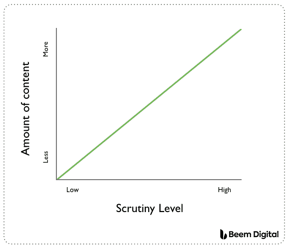
According to Beem Digital, landing pages for products that are new to the market, difficult to understand, or open to a lot of scrutiny should be long, while a landing page for a familiar, easy-to-understand product should be short.
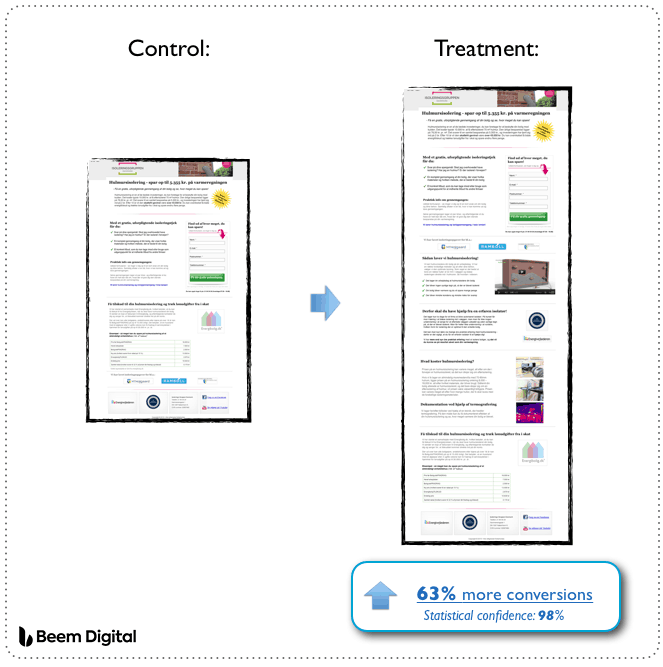
And that’s not just hot air and assumptions. Beem Digital also found a 63% increase in conversion rate when they doubled the length of the landing page for a company with a complex and difficult-to-understand product.
For some websites, short will be better. Which is it for you?
5) The CTA Button Copy
When people click on a CTA, they often want to know what’s going to happen. Will they be taken to fill out a form? Watch a video? Or answer a few questions?
In marketing as with all things, honesty is often the best policy. Not just because people will know what’s coming, but because they might actually click more. A SaaS company for real estate investors, Carrot, ran an experiment on one of its customers websites to determine whether generic or specific sales copy performs better.
They changed the CTA button from, “Click here to Continue” to “Get My Fair Cash Offer.”

The result? A 49.55% increase in conversion rate. Not too bad for changing a few words on a button. Increase the specificity of your own website’s CTA buttons and A/B test to measure results..
6) The Sales Page’s Font Size
Could something as seemingly insignificant as landing page font size impact your conversion rate?
Well, maybe …
VWO ran one experiment, for example, where a font change from 17 pixels to 18 pixels increased conversions by 32%. Think about it this way: the easier that text is to read, the more likely that people are to read it. The more people who read it, the more people who become convinced to buy. It’s worth A/B testing different font sizes on your own sales page to see if one size converts better than another.
7) The Navigation Bar
Navigation bars are useful when a visitor is trying to browse around your website and learn about your business, but they aren’t so useful when you’re trying to sell that visitor something. Especially on a sales page, that navigation bar often does more to distract from what you’re trying to sell than it does to benefit the user’s experience. So much so that Yuppiechef saw a 100% increase in conversions after removing the navigation bar from its landing page.
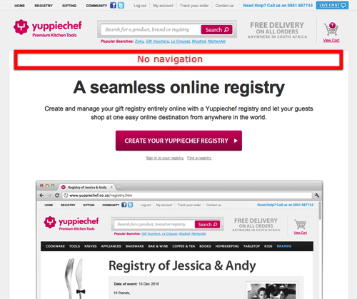
A/B test with and without a navigation bar to determine if it’s killing your sales. Unfortunately, it just might be.
If you want to A/B test different elements of your landing page, but you also don’t know where to start, then this article is for you. Start with number one and work your way through the list. On the way, you’ll discover new tricks to turn more cold website visitors into paying customers – and that alone makes an A/B test worth running.
Digital & Social Articles on Business 2 Community
(75)
Report Post
