— June 8, 2018

Did you know that 74% of marketers rely on visuals in their social media marketing campaigns, and 56% of them rely on infographics?
It’s easy to understand why visual content is such a success in the online world. “A picture is worth a thousand words” is not just a random saying. There’s a lot of truth behind it. The human brain is faster and more effective at processing visual information. When processing text, the brain has to put in much more effort, which is exactly why the online audience doesn’t have an impressive attention span in terms of reading articles.
You’ve probably seen infographics that went viral, right? Here’s an example: 10 Banned Foods Americans Should Stop Eating. It has over 680K shares on Facebook. The infographic was published at Dr. Mercola’s website, so it was clearly created with a marketing purpose to mind. The idea behind it was to drive more traffic and help the doctor build a personal brand.

That’s how effective viral infographics can be! The main question is: how do you create an infographic that goes viral? We’ll give you 7 tricks to help with that.
1. Be Unique!
The infographic we mentioned as an example was effective because it was unique. Some people already knew that Americans were eating foods that have been banned in other countries. Have they seen an infographic that clearly listed those foods and provided easy-to-process data regarding the issue? No. That’s what made this content so successful.
- Use your imagination! You can surely think of a very specific topic from your industry, which you can turn into an infographic.
- Instead of choosing something that’s generally popular in your industry, think of a specifically relevant topic. What would your audience be thrilled to learn about? What new information can you provide for them in the form of an infographic?
- Remember: you’re not trying to create an infographic for the entire world even though you want this content to go viral. You’re targeting a specific audience. Check out this example of a successful infographic: Anatomy of a Teacher. Although it got quite popular as soon as it was published, it’s still aimed at a very specific audience: public-school teachers.

2. Stay Simple
Let’s check another example: the infographics published by Essay Geeks. 10 Most Hilarious Pre-Exam Superstitions is a pretty cool infographic. It’s very unique and targeted to a specific audience (students). You won’t see much text in the infographic itself. You’ll just see the superstitions of students from different countries. In China, for example, students think that red underwear will bring them luck.

Infographics are effective because they give fresh information in an easy-to-process format. Yes; you may include important data, such as statistics. The important thing is to keep the infographic as simple as possible. If you make it needlessly complex, the audience will have a hard time to process the information.
3. Think of an Awesome Headline
If the headline doesn’t get attention, the infographic won’t go viral. It’s as simple as that.
A great headline should meet few goals:
- It must trigger the curiosity of the audience;
- It must describe the essence of the infographic;
- It should be short, so the viewer will process it at a glance.
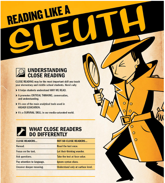
Check out this example: an infographic named Reading Like a Sleuth. It’s aimed at teachers, who should encourage close reading as one of the most important skills their students should develop. How to Encourage Your Students to Develop Close Reading Skills would be a really boring headline, don’t you think? Reading Like a Sleuth, on the other hand, immediately grasps the concept of the infographic without being too obvious. It also gives the foundation for including nice visual elements.
Brainstorming is the best technique for writing good headlines. Think of several alternatives that could work, and pick the strongest one.
4. The Visuals Have to Be Awesome
Are you good at graphic design? If not, you’ll have to hire a graphic designer, who will develop the visuals for your infographic. You can’t turn an infographic viral if you use stock photos. That’s simply not an option.
Since the essential approach to infographics is maximum visuals and minimum text, the visual pizzazz mustn’t be short of impressive. Check out all above-listed examples and you’ll realize that visual design is an essential reason for their success.
5. Make It Readable
Yes; the content should be digestible, but that’s not our focus when we say you should make the infographic readable. This is more of a design issue.
Designers often make the infographics huge, so the developers have to downsize them. During this process, you may lose the infographic’s readability. It will appear too small and when you click to enlarge it, it will be huge.
The infographic should be readable in its native form, and it should also be readable when the user enlarges it. Make that happen! The usual width that works is 600 pixels. That’s the width that Pinterest recommends as ideal, and we all know how much we want our infographics on Pinterest.
6. Make It Long Enough, But Short Enough
That sounded confusing, didn’t it? Well, here’s what we mean: you have to be smart about the length of your infographic. If it’s endless, people won’t get to its end and they won’t see your brand’s logo and links. If it’s too short, it means you’re not giving enough information to your audience.
Most infographics are big. They are supposed to be big. When they are huge, however, they challenge the attention span of the audience, and that’s a battle that no one wins.
If you want a precise recommendation, it’s best not to exceed 1800 pixels. That should give you an infographic that’s long enough to give a good deal of information, but short enough to keep the audience interested.
7. Mind the References
Do you know what the most annoying thing about infographics is? They rarely cite their sources. You see tons of percentages, such as “Infographics drive 79% more traffic to a website,” but you don’t know where that data came from. When this is the case, you assume two things:
- The writer is lying, or
- The developer was not attentive enough to reference the sources.
Either way, this is not a beneficial situation for the brand that launched the infographic.
You must cite the sources! If you check the infographic by Essay Geeks we mentioned above, you’ll notice that the sources are provided at the bottom. That’s the usual way to handle references in infographics, since you can’t rely on links throughout them.

Infographics Have Tons of Potential for Going Viral
If you choose a great topic, think of an attractive headline, create lovely visuals, and provide the perfect package, you’ll have great chances for the infographic to go viral. The promotion, however, will play a huge role. You have to feature this content all over your social media pages. It’s smart to contact influencers with a proposal for collaboration, so they will promote the infographic further. Furthermore, automation tools like Viraltag help make posting on social media a breeze! Once people start sharing, you’ll just have to wait and see how viral the infographic goes.
Digital & Social Articles on Business 2 Community
(104)
Report Post

