Every point of interaction with your audience is an opportunity to build your relationship with them.
And this is true even when they click on a broken link and land on your 404 pages.
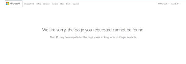
- An example of a 404 error on the Microsoft website
A 404 error is when a user tries to find a page that doesn’t work anymore. And a 404 page is a designated page that users land on when they click a link that’s misspelled or has been removed by the website’s creator.
There are other types of errors that can take place. For example, a 503 error page is when the server is busy, and a 401 error page for when users try to access a page that they’re not authorized to.
A 404 error is one that takes place quite often. And that’s what we’ll focus on in this post. You could create a generic 404 page that lets users know that there’s a problem. But, it would be smarter and effective to optimize your 404 pages. With optimized pages, you could:
- Build leads
- Move users through your sales funnel
- Improve your site’s user experience
- Retain site visitors
- And boost your brand image.
Let’s look at powerful ways you can optimize 404 pages to create the best impact.
How to optimize your 404 pages
Here are the top tips to keep in mind when building your 404 pages. Use a landing page builder like SeedProd to set up your pages with all the elements needed to keep visitors on your site.
Link to other pages
A 404 page without a navigation bar and links to other pages is like a dead end. Users won’t know what to do next and they’re likely to leave your website for good and never return.
The most basic setup you can create is one where you add a home page, links to your FAQ section, contact page, and other places on your site where users can continue to interact with your brand.
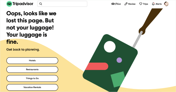
- Tripadvisor’s 404 page has links to different activities and pages
Add a search bar
Some users land on a 404 page when they follow a link that doesn’t work anymore. By adding a search bar, you give users the option to search for a topic, a keyword, or a page. And from here, users can find select an option from the list of automatic suggestions. Or they can type in a keyword, move to a page of related results, and find what they need.
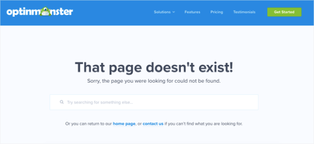
- Adding a search bar to your 404 page helps users find content
A simple search bar keeps users moving and gives them the ability to find what they need. They’ll stay on your site longer and you’ll retain your lead.
Use humorous language or a casual tone
Many top brands make use of their 404 pages to connect with readers at a closer level. You can make your 404-page content humorous by adding a funny image and engaging copy.
Here’s an example of a website that has changed since the time this screenshot was taken. Users on this company’s 404 page could play a simple game where they picked which developer to fire.
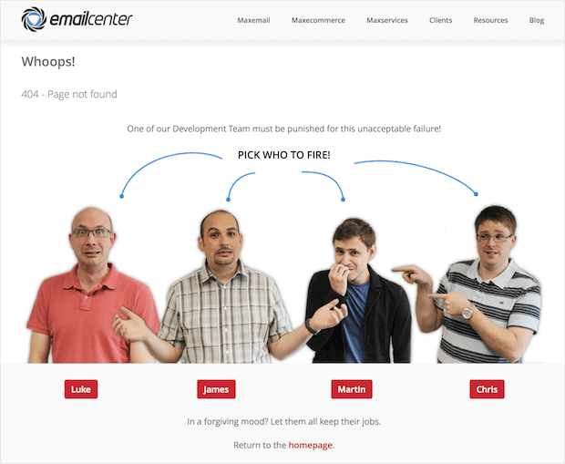
- A humorous 404 page
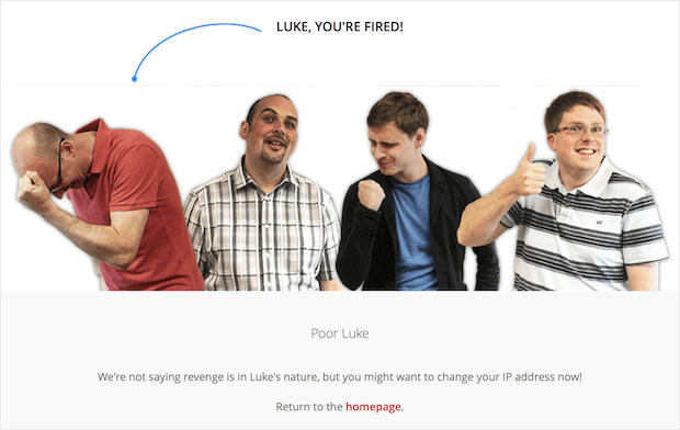
When the user clicked on a person, the image changes to the one above. What’s great about this 404 page is that it immediately makes you smile. And the brand behind this site also shows that it cares about your experience. This type of humor and creativity will keep people on your website longer and make your brand memorable too.
Add a call to action
Another way to optimize your 404 pages is to add calls to action. Giving users something to do will lead to further engagement on your site and move them through your sales funnel. Here are a few types of actions you can ask users to take:
- Sign up for your email marketing newsletter
- Create an account on your website
- Download a free ebook, checklist, product, or something similar
- Book a product demo
- Chat with your sales or customer support team
- Shop on your product pages
- Read your blog posts
- Schedule an appointment
- Register for an event
- Follow your business on social media
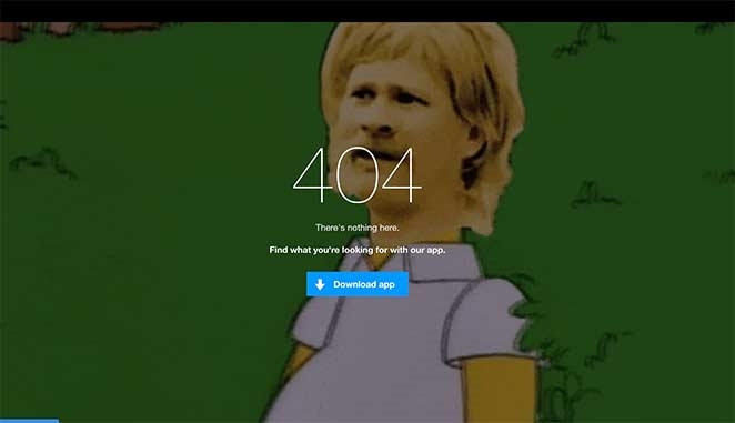
- An example from 9gag’s 404 page. They stay true to their brand tone and also encourage users to download their app.
You want to make sure that you don’t create too many options. First, have a list of goals and prioritize the actions that will help you achieve your top goals. Your call to action should help users easily carry out the step you’d like them to take.
Add an explanation
For some users, landing on a 404 page can be a confusing and new experience. You can highlight your thoughtfulness and professionalism by making a brief explanation of why they landed there.
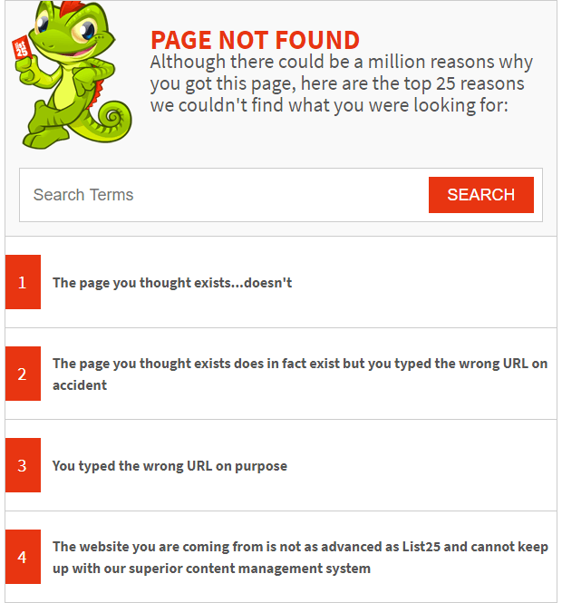
- List25 stayed true to their brand tone and also explained to users why they landed on the 404 page
Let users know that the page doesn’t exist or that some kind of mistake has taken place. Then guide them to other content or to taking some kind of action.
This is a good user experience in action and will make a positive impact on site visitors.
Create a special hero image
Some brands create imagery specifically for their 404 pages. This kind of step reinforces your brand image and also highlights your attention to detail.

- This specially designed 404 page by The New Yorker is a great example of using a hero image
At a subconscious level, this plays an important role in building up your brand’s reputation and image to your target audience.
Consider engaging an artist or your company designer to make a special 404 page hero image. You can also opt to use stunning photography and even videos to form the backdrop of your 404 landing page.
Suggest alternative content
Suppose a user clicks on a link that’s supposed to take them to a page for buying boot-cut jeans but finds themself on a 404 page instead. A helpful step that you can take is to recommend something similar to a product page for jeans in general.
This kind of step makes it easier for users to find what they need and you’ll avoid losing a potential customer. They’ll continue shopping on your site and generally have a better user experience.

- In the 20th Century Studio’s 404 page, visitors get recommendations to see other movies
Conclusion
It’s rare for people to land on 404 pages. But when they do, it’s important for you to create an experience that keeps them on your website.
We’ve looked at several ways you can optimize your 404 pages. Keep your goal in mind when building your 404 landing page and also refer to the tips here. You’ll keep growing your customer base and your business too.
Digital & Social Articles on Business 2 Community
(97)
Report Post


