Today we’re gonna analyze top 7 trends in web design. Understanding and utilizing trends is critical for any creative professional or entrepreneur.
What else is waiting for us in web design in 2017? Check out the rest of my predictions.
1. Card Design

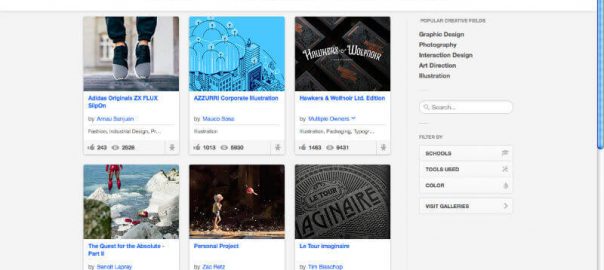
Source: Behance
Cards are intuitive and easy to understand, they kind of came about with Pinterest and other gallery website pages, They are great for organizing a large amount of content into easily digestible and viewable pieces it’s perfect for responsive design, card layouts easily reorganize themselves at different breakpoints as your browser window resizes itself.
2. Illegibility

Source: Rogge & Pott
Trends are not always good, and this is a design trend that’s kind of tough. A lot of designers and brands have been started to reduce the contrast in their text so they’re becoming more and more illegible. So using contrast makes things harder to read and whether we like it or not, we have an aging population and our devices are getting smaller and smaller from desktops to laptops to mobile devices. Therefore having things be legible and having a decent amount of contrast is really important.
3. Minimalist Design

Source: Omega
So, stripping away distractions, making it very clean, sophisticated, increasing legibility, improving the simplicity of navigation, are all good. Trying to focus on user interface and going with the minimalist design is a great idea.
4. No Bad WordPress

Source: Evangel Cathedral
They say 80% of the web is built on WordPress and I’d say about 50 of those built with very bad WordPress themes. So, when you’re designing, try to use a beautiful responsive theme, modern, contemporary. Be original with WordPress, be beutiful, be simple.
5. Hybrid Material Design

Source: Google Now
What I mean by this is there was a trended design going very flat, we even see it on Microsoft operating system, they got rid of shadows, textures and everything got super flat. That was predominantly style for awhile and now we’re starting to move away from that. Google has developed something called material design which is essentially a hybrid between flat and a little bit of more volumetric shape built into it, so it’s easier to navigate and move around while protecting the modern visual aesthetic. Also, Material design is better for mobile in terms of understanding how to navigate and what you actually need to do on the website or app.
6. Rich Animations

Source: GreenLabs
Where ever possible try to add animations such as gifs and hovers. It benefits your website, makes it more attractive and gives a more engaging experience rather than just static images. Also, creates a level of visual feedback what you’re doing and how interacting with the audience. So it makes learning more intuitive and more fun.
7. Dynamic Typography

Source: Grange Web Design
The advent of Google Fonts and Adobe Typekit has made using new and different fonts and scaling them to large sizes much easier than it ever used to be. So it benefits designers in being able to be simply and dramatic, it can also benefit high-resolution display and can be used predominant retina design. In a nutshell, it gives you the opportunity to display your brand identity in a very unique and differentiated.
Digital & Social Articles on Business 2 Community(109)
Report Post


