When you think of whiteboard animation, you probably think of a hand illustrating a complicated series of ideas as a soothing voiceover explains particle physics or the psychology of social media. Odds are, you’ve seen a whiteboard video in the past few years because online education content has exploded in the past decade, and whiteboard animation is kind of perfect for explaining things.
And while whiteboard explainers are ideal for your next TED talk, whiteboard animation is about so much more than education content. Here are 6 Super Versatile Uses for Whiteboard Animation:
Whiteboard Animation Title Sequence
Weeds Show Opener — IdeaRocket
When the hit Showtime program Weeds was looking for a way to mix things up for their eighth and final season, they turned to whiteboard animation for their iconic show opener. The result was an attention grabbing title sequence that summed up eight years of complicated story lines, character arcs, and plots in just 30 seconds. It was an elegant way to include easter eggs for long time viewers, and remind casual viewers of important developments with their favorite characters.
The Weeds show opener is one of the better examples of the power and simplicity of whiteboard animation. It was even nominated for Best Title Design at SXSW.
YouTube Homepage
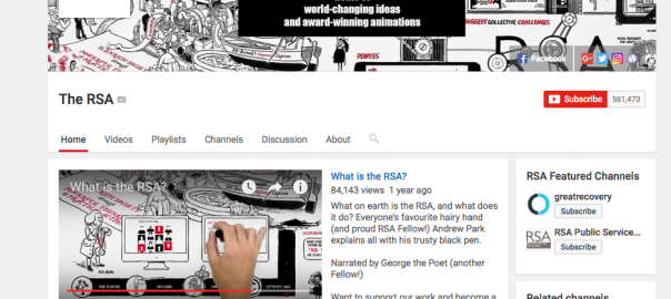
What is the RSA? — RSA Animates
When viewers visit your YouTube page, they want to know what your channel is all about. Whiteboard animation is one of the simplest, most effective ways to explain what you’re all about and welcome new viewers. And if anyone knows the power of whiteboard animation, it’s the RSA.
They feature several kinds of videos on their YouTube channel—talking heads, lectures, and animation—but the featured video (the one that auto-plays when you visit a YouTube channel) is a brief whiteboard animation that lets you know exactly what the RSA is all about.

It’s sleek, modern, and a great introduction to who the RSA is, and what it does. Each “panel” is packed with text and informative graphics, that works thanks to the clean lines, attention to contrast, and use of negative space as an asset. The black timeline at the bottom of the screen, for example uses every inch of the frame, while also keeping the narrative clear. The timeline progresses forward in time as the camera pans to the right, moving the viewer forward in time without confusing them, and the white text is clearly visible, and provides a counterpoint to the dark text and black lines above.
Full of thoughtful beats and helpful information, the whiteboard explainer is a great reason to stick around and see what the RSA is all about.
Whiteboard Animation Commercial Spot
Dare Breton Crackers — IdeaRocket
This thirty-second commercial spot for a new line of gluten free, bean based crackers from Breton is done entirely in the whiteboard animation style, and it works beautifully. The whiteboard animation keeps the attention focused on education and the nutrition of wholesome ingredients, while keeping the action flowing with smooth transitions and dynamic visuals.
Whiteboard animation is the perfect way to educate consumers on features or facets of a product that are great selling points, but don’t typically seem all that exciting—like the ingredient list! Make the seemingly mundane exciting with whiteboard animation.
Whiteboard Animation Music Video
Weird Al Yankovic “Mission Statement” — TruScribe
Still one of my absolute favorite whiteboard animations, this 2014 music video parody pokes fun at all the meaningless corporate jargon that some videos (we’re not naming any names!) throw around. The upbeat guitar soundtrack is perfect, the three-part harmonies on every single word are hilarious, and the end product is just plain entertaining as heck (I dare you not to laugh the fifth time he says “synergy”).
This video is a great cautionary tale for vanilla whiteboard animation production. The takeaway: Inject your quirky personality and unique perspective in your videos, have fun with it, and viewers will love it—just like Weird Al.
Whiteboard Animation Educational Video
How Do Airplanes Fly? — Minute Physics
While whiteboard animation is a great way to shake up expectations, it really shines when it’s doing what it was designed to do—educate. The illustrative power of whiteboard animation—particularly complicated concepts like scientific concepts—is simply unmatched by anything else.
YouTube creator and scientist Henry Reich has completely embraced the teaching power of whiteboard animation in every one of his short, helpful videos that tackle some of the most complicated scientific principles out there. He uses whiteboard to clear the slate and show viewers exactly what they need to know to understand quantum physics, fluid dynamics, astronomy, and all the daily science we take for granted, like how airplanes fly. Every video is a pleasure to watch, and each will leave you a little smarter, or at least a little more curious.
Whiteboard Animation Book Promo
Where Good Ideas Come From — Riverhead Books
Do you know what the hardest part of writing a book is? It’s not the writing—that’s easy. It’s selling it.
Book promotion is a brutal process where even established authors have to beg borrow and steal their way onto any blog, book tour, speaking engagement, social media account, and show that will have them. Sure, they can always self-promote, but that’s a lot tougher than you think. Unless, you have a great whiteboard animation explainer video.
Steven Johnson changed the game for book promotion with a TED Talk featuring the findings of his new book Where Good Ideas Come From. The talk has 1.7 million views to date. However, things really picked up when he followed up that successful talk with an RSA-style whiteboard animation. That video has over 4 million views.
The breakout success of the whiteboard animation shows what a powerful tool explainer videos are: His book is a best-seller, and he’s still a prominent speaker on the circuit.
Whiteboard Animation Article Summary
David Brooks on Character in the Selfie Age — RSA
Recently we talked about the beauty and effectiveness of using animation for “talking head” interviews like this David Lynch interview, but another great example is the whiteboard inspired animation featuring an article from New York Times writer David Brooks.
Sweeping black and white animations make his points come to life in almost painfully crystal clarity. The emotion that bleeds from the simple images make his argument a palpable indictment of what’s wrong with the social media driven environment today. It’s a master class in whiteboard animation, and a great example of the versatility of the style.
Whiteboard Animation TED Talks
Changing Education Paradigms — RSA
Ok, yes—whiteboard animation is awesome for illustrating TED Talks. We all know that. This classic example from Sir Ken Robinson has millions of views, reached top influencers, and almost single-handedly helped build the RSA and TED brands into what they are today.
Whiteboard animation is almost a requisite for a great TED style talk. It handles complicated topics with ease, is perfect for voiceover, takes the focus off the speaker and places the attention on the topic, and clearly communicates no matter how long or how short. Whiteboard animation and TED Talks are a match made in heaven.
Whiteboard animation has been around for over a decade, and while the common use cases—education and talks—are still there, its grown into a diverse style with applications in surprising places. Explore what whiteboard animation can do for you and your brand today.
Digital & Social Articles on Business 2 Community(122)
Report Post