— November 15, 2017
A couple years ago, I worked at my local Starbucks as a barista. My short tenure there signaled the beginning of my caffeine dependency and my undying loyalty to Seattle’s crown jewel coffeehouse.
Since then, I’ve learned a thing or two about Starbucks, and almost as much about their intensive – and rather brilliant – email marketing strategy. It’s a strategy used to market to tens of millions of Starbucks customers and is a massive focus when it comes to Starbucks’ digital marketing strategy.
In this article, I’ll take a look at 8 specific strategies Starbucks uses in their email marketing, and how you can use them in your business.
So get yourself a grande Pike Place roast, and let’s get started…
Consistency
Starbucks is (as they should be) a company that’s exceptional when it comes to knowing what their target market wants and offering it to them.
Overpriced coffee jokes aside, a Starbucks drink comes with a relatively small price tag when you compare it to higher-commitment purchases like an expensive pair of shoes or a watch. Starbucks’ marketing team knows it’s not necessary to create a long nurturing email drip campaign to sell coffee.
On the contrary, Starbucks knows their patrons are rarely one-time customers. Dedicated Starbucks customers buy often, even coming in more than once a day for their caffeine fix.
To capitalize on this, Starbucks frequently sends promotions. They send emails at least once every two or three days, each with a different type of promotion or the occasional piece of content (more on what’s in their emails later in the article).
Doing this serves to keep Starbucks top-of-mind – even if a subscriber doesn’t open an email, the push notification they receive might be the reason they take a pumpkin spice latte detour on their way to work.
Expert Typography
As a designer, the feature that really stands out to me in Starbucks email is the way they look. If nothing else, they’re absolutely beautiful.
The email marketing team behind Starbucks uses a bunch of tricks to make their emails eye-catching and visually appealing, so I’ve split these tricks up into a few different points.
First, let’s talk typography. Let me guess – you probably go through email after email in your inbox seeing the same thing: line upon line of black, 14px Arial. Though this makes sense for day-to-day emails, it’s not well suited for email marketing.
Check out this Starbucks email:
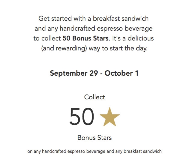
The typography is beautiful and clean – not at all representative of what you traditionally see in even good email newsletters. Their designers are experienced, and this shows in their expert use of space and sizing to maximize the effect of email copy.
But there’s more! If we look under the hood, we can see they’ve used some light HTML to make their text look as good as possible. In particular, they’ve specified a specific font face that’s on-brand, and included fallbacks so you really only see Helvetica or Arial if none of the first-choice fonts are somewhere on your computer.
On top of this, they’ve picked a nice shade of grey for their text. Though it might not seem like a big departure from standard black, grey text is much softer on the eyes.

If you’re looking to do these things, I’m including the HTML below. I will mention, however, that you’re best off picking relatively common fonts (like Starbucks did) – otherwise, your viewers will likely end up seeing Helvetica after all.
<div style="font-family:Avenir,'Roboto',Helvetica,Arial,sans-serif;font-size:22px;line-height:33px;”> Your text goes here</div>
Just change the fonts, color, font size, and line height as necessary (though I’ve given you a pretty good starting point).
Spectacular Images
Probably the most noticeable feature of a Starbucks email is the fantastic imagery. Every email features at least one beautiful photo of a Starbucks product.
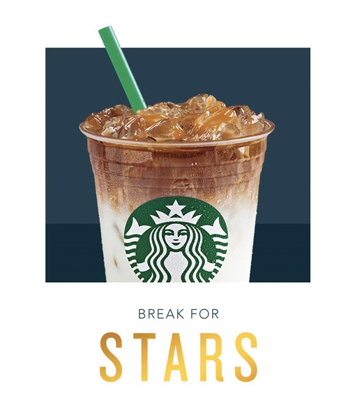
On the surface, there’s not much to dissect here – images are great, eye-catching (in Starbucks’ case, mouth-watering) and help to provide context to the rest of the email.
However, there’s a special quality about Starbucks images that serve to elevate them, making them just that little bit more engaging. Let’s peer into the pastry case…
Professional Photography
If you’re a company like Starbucks, you definitely have the resources to put together a professional photo shoot whenever you want. All of Starbucks’ images are beautifully laid out, amazingly lit, and brilliantly shot.
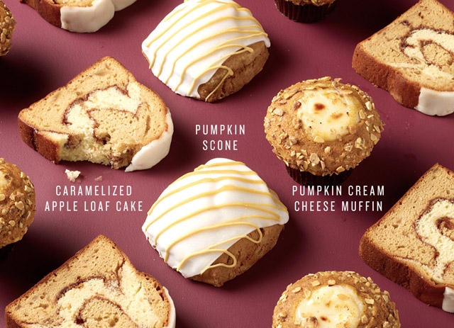
Though you might not have the resources to take amazing photos whenever you want, invest some time (and maybe some money) into putting together an extensive photo shoot featuring all of your products in multiple angles and settings.
Having a library of material to pull from whenever you need an image for your email is incredibly handy, and having a single large product shoot (as opposed to multiple smaller ones) can help keep costs low. In most cases, even photos taken with a newer smartphone can pass for professional (just set them up well).
Added Typography
Starbucks always starts the body of their emails off with an image. And nearly every single time, they actually put their headline in the hero image itself.
This does multiple things. First, it lets Starbucks have complete control over the positioning of the text and allows them to do more creative things with placement, as you can see in the example below.
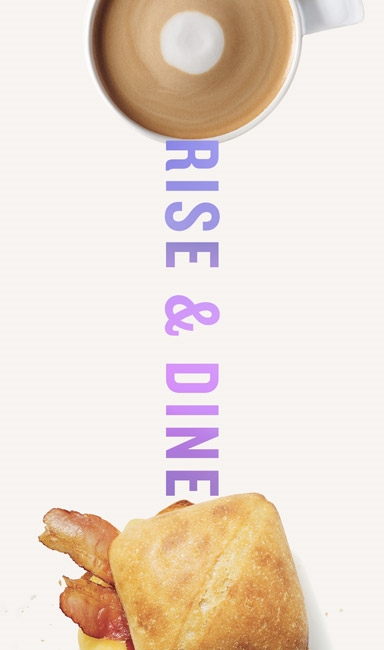
Plus, it gives them the ability to go crazy with typography. Though body copy should remain relatively simple stylistically, hero or headline text is your business’ opportunity to go a bit crazy. Check out these amazingly creative examples:
You can use Photoshop or a more noob-friendly tool like Canva to add some text to your image. Make it big and bold, and don’t be afraid to get creative.
Animations
Finally, Starbucks occasionally adds a GIF into their emails, adding an animated component to an often-static medium. They use it in a few different ways, most recently to show off the different variations of their Christmas cups:
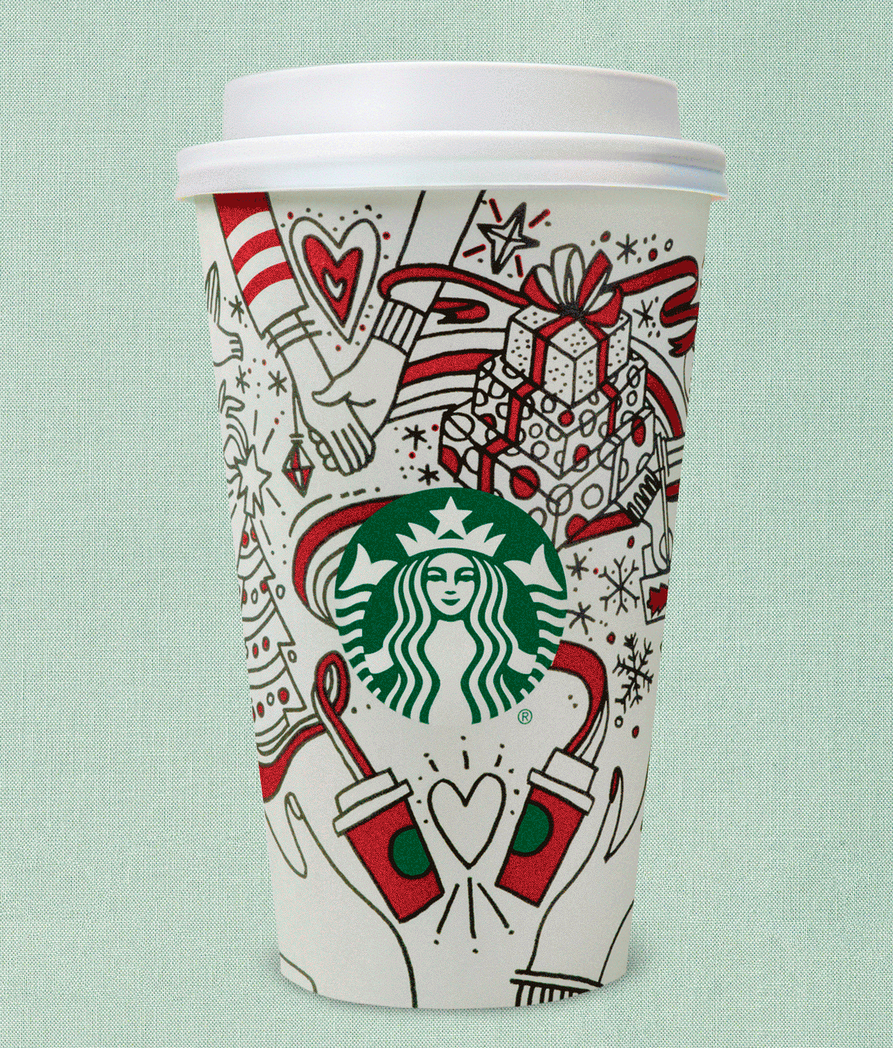
Again, you can use Photoshop to put together a simple GIF. Don’t make it too complicated or animated, as this will send your file size through the roof.
Engaging Layouts
Last on our list of design do’s is an engaging layout. Starbucks’ particular attention to typography and their rather strict aversion to overwhelming amounts of copy means they’ve got a lot of room to play with when it comes to layout.
Emails often aren’t very flexible, even when you use a WYSIWYG editor. Starbucks works around this by using images abundantly, allowing them to arrange things exactly the way they want. Check out this email excerpt:
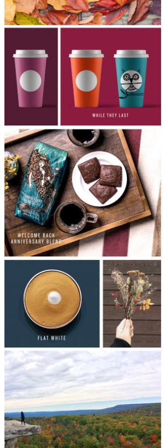
In the email above, each row of content (including text) is simply an image, which allows Starbucks to get more creative with a medium that isn’t usually very customizable.
You can do this yourself by using a tool like Photoshop to build your entire email. Export it in full-width rows based on your desired layout and content within the email.
This is a great strategy, but remember an all-image email will take a bit of a toll on your readers’ bandwidth, so use text where you can.
Strategic Gamification
This is partially a commentary on Starbucks’ entire mobile strategy, but it’s linked closely enough to their email marketing strategy that I’d like to talk about it.
In case you haven’t used the Starbucks app, I’ll try explain how it works. Every purchase you make with the Starbucks app counts for a certain number of stars and every 125 stars earned gets you one free food or drink item.
Spending 5 dollars a day on your quad venti soy half-sweet no-whip extra foam mocha can add up, so it’s always nice to get a freebie every so often. Starbucks knows that too, which is why they put a lot of focus on earning bonus stars in their email marketing.
Here’s an example of an email promoting a new product:
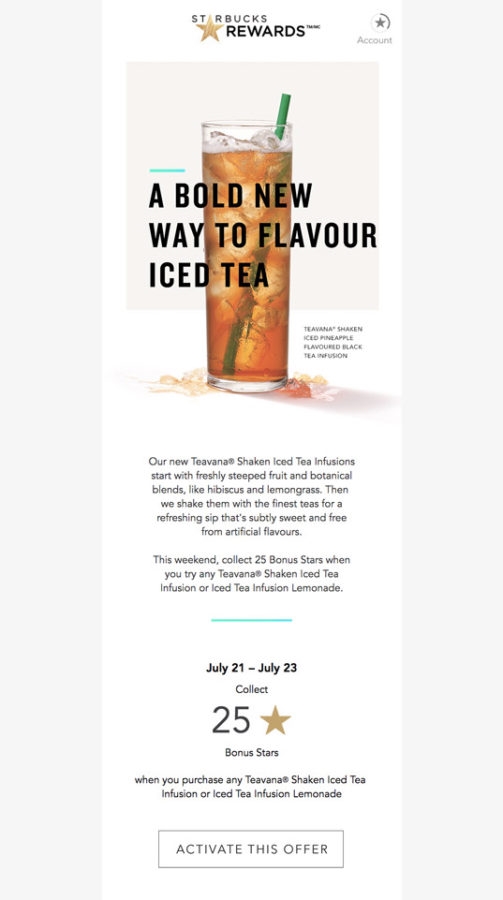
As you can see, the body of the email revolves entirely around earning extra stars. It’s a clear call to action – buy these items, earn these stars.
This is brilliant.
Most companies make use of special discounts or limited-use coupons to drive sales, but Starbucks knows they’ll actually make more money overall with Stars. Instead of giving customers a discount right off the bat, they require them to make other purchases first. This ensures sales in exchange for the offer, unlike coupons or other discounts.
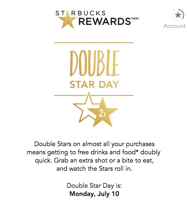
Starbucks also runs other short-term promotions to cater to people who don’t normally go out of their way to earn more stars. For example, they offer bonus stars on certain items, or have Double Star Days, where people can earn more stars based on their purchases. Doing this keeps the “game” more exciting, leading to more sales.
You can do this for your business with a customer loyalty app (TapMango and Kangaroo Rewards come to mind), or even build a simple customer loyalty program using your marketing automation platform, sending specific rewards based on purchase volume, frequency, etc.
Themed Promotions
One strategy that’s been talked about time and time again by digital marketing gurus (including all of us here on the Wishpond blog) is to capitalize on holidays and seasons to give your marketing promotions a more cohesive theme.
Starbucks makes sure to take this strategy to the extreme. Because even their products change from season to season, it’s easy for Starbucks to put together promotions that fit the time of year.
To take advantage of the Halloween season, Starbucks released a special Zombie Frappuccino – a sweet, blended beverage modeled after our favorite undead creature.
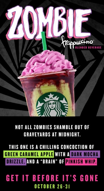
To promote it to their email subscribers, they put together an amazing email. In this case, the email’s design was a departure from the usual. Though it’s important to be on brand, use special occasions like Halloween or the holiday season to get creative with your visual design.
The body of the email is great as well, highlighting the product’s key features (with some creative visual cues) in a clever, thematically-relevant manner.
Best of all? The promotion was available for a limited time, which served to create urgency and push more subscribers to try it out.
Consider capitalizing on specific events or times of year when putting together your marketing campaigns. You might want to run a Christmas-themed giveaway for the holiday season, or celebrate the Super Bowl with a promotion.
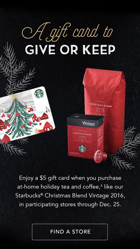
These kinds of promotions work well because they’re topical – there’s a certain friction that’s eliminated when you show potential customers the things that are already on their mind.
Subject Lines, Subject Lines, Subject Lines
Subject lines are at least as important as the body of your email and the offer or ask within it.
This might be a weird notion if you’re new to email marketing and when you consider the relative size of a subject line compared to the email itself. Nonetheless, the subject line is probably 90% of a subscriber’s decision-making process when it comes to deciding whether or not to open an email – and your open rate is huge when it comes to the conversion rate of your entire email marketing funnel.
It follows, then, that Starbucks’ expert email marketing team also knocks it out of the park pretty much every time with their subject lines. There’s a couple of things they do to make their subject lines especially prone to high open rates.
Let’s take a closer look.
Length
Here’s a screenshot I took of all the Starbucks emails in my inbox.
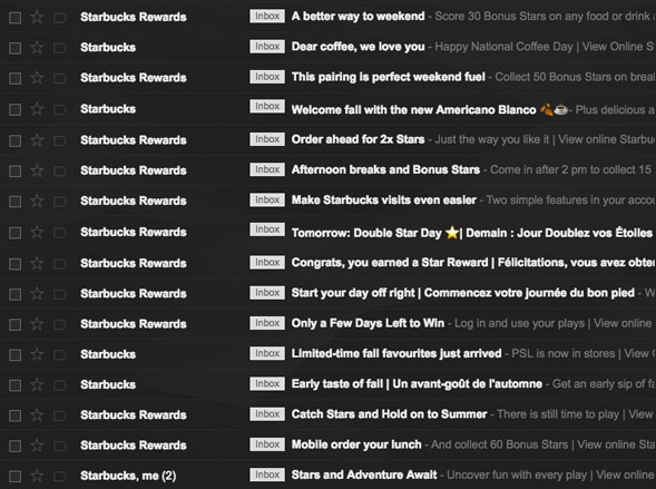
Notice a trend? All of these subject lines (with the exception of those with French, because Canada) are incredibly short, which serves two distinct purposes.
First, they’re easy to digest. Though a detailed subject line might look great in theory, once it’s just 1 of 100 unopened emails, many of your subscribers might not even bother reading it.
Second, they’re designed for mobile. Litmus found that 53% of emails were opened on mobile. And that was three years ago – I’m willing to bet the number is much, much higher now. Having short subject lines means subscribers can see the whole thing within a push notification, without needing to click.
Keep your subject lines short where possible – it’s also a great exercise in making sure they say only what they need to. Keep in mind this doesn’t mean they need to be void of personality – Starbucks knows when to be more playful with their subject lines.
Conveying value
Starbucks also does an excellent job using subject lines to communicate the value of the offer within. Here’s a few examples:
- Tomorrow: Double Star Day
- Order ahead for 2x Stars
- Pick up lunch for $ 5
In each of these subject lines, the message is clear.
Keeping the value clear in your subject lines lets your subscribers understand immediately what the email will contain, setting expectations and piquing their interests. For a promotion, your offer is the most important part of your email – why shouldn’t it be in your subject line, too?
Bonus: Post-subject line copy
Here’s a neat little trick Starbucks uses, which helps to provide context while keeping subject lines short and optimized for mobile:
Starbucks puts a short sub-headline at the header of their emails, above the hero image. This subheadline serves to expand on the subject line without adding to its length.
![]()
And here’s how it looks in the email (nice and subtle):

Why not just put this subheadline in the subject line itself? Like I mentioned previously, Starbucks’ email marketing strategy is mobile-centric. A longer subject line might not fit on a smartphone display, whereas body copy tends to show up underneath the subject line.
This way, the notification displays the subject line and subheadline as intended. Pretty cool.
Personalized marketing
This is the final piece of the email marketing puzzle, and it’s a huge part of Starbucks’ strategy.
Having your subscribers’ email addresses gives you the unique ability to track their activity and personalize your marketing to match.
Starbucks uses their customer loyalty program (which is tied to the Starbucks app and its customers’ Starbucks cards) to gather information about each user’s purchase habits. This information allows them to send users personalized offers.
Let’s take a look at a specific example. I visit Starbucks one or two times a week, but I tend to purchase only a few staple items. Most of the time, I’ll order an iced Americano or a turkey-bacon breakfast sandwich.
Imagine my surprise when I got this email:
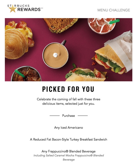
Starbucks used my purchase data to put together a specialized promotion just for me, offering 125 bonus stars to me if I were to buy the items listed in the email. You’ll notice two out of the three items were my regular buys, making this “Star Dash” seem pretty simple to complete.
Smartly, Starbucks tends to make the third item in these dashes a Frappuccino, which is a pricier product. This helps drive sales on products with higher markups.
Starbucks also uses urgency in these dashes – this one below offers bonus stars if I purchase my favorite items several times over a few days. This promotion serves a different purpose: increasing my purchasing frequency.
To me, this is a prime use of marketing automation, and just a glimpse into the power it can bring to your business.
Try using marketing automation to personalize your own marketing. It doesn’t even need to be as targeted as the examples above – just using it to segment your customers based on pages they’ve visited or products they’ve purchased can help you create marketing campaigns that are more specific to subsets of your target market.
Personalized email marketing campaigns are powerful in their ability to be more relevant to the people who see them, which is sure to increase your conversion rate.
Conclusion
Whew! I know that might be a lot to take in, but trust me – there’s a lot to learn from Starbucks’ email marketing strategy. Whether that’s honing in on effective subject lines or using marketing automation to power up your email strategy, there’s definitely things you can take away to use for your own business.
Any questions? Let me know in the comments below!
Digital & Social Articles on Business 2 Community
(89)
Report Post
