 Intuitive, conversion-optimized navigation is the cornerstone of great website design and development. In an increasingly competitive business landscape, user-friendly aspects of a website are no longer optional. They’re a must. If you don’t invest in an engaging website layout and navigation structure, you risk losing ground to more forward-thinking competitors – and hamstringing your lead generation, conversion optimization, and revenue-growth operations.
Fortunately, better website performance and conversion metrics are within your grasp. If you’re eager to learn how to improve your website’s navigation, follow these nine website navigation tips.
1. Avoid Data-Hungry Website Features
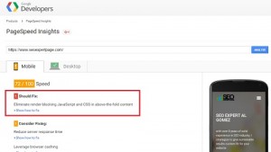
Although the vast majority of desktop and mobile users now have access to broadband Internet, data-hungry website features can still negatively impact the user experience. Large videos, infographics, Flash components, and animations take much longer to load than simple graphics and text. This makes it more difficult for search engine robots to crawl the site, potentially affecting the quality of its on-page SEO and overall search rankings.
Slow-loading website features also hamper navigation by increasing the time it takes for a new page to fully load. Visitors hate waiting for features to load and may navigate away from loading processes that drag on for too long.
2. Use Logical Nav Bars and Site Layouts
An onsite nav bar is a critical website navigation feature. Make sure the buttons in your top or bottom-page nav bar are logical and well-ordered. For instance, the “Company,” About” and “Products” buttons should precede the “Contact Us” button, which denotes a lead generation opportunity that the typical visitor is likely to explore after conducting on-site research.
Your website should also have an intuitive layout that includes pages that convey the necessary information without conflating key issues. The overarching structure should involve a handful of main pages, top-level subject pages, and additional subpages as necessary. This layout lessens friction for search engine robots and makes for a more logical user experience.
3. Invest in Mobile-Friendly Responsive Design
Mobile-responsive design is no longer the wave of the future: It’s now the de facto website layout and navigation approach. This is largely due to a recent Google algorithm change that penalizes sites without certain mobile-friendly features. If you haven’t yet redesigned your website to be easy and engaging to navigate on a mobile device, put the project on your company’s front burner.
4. Avoid the Back Button Like the Plague
While it’s always nice for a website’s visitors to have the option of using their browser’s “back” button to navigate through the site, it’s not appropriate to require them to do so. If your website navigation absolutely requires the use of the back button to move away from important site pages, implement an alternative design strategy as soon as possible. In many cases, the fix is as simple as installing a standardized, 100 percent functional nav bar on all site pages and subpages.
5. Limit the Number of Direct Navigation Links
You’ve probably been to a website with a nav bar that resembles a laundry list with 10 or more discrete items. This is a tempting and all-too-common mistake that confuses users, hampers logical navigation, impedes visitor flow, and ultimately reduces conversion rates.
Only include the most important or most heavily trafficked pages in your permanent nav bar links. For less mission-critical links, opt for dropdown menus or other navigation structures instead.
6. Fix Broken Links
Broken links are the bane of website owners’ – and website visitors’ – existence. Moreover, broken links can impact on-page and off-page SEO. Regularly check all links on your site, and replace any that don’t appear to work any longer. It’s easy to run such checks without actually clicking each link by hand, so the benefit relative to the amount of time necessary to complete the job is substantial.
7. Listen to What Visitor Flow Patterns Are Telling You
As the old saying goes, you can’t manage what you don’t measure. In addition to other Web traffic metrics available through Google Analytics, website flow patterns provide great insight into what your visitors are doing with your website.
Website flow patterns illuminate the initial route a visitor takes to find your domain, the number of pages they engage with on your site, and the order in which they engage. Using this information, it’s easy to make tweaks to your navigation structure to subtly influence visitor behavior and boost conversions.
8. Embrace Social Sharing Buttons and Practices
The social sharing buttons at the top or bottom of your competitors’ websites aren’t just there for show. They’re critical promotional and advertorial tools that cost virtually nothing but your time to implement and boost low cost-per-lead numbers. Include social sharing buttons on every appropriate website page, ensuring that visitors like, tweet, and share even the most innocuous website content.
Learn More About How to Improve Your Website Overall
If you’d like to learn more about improving your website’s navigation and other best practices that can dramatically improve your website’s performance and user friendliness, download the free whitepaper “10 Key Steps for a Successful Website Redesign.”
Reading and applying the principles outlined in the whitepaper will boost your search rank, enhance your lead generation operation, and increase your conversion rate.
Digital & Social Articles on Business 2 Community
(130)


