— April 26, 2019
Your website design is more important for conversions than you think. You can implement every conversion-boosting tactic in the world, but if your web design looks like crap, it won’t do you much good.
Design is not just something designers do. Design is marketing. Design is your product and how it works. The more I’ve learned about the principles of web design, the better results I’ve gotten.
Here are 8 effective web design principles you should know and follow.
1. Visual Hierarchy
Squeaky wheels get the grease, and prominent visuals get the attention. Visual hierarchy is one of the most important principles behind good web design. It’s the order in which the human eye perceives what it sees.
Exercise. Please rank the circles in the order of importance:
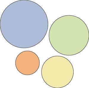
Without knowing anything about these circles, you were able to rank them
easily. That’s a visual hierarchy.
Certain parts of your website are more important than others (forms, calls to action, value proposition, etc.), and you want those to get more attention than the less important parts.
If you website menu has 10 items, are all of them equally important? Where do you want the user to click? Make important links more prominent.
Hierarchy doesn’t come only from size. Amazon makes the “Add to Cart” and “Buy Now” call-to-action buttons more prominent by using color:
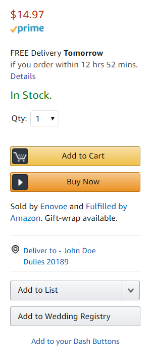
Which buttons catch your eye? Color can help elements of a web page stand out.
Start with the business objective
You should rank elements on your website based on your business objective. If you don’t have a specific goal, you won’t know what to prioritize.
Here’s an example. It’s a screenshot I took from the Williams-Sonoma website. They want to sell outdoor cookware.
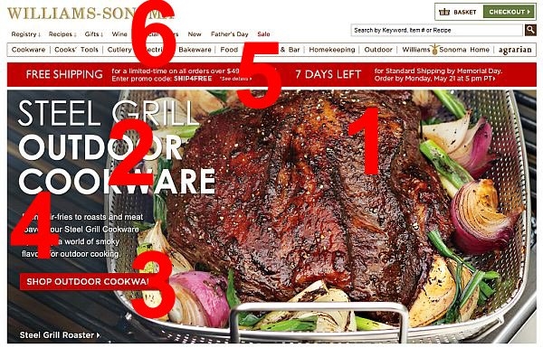
Visual hierarchy is essential to effective web design.
The biggest eye-catcher is the huge piece of meat (make me want it), followed by the headline (say what it is), and a call to action (get it). Fourth place goes to a paragraph of text under the headline; the fifth is the free shipping banner, and the top navigation is last.
This is visual hierarchy—a timeless principle of web design—well done.
Exercise. Surf the web and consciously rank the elements in the visual hierarchy. Then go look at your site. Is something important (i.e. key information that visitors seek) too far down in the hierarchy? Make it more prominent.
2. Divine Proportions
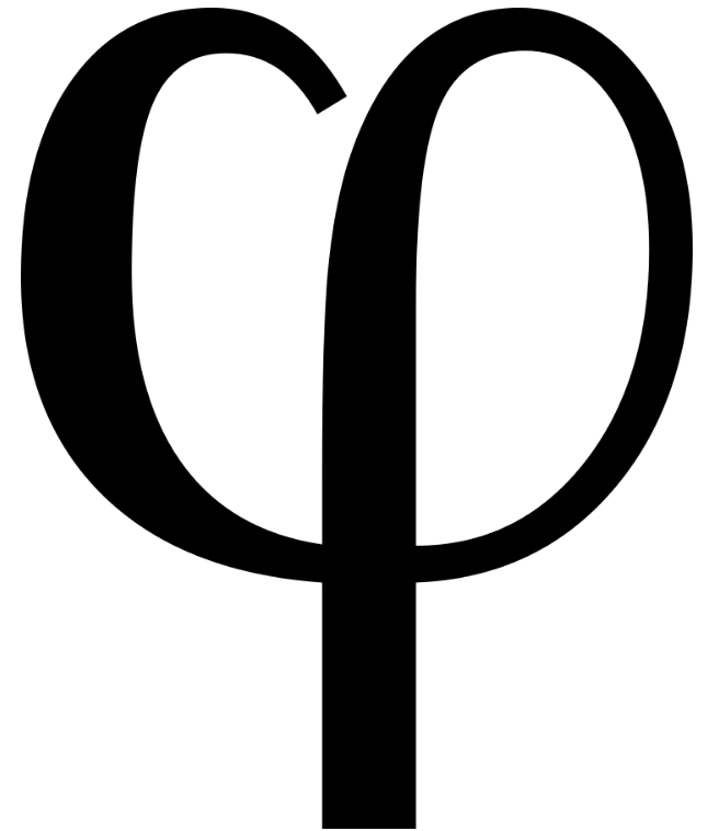
The lower-case Greek letter phi is used for the Golden Ratio.
The Golden Ratio is the magical number 1.618 (f). Designs that use proportions defined by the golden ratio are, it’s believed, aesthetically pleasing.
Then, there’s the Fibonacci sequence. Each term is the sum of the two previous terms: 0, 1, 1, 2, 3, 5, 8, 13, 21, and so on. The interesting thing is the two seemingly unrelated topics produce the same exact number.
Here’s what the Golden Ratio looks like:

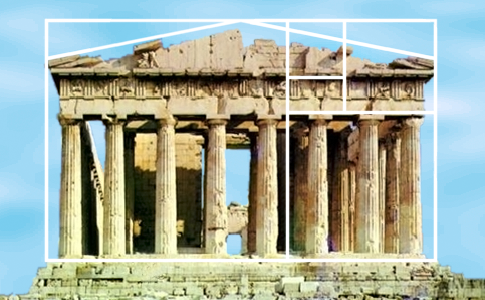
Many artists and architects use proportions to approximate the Golden Ratio. A famous example is the Parthenon, built in Ancient Greece:
Can the Golden Ratio work for web design? You bet. Here’s Twitter:
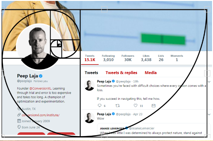
Here’s a comment, from years ago, by Twitter’s creative director, Doug Bowman. The design choice wasn’t accidental:
To anyone curious about #NewTwitter column proportions, know that we didn’t leave those ratios to chance. http://flic.kr/p/8ETYM7
— Doug Bowman (@stop) September 28, 2010
So, if your layout width is 960px, divide it by 1.618 (=593px). You know that the width of the content area should be 593px and the sidebar 367px. If the website height is 760px tall, you can split it into 470px and 290px chunks (760/1.618=~470).
If you want to learn more, check out this article on how to apply the Golden Ratio to typography.
3. Hick’s Law
Hick’s Law says that with every additional choice increases the time required to take a decision.
You’ve experienced this countless times at restaurants. Menus with huge options make it difficult to choose your dinner. If it offered two options, making a decision would take much less time. This is similar to the Paradox of Choice—the more choices you give, the easier it is to choose nothing. Both principles come into play with web design.
The more options a user has on your website, the more difficult it is to use (if it’s used at all). We need to eliminate choices. To make a better web design, focus on eliminating distracting options throughout the design process.
In an era of infinite choice, people need better filters! If you sell a huge number of products, add better filters for easier decision-making. Wine Library sells a huge amount of wine.
They do a good job with the filters (on the left):
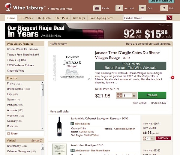
Good web design offers clear filters to help reduce choices, which makes it easier for users to decide.
4. Fitt’s Law
Fitt’s law stipulates that the time required to move to a target area (e.g. click a button) is a function of the distance to the target and the size of the target. In other words, the bigger an object and the closer it is, the easier it is to use.
Spotify makes it easier to hit “Play” than other buttons:
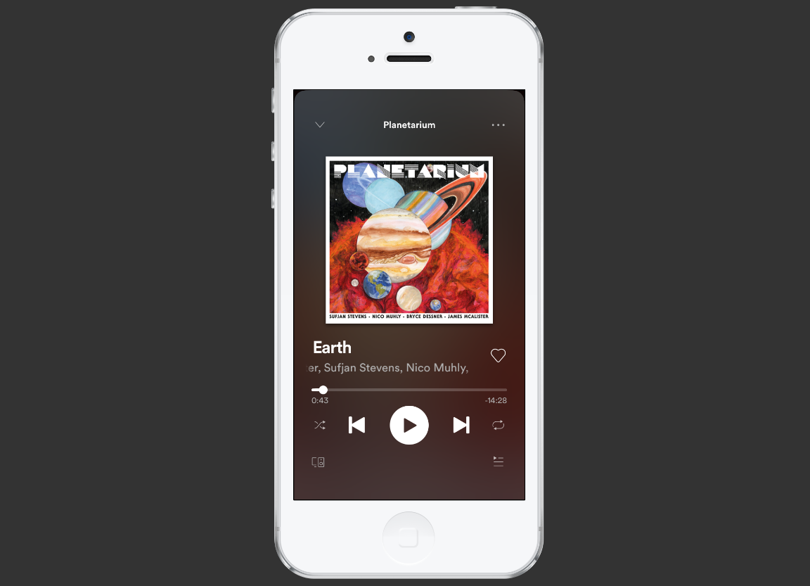
On the mobile phone app, they also place the play button in an easy-to-tap location.
Bigger isn’t always better. A button that takes up half the screen isn’t a good idea, and we don’t need a mathematical study to tell us. Even so, Fitt’s Law is a binary logarithm. This means that the predicted results of the usability of an object run along a curve, not a straight line.
A tiny button is much easier to click when given a 20% size increase, whereas a very large object, given the same 20% boost in size, won’t deliver the same benefits in usability.
This is similar to the rule of target size. The size of a button should be proportional to its expected frequency of use. You can use mouse tracking to see which buttons people use the most, then make popular buttons bigger (easier to hit).
Let’s imagine there’s a form you want people to fill. At the end of the form, there are two buttons: “Submit” and “Reset” (clear fields).

99.9999% want to hit “Submit.” Hence, the button should be much bigger than ‘reset’.
5. Rule of Thirds
It’s a good idea to use images in your design. A visual communicates your ideas much faster than text.
The best images follow the rule of thirds: An image should be divided into nine equal parts by two equally spaced horizontal lines and two equally spaced vertical lines. Important compositional elements should be placed along these lines or at their intersections.
Below, see how the image on the right is more interesting? That’s rule of thirds in action.
 The rule of thirds is a simple design principle to follow for images.the (Image source)
Using beautiful, big images contributes to good web design. If your images are more interesting, your website will be more appealing.
6. Gestalt Design Laws
Gestalt psychology is a theory of the mind and brain. Its principle is that the human eye sees objects in their entirety before perceiving their individual parts.
Here’s what I mean:
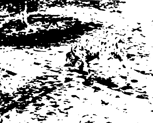
Notice how you could see the dog without focusing on each black spot that the dog consists of? A founder of gestaltism, Kurt Koffka, explained it this way: “the whole exists independently from the parts.”
As it relates to web design, people see the whole of your website first—before they distinguish the header, menu, footer, and so on.
There are eight so-called gestalt design laws that allow us to predict how people will perceive something. Here’s how each relates to web design:
1. Law of Proximity
People group things together that are close together in space. They become a single perceived object.
For effective web design, make sure that things that do not go together are not perceived as one. Similarly, you group related design elements together (navigation menu, footer, etc.) to communicate that they form a whole.
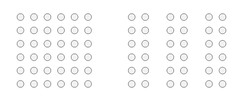
The Law of Proximity shows how the mind naturally groups (or separates) items based on their distance from one another.
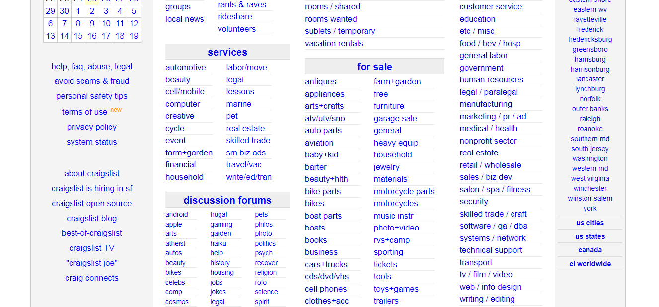
Craigslist uses this law to make it easy to understand which sub-categories fall under “for sale”:
2. Law of Similarity
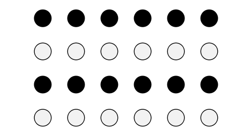
We group similar things together. This similarity can occur in the form of shape, color, shading, or other qualities.
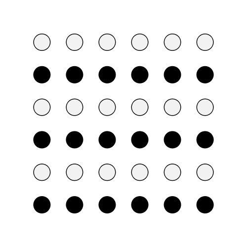
Here we group black dots into one group and whites into another one, because, well, dots of the same color look similar to one another.
What’s this look like when applied to web design? Codeschool (now part of Pluralsight) makes all their testimonial boxes similar, so we see the testimonials as a single group:

3. Law of Closure
We seek completeness. When shapes that aren’t closed or parts of a picture are missing, our perception fills in the visual gap. We see a circle and a square even though neither shape actually exists in the graphic below.

Without the law of closure, we would just see different lines with different lengths. But the law of closure combines the lines to form whole shapes.
Using the law of closure can make logos or design elements more interesting. A good example is the World Wide Fund For Nature logo, which was designed by Sir Peter Scott in 1961:

4. Law of Symmetry
The mind perceives objects as symmetrical, forming around a center point. It is perceptually pleasing to divide objects into an even number of symmetrical parts.
When we see two symmetrical elements that are unconnected, the mind perceptually connects them to form a coherent shape.
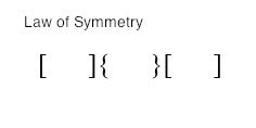
When we look at the image above, we tend to observe three pairs of symmetrical brackets rather than six individual brackets.
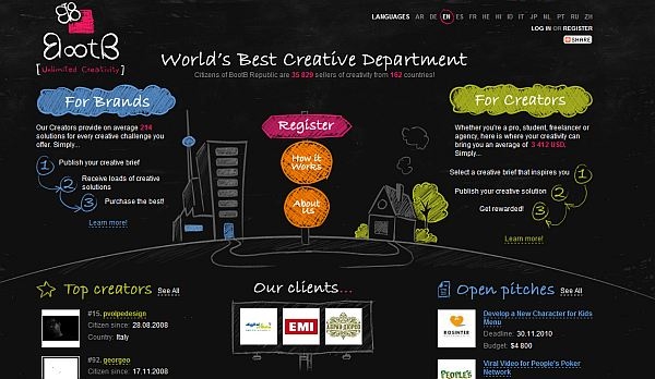
People prefer symmetric appearances over asymmetric ones. Balanced column width and a gentle curve add to the enjoyment of the BootB web design:
5. Law of Common Fate
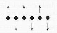
We tend to perceive objects as lines that move along a path. We group together objects that have the same trend of motion and are, therefore, on the same path.
Mentally, people group together sticks or raised hands pointing somewhere because they all point in the same direction. In your site design, you can use this to guide the user’s attention to something (e.g. a sign-up form, value proposition, etc).

For example, if there’s an array of dots, and half the dots move upward while the other half move downward, we perceive the upward-moving dots and downward-moving dots as two distinct units.
6. Law of Continuity
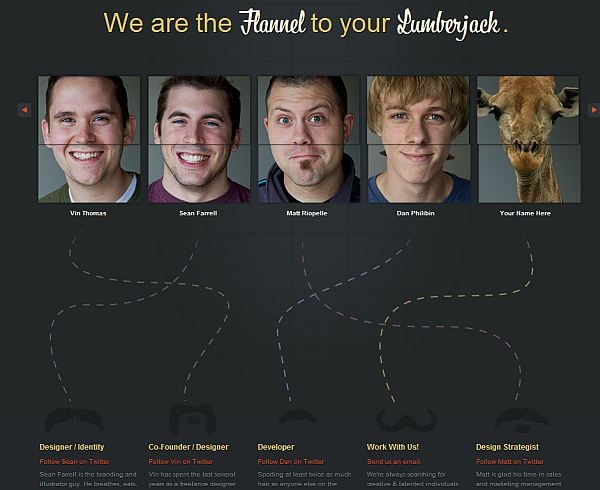
People have a tendency to perceive a line as continuing its established direction. When there’s an intersection between objects (e.g. lines), we tend to perceive the two lines as two single, uninterrupted entities. Stimuli remain distinct even with overlap.

Fixel uses this to connect faces to bios:
There are other gestalt laws, too, such as Figure and Ground or Law of Good Gestalt. (Objects tend to be grouped together perceptually if they form a pattern that is regular, simple, and orderly—like the Olympic rings.) However, the ones covered above are the best guiding principles for web design.
7. White space and clean design
White space (also called “negative space”) is the portion of a web page that remains “empty.” It’s the space between graphics, margins, gutters, space between columns, space between lines of type, or visuals.
It’s not just “blank” space—it’s an important element of web design. It enables objects within it to exist. White space is all about the use of hierarchy for information, typography, color, or images.
A page without white space, crammed full of text or graphics, risks appearing busy or cluttered. Typically, it’s difficult to read. (People won’t even bother.) This is why simple websites are scientifically better.
The right amount of white space makes a website look “clean.” While a clean design is crucial to communicate a clear message, it doesn’t just mean less content.
A clean design makes the best use of the space it’s in. To create a clean site design, you need to know how to communicate clearly by using white space wisely. Made.com uses white space well:
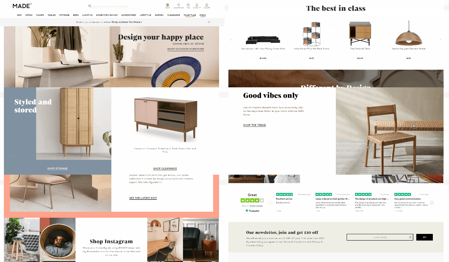
The fine use of white space makes it easy to focus on the main message and visuals, and the body copy is easy to read. In general, white space promotes elegance and sophistication, improves legibility and drives focus.
Read more about white space and simplicity.
8. Occam’s Razor
When given several competing hypothesis, Occam’s razor urges you to choose the one that makes the fewest assumptions and, thereby, offers the simplest explanation. To put it in the context of web design, Occam’s Razor argues that the simplest solution is usually best.
In a post about their Angelpad experience, Pipedrive’s team writes:
The Angelpad team and mentors challenged us in many ways. “You have too many things on your home page” was something we didn’t agree with at first, but we’re happy to test. And it turned out we had been wrong indeed. We removed 80% of the content, and left one sign-up button and one Learn More link on the home page. Conversion to sign up increased by 300%.
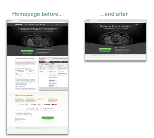
It’s not just about the looks, but also about how it works. Some companies—like 37Signals—have turned “simple” into a business model. Here’s a quote from the book Rework, written by founders Jason Fried:
Lots of people hate us because our products do less than the competition. They’re insulted when we refuse to include their pet feature. But we’re just as proud of what our products don’t do as we are of what they do. We design them to be simple because we believe most software is too complex: too many features, too many buttons, too much confusion.
Simple, minimalist design does not guarantee that the design will work. But, in my experience, simple is always better than the opposite—and, hence, we should strive to simplify our web designs.
Conclusion
Effective web design and art are not the same. But many psychological and design principles apply to websites. You can design a great website by applying the relevant aspects of those laws to your layout, typography, and images.
Design for the user and your business objectives. Good web design can deliver aesthetically pleasing and financially rewarding results.
Digital & Social Articles on Business 2 Community
(40)
