— September 22, 2017
For eCommerce store owners, your product page deserves a lot of your attention. There are so many elements to consider, but also lots of opportunities to create a great shopping experience for your customers.
In this article, we are going to look at some of the areas you can focus on to really optimize your eCommerce product pages for higher conversions, a better shopping experience and turn your browsers into buyers.
1. Map out the Elements of your Product Page
The first step in designing an eCommerce page optimized for conversions is to incorporate the elements that are commonly used in successful eCommerce pages.
Looking at a popular store like Asos as an example, we can identify some of the important factors that they have found worked well on their product page.
With product pages having such a significant impact on conversions, you can be sure Asos will be dedicating resources to test and optimize each and every component.
This attention to detail is evident if we look at how a typical product page loads in slow-motion – capped at 250kb/s (or a regular 3g connection). The order of how each component loads gives us some indication of how important each component is.

Source: Asos
The loading order of the elements goes:
- Navigation and logo. The user should always know where they are and have a way to navigate to other pages quickly.
- Product thumbnails. Images convey that the user is on the right page and gives them a preview of the page before it has fully loaded.
- Product title and breadcrumbs. Further confirm the user’s choice and give them a quick option to navigate back to a similar category
- Main product image. The product photo is what the customer is looking for. Notice that these load even before the call to action, despite images typically being a larger file size.
- Call to action. The add to cart button
- Extra information. Further product information that lies below the fold is loaded last.
Let’s break down some of the components of the Asos product page further.
2. Highlight your Product Photos Front and Center
Asos is a content-heavy site that uses photography in a variety of ways. When you’re on the homepage, you won’t see photos linking to any specific products, but rather to collections.
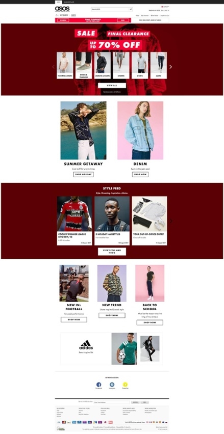
Source: Asos
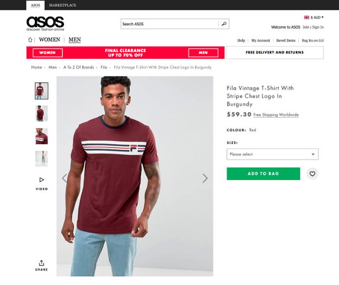
But when a customer clicks through to a product, it’s a different story. The first thing they see is a product image front-and-center. What little content remains above the fold is all aligned around this main photo gallery.
Source: Asos
We’ll talk more about the importance of the variety of different photos that Asos uses, but the positioning and prominence are what’s important now. Product photos help customers immediately discern details about a product faster than any description and help them find the product they are looking for quicker. They need to be placed prominently and loaded quickly.
3. Display Shipping Information Clearly.
Not only do Asos have a free delivery and returns banner, they also link to their free worldwide shipping details next to the price.
High shipping costs are rated as the number one reason consumers abandon their cart, and 93% of consumers state they would purchase more products if free shipping were available. Knowing this, Asos does everything it can to promote its free shipping offer.
4. Include Extra Details
While the Asos product page might have sparse information above the fold, a trove of extra information about the product is readily available for the customer who is interested in learning more.
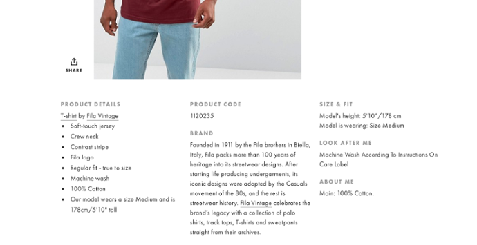
Source: Asos
Because customers cannot physically try on the product or ask questions to a salesperson, you have to do everything you can to help educate them and provide answers to the questions they may have.
What kind of details should you include?
This information can include details like:
- The material of the product
- The style
- Significant design features
- Care and maintenance instructions
- Information about the brand or manufacturer
- Meta information such as SKU’s that can help the customer conduct further research or contact you.
For fashion brands, these extra details can be especially important. Asos also includes the measurements of the model and what size they are wearing so the customer can more accurately gauge how this product will suit them.
Why is this extra information so important?
For one, having unique product descriptions can be a great way to boost your organic search engine traffic. But they should also help answer the question of why a customer should choose your products or store over a competing one. Providing these extra details shows that you have a greater level of expertise on the product than simply listing the basic details discernible from a product photo.
More information also means a customer can make an informed choice independently, and this isn’t just good for them. Helping the customer to make a purchase they are confident in can help lead to lower customer support and fewer returns.
5. Feature a Clear Call to Action
Another feature design feature of the Asos website is the clear call to action available on the product pages.
There is no convoluted ordering process involved. In fact, all of the information the customer needs is conveyed in the product photos, title and description. The customer simply has to select their size and click the prominent Add to Cart button. Upon doing so, they are met with an unobtrusive popup that confirms their selection. This popup allows them to either complete their checkout quicker or continue shopping, before fading away after a few seconds.
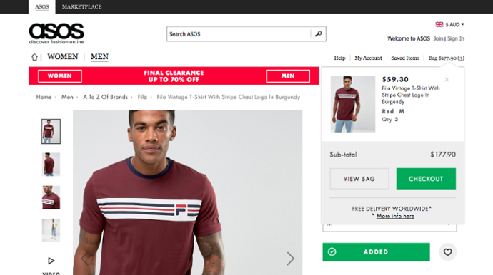
Source: Asos
Many stores opt towards one form of notice or the other, either redirecting them to the cart or showing a pop-up cart as soon as an item has been added, or, alternatively, taking no option at all and leaving it to the customer to navigate to the checkout. This approach seems to be a good middle ground.
If the customer is not ready to purchase, Asos has also included an easy way for customers to favorite the item. Most stores now have some kind of wish list feature, but what’s great about Asos’s execution is the fact that the user doesn’t need to create an account for the item to still be saved for 60 days in their browser cache.
However, clicking the button still sends a request back to Asos, so they know details like the type of user who is saving the item, what item is being saved and when it was saved – all of the fantastic information they can use to retarget the customer on social media.
6. Use a White Background on your Product Images
At Pixc, over 90% of our clients choose to have their photos edited to remove the background from their images and replace it with white. And it’s not just us. Having a white (or at least consistent) background for all of your product images has become standard for any successful eCommerce store.
So why is it so important?
It saves you money
Keeping a consistent background speeds up the process of bringing in new products, photographing and editing. Stores like Asos can afford to have a studio, photographer and editor on-hand to ensure consistent layout and lighting across their products, but even for large eCommerce stores utilizing a white background can save a lot of time.
Instead of having an in house team, you can simply photograph your products and edit them for consistency. Or better yet, send them to a service like Pixc to automate your process even further.
It emphasizes your product better
Without a background, there are no distractions to take away from the product itself. A white background allows you to better showcase the finer details of the product and specific features that may otherwise go unnoticed.
It helps customers browse your products
When product photos are all similar, a customer can easily scan through your collection pages and pick out the product they are looking for.
7. Incorporate a Good Mix of Photography
Increase the number of photos you’re showing
With your product photography being so important, it’s important to include a variety of different shots of your product. One extra photo can convey more information than any description.
Only 0.52% of consumers want to see a single photo, while 33.16% prefer to see multiple photos and 58.03% want to see product photos that show the product in full 360º.
What this means is you need to include a mix of product photos to showcase every angle of the product, and utilize a variety of photography to emphasize the key points of the product. For example, for products like shoes, use close-ups of the sole and stitching to convey the major selling points of the product.

Source: Sketchers
Consider in-context shots
Context photos showing your product in action can help stir the imagination of the customer. It also gives them a chance to see how it looks outside of a showroom setting.

Source: Burst
8. Optimize your Image Metadata
Too many eCommerce stores are let down by their product images. While platforms like Shopify and BigCommerce are helping to bring compression and proper aspect ratio to the masses, there are a few other good habits you should always maintain.
Include the appropriate meta information
Proper metadata comes down to three things. Make sure your images have:
- Correct ALT tags that accurately describe the image
- Appropriate title tags
- A relevant file name utilizing hyphens (e.g. my-image.jpg)
Meta information is important for accessibility, so keyword stuffing is frowned upon (and also ineffective). But, it does give context to Google, who will use the image metadata, as well as the content around it, to help understand the content on the page.
Ensure your images are an appropriate size
- Make sure they have the same height and width. Generally speaking, square images will display better across all devices. Using rectangular images can also start to look awkward if you have products that are particularly long or wide.
- Ensure they are big enough to enable zoom. Depending on how your eCommerce site is designed, your site will use different sized versions of the same image for thumbnails, collection images, product images and the zoom functionality. You want to ensure that you images are big enough to allow this zoom function to work without being unnecessarily large. Images between 1,000px and 1,600px are typically a good size.
9. Create your own Product Photography Template
With the above tips in mind, one of the easiest ways to ensure your product images are consistent is to use a template. A template allows you to repeatedly align your photos correctly and ensure the layout and dimensions remain the same.
Achieving this in Photoshop is relatively straightforward.
1. Create a new file in Photoshop. Make sure your color mode is set to RGB Color – 8-bit, resolution is at least 72 pixels/inch and background contents are white or transparent.
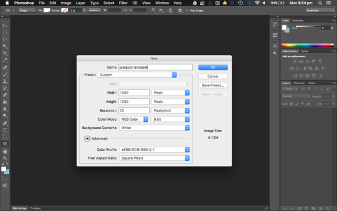
2. Create a new guide. Select “New Guide” from the “View” menu.
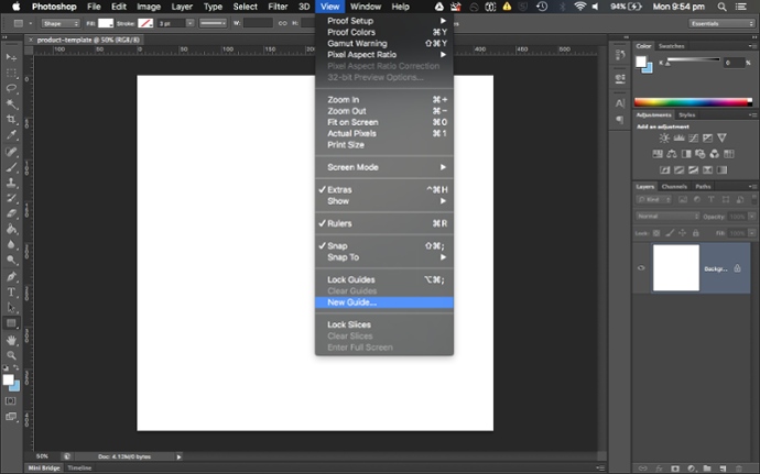
3. Create your margin guides. Create a 10% vertical, 90% vertical, 10% horizontal and 90% horizontal guide. You can also set your own margins.
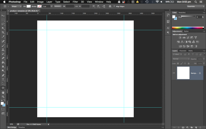
4. Create your centering guides. Create a 50% vertical and 50% horizontal guide.
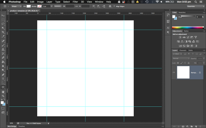
You should end up with this:
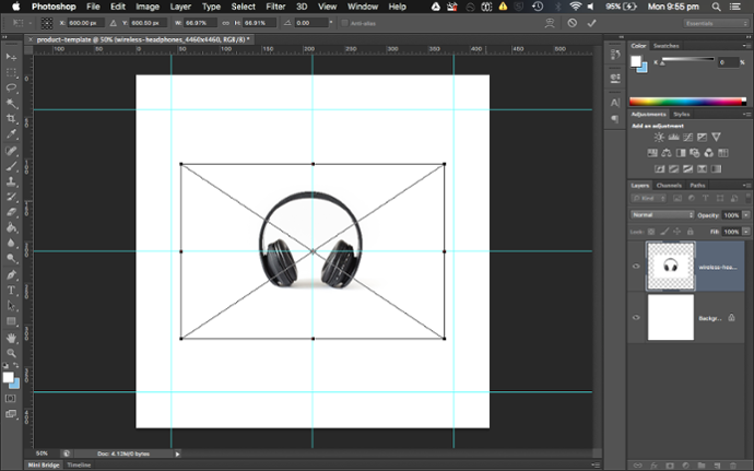
Once you’re done, save your template file as a typical Photoshop document. Your guides will remain available to you next time you open the document.
Having a template allows you to place all of your product images in the exact same position. It also ensures that your images are all scaled correctly and that they are saved with consistent dimensions.
In this guide, we’ve looked at the elements that will contribute to a well-designed product page and some of the steps you can take today to improve the shopping experience for your customers.
With the advice in this guide, you now have actionable suggestions you can implement to start to improve your product page. Now it’s up to you to apply these tips to your own eCommerce store to start driving sales!
Digital & Social Articles on Business 2 Community
(63)
Report Post


