When crafting eCommerce emails for the first time, you’d think that your email’s most important aspect is the products you show off to your email subscribers. That’s true, but it only accounts for 30% of the email’s success. The rest is science: the subject line, layout, the copy, the use of color, and click-through and conversion rates.
This article will cover the latter, for subject lines, which are your email’s first and last impressions to get people to open your beautifully and skillfully crafted email. If you need help with crafting your eCommerce email subject lines, you can check out 5 Guaranteed Ways to Craft the Best Email Subject Lines for Sales.
Today I’m going to break down the best 14 eCommerce email examples that you should have on your radar. I’ll also be breaking down each email with actionable tips to boost sales so you can not only see but implement these strategies and tactics for your own eCommerce business.
1. Ecommerce Email Examples: David’s Tea
Ecommerce Email Overview
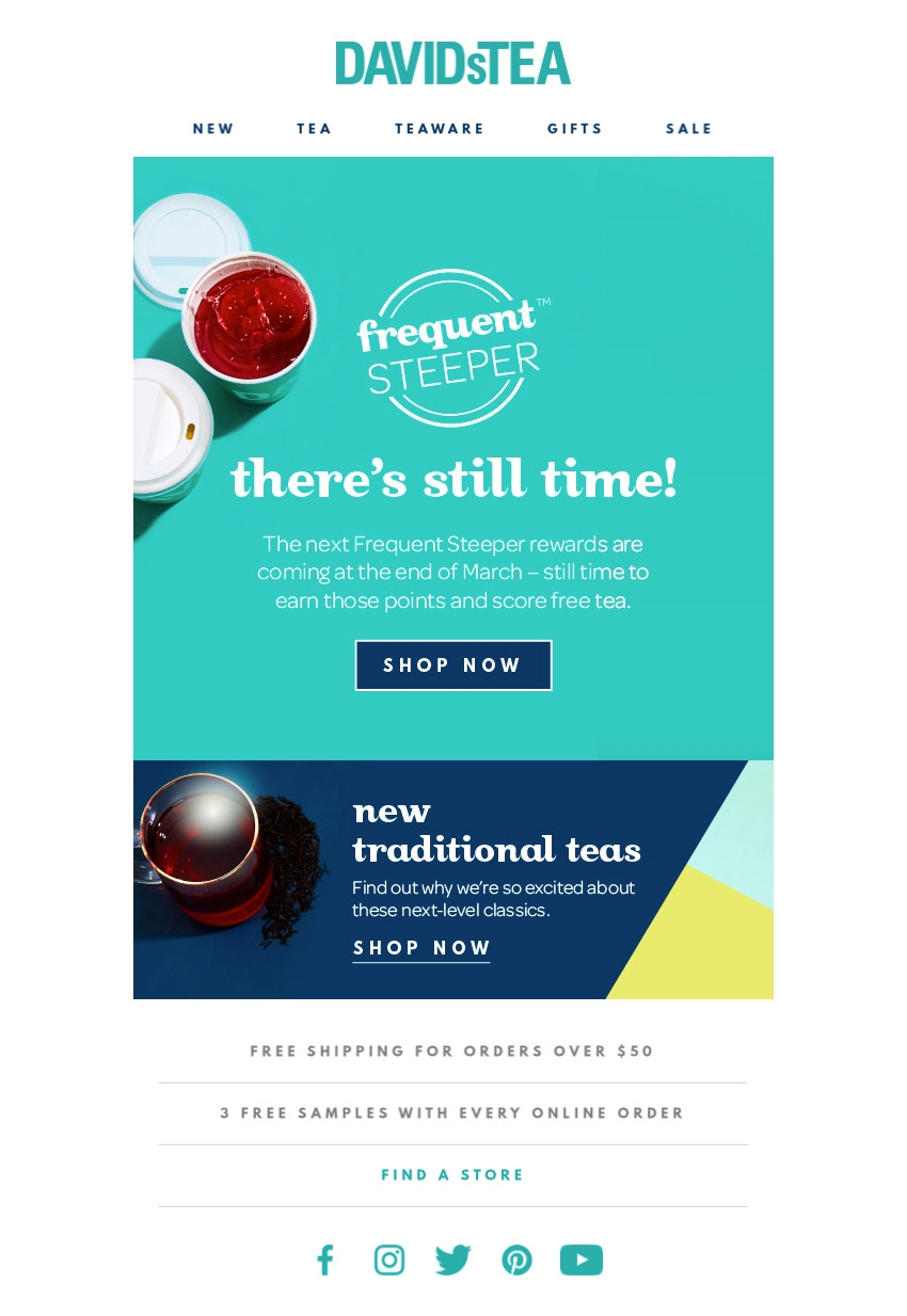
David’s tea is known for its tasty tea blends and accessories, but you can’t deny that the emails are just as great as a marketer. This email is a simple yet effective FOMO eCommerce email example.
Online shoppers have countless options, and they know it. But if there’s one thing they have in common, it’s that no shopper wants to miss out; on a deal, a unique, new collection, or a chance to be the first.
When humans react more positively to a time limit or rare opportunities, rather than deals or resources that are consistently present and can be accessed at any point in time, humans will be less inclined to give it their attention.
So when you use the art the “fear of missing out” FOMO, you push shoppers to add items to their cart faster rather than waiting for them to come to you on your own.
Social Pilots describe FOMO Marketing as a form of marketing where you leverage the consumers’ desire to grab every opportunity that they get. The messaging in it is framed such that you push the customers to make an impulse purchase rather than regretting the lack of action later.
Best Practises for FOMO eCommerce Emails
Get to the point: FOMO emails should be the simplest emails. It should incite the fear of missing out instantly by getting right to the point. “Sale now,” “Don’t Miss Out”. Don’t drag it out or spend too much time talking about your products. Focus more on the fear and leave a hint of curiosity to get them clicking.
CTA is key: Always add a CTA that matches your FOMO message. Your CTA or call to action should direct customers to the action you want them to take once they have finished reading your FOMO message. It also helps them to go to your site faster. Leaving it to chance that they’ll click around or go to your site defeats the purchase of the fear of missing out and slows down the customer to website process.
Use graphics and colors: This may seem like a no-brainer, but your graphics and colors should not only be on brand but use colors and graphics that push the FOMO into the reader. It may seem like a little detail to pinpoint, but color psychology can be your best friend when it comes to crafting emails that sell.
2. Ecommerce Email Examples: Birchbox
Ecommerce Email Overview
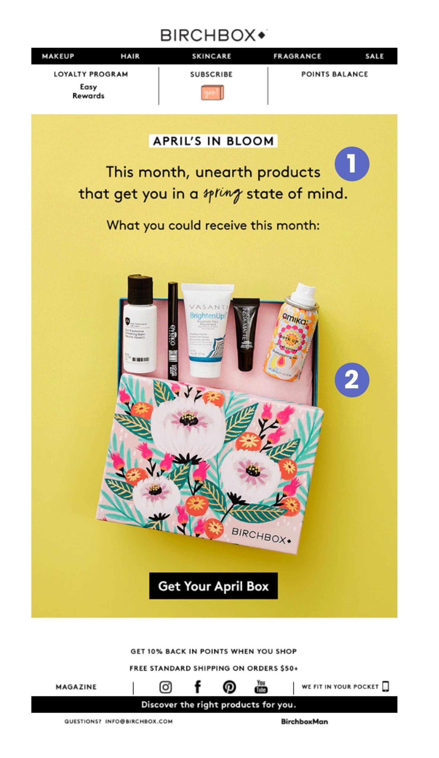
If you have a subscription service or mainly focus on product bundles, BirchBox should be your guiding star in marketing. This eCommerce subscription email example shows you how it’s done.
If your eCommerce brand relies heavily on customers renewing their products or subscription, then it’s important to create an email campaign to remarket to customers who have purchased from you before for three reasons:
1. It’s easier to get a repeat purchase: Compared to new customers who are more hesitant, a repeat customer is more likely to shop with you again and again because they’ve already passed through your marketing funnel and built trust with your brand. So it’s less work to convince them to buy again (once they had a great experience with you.)
2. Always remind them to come back: Life gets hectic sometimes, and customers can forget to renew their subscription purchases. So sending a friendly reminder helps keep your brand on their mind, taking up space a competitor might otherwise have instead.
3. You can recover lost sales: Whether or not someone has purchased from you, sending a subscription email or reminder helps you to recover lost sales. This could be lost sales from people who might have forgotten your brand or need a reminder that new products could pique their interest in the new month.
3. Ecommerce Email Examples: Huckberry
Ecommerce Email Overview
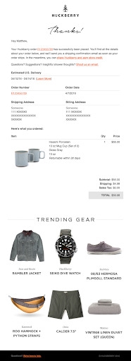
Huckberry does an excellent job of seamlessly inviting the customer to connect in the opening paragraph and adds product recommendations after the preliminary order information has been supplied. Huckberry is a quiet reminder that you should never overlook any aspect of your email campaign, even if it’s an automated ‘Shipment confirmation” email. Every email you send your customers is a representation of the best your brand has to offer.
Most eCommerce owners think that simply sending a simple “Your order is on the way” shipment confirmation email is the best method. But it’s also another opportunity to encourage a future purchase or upsell products that customers were interested in based on their search history or best seller that seem to keep going out of stock.
Best Practises for Shipping Confirmation Email
1. Always summarize the order: Give customers a summarization of all the items that have been confirmed for shipment. This helps to reassure your customers that they’ve successfully checked out all the things they’ve added to their cart.
2. Always add the essential order details: Providing order essentials demonstrates your eCommerce Your shipment confirmation email should always have the following no matter who repetitive it may be such as: *Order confirmation. *Your [insert name of business] order confirmation. *Order number [insert order number]. *Your order has been received. *Thank you for your order
3. Upsell or promote loyalty programs: Shipment confirmation emails get the most engagement because orders are precious. It would help if you used this attention to upsell your products or remind them about loyalty programs to build customer loyalty.
4. Ecommerce Email Examples: Casper

Ecommerce Email Overview:
One of the gems of remarketing emails has always been your shopping cart abandonment emails.
Casper is a brand that has benefited from spending time crafting high converting shopping cart abandonment emails.
Shopping cart abandonment is when a customer fills up their cart with things they love and leave without checking out for some reasons. This is standard online shopper behavior that has amounted to billions of dollars lost in sales globally.
If you already have a shopping cart abandonment email campaign, but it doesn’t seem to be doing well, I’ll be breaking down the best practices below that we can learn from Casper.
Best Practises for Shopping Cart Abandonment
eCommerce Emails
1. Use an attention-grabbing and headline: After your subject line has hooked them in, you need an attention-grabbing headline to keep them reading, or they’ll lose interest and leave. Think of your headline as a movie trailer or an action you’d like them to take.
2. Always add personalization: To get customers back to check out, you have to not only personalize the email by adding a “Hey {first name}” section but show them the items they left behind as well. People are more inclined to take action when it specifically applies to them, so never skip personalization.
3. Time it properly: When it comes to emails, timing is always crucial. When you set up your shopping cart abandonment email, it’s important to send the first email within the first few hours – in the first 15-20 minutes after cart abandonment, if possible. This spacing and timing should be optimal and not overwhelming the customer.
4. Make it urgent: Your Shopping cart abandonment email should always have a sense of urgency. Add a discount with a time limit or remind them how easy it can go out of stock. After all, you want to get those items sitting in their cart successfully to check out.
5. Ecommerce Email Examples: FunFit
Ecommerce Email Overview
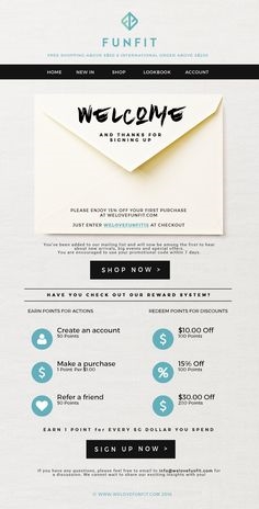
Did you know your welcome email is the first and last impression that most potential customers will have of your brand? And let me tell you, looks matter.
It’s also the email that will be the highest open rate your brand will ever see. Invespo found that the average open rate for a welcome email is 50%. That makes it 86% more effective than standard newsletters.
It’s simply because 76% of people expect to receive a welcome email immediately after subscribing to your list. They took the initiative to provide you their email because they want to be engaged with your brand.
Best Practises for Your eCommerce’s Welcome Email
Here are a few things we learned from FunFit’s Welcome Email and how you can craft a warm welcome email for your brand:
1. Mind your manners, introduce yourself: Don’t forget to introduce your brand to your new email subscriber properly. A welcome or introductory note that says something about your brand can be a good way to help new subscribers better understand your brand. You can introduce them to the features and highlights of your products or services.
2. Remember, always make it personal: Your welcome email should be as personal as possible. Collect as much information as you can (connecting site behavior with upfront questions on your form), so you can tailor content that takes into account subscriber interests and likes. This kind of personalization done in the first email from you can leave a great impression on the new subscriber’s mind.
3. Keep connected outside of emails: Suggest you’d like to connect outside of emails, so you’re a part of their daily activities. Giving your subscribers other options to connect with your brand can draw better engagement. Use your welcome email as an opportunity to increase your social reach by including social sharing buttons and links to your social media accounts.
6. Ecommerce Email Examples: Bare Mineral
Ecommerce Email Overview
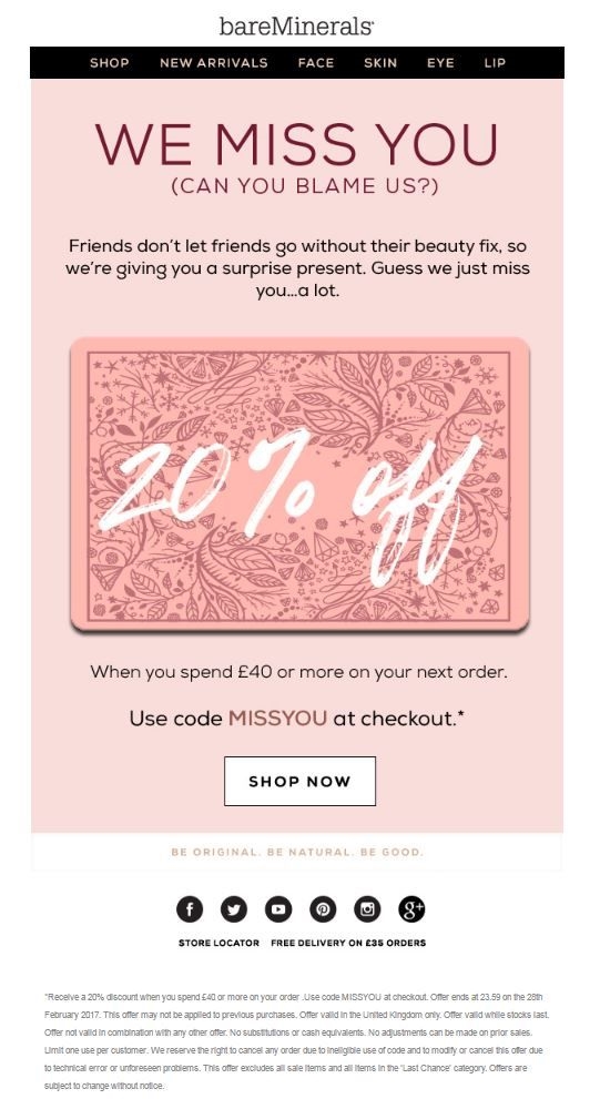
Next to welcome emails are * “Win-Back”* emails. Win back emails are used for retargeting and converting customers:
- Who hasn’t purchase in a long time
- Fell off your eCommerce marketing funnel
- Who bought something from your site once but haven’t come back for subsequent purchases.
- Who hasn’t opened any of your previous emails
- May have been a customer, but you haven’t seen any activity from them in a long time.
Research reveals that businesses lose between 20-40% of their customers every year. And while it may be normal to have some of your audience lose interest in your brand (the average email list declines 25% each year).
Since we know, it takes 10x more effort to find and convert new customers. It seems like a total waste to let customers who are already familiar with your brand be left on the wayside. But we also have to consider that since these people haven’t interacted with you in a while, it could mean (but not limited to):
- They have found another yet similar brand to yours to get their shopping fix
- Your brand voice, story, or products may not have been their cup of tea.
- They hadn’t experienced good customer service or experience when interacting with you in the early stages.
- You haven’t provided them with anything of interest (discounts, etc.) *You haven’t done anything to grab their attention, and you’re being ignored.
Best Practises for a Win-Back eCommerce Email
Here are some best practices when crafting a win-back eCommerce email campaign for your brand:
1. Let them know you miss them: You can treat this segment of customers as the rest. They need to feel special. If you pretend their absence doesn’t affect you, then you’ll miss using sincerity as an emotion to pull them back to your website. So tell them either in the subject line and or the email.
2. Give readers an incentive to come back: Add a special discount or deal to your email. Try not to rinse and repeat a deal you’ve been using regularly on your website. You want this discount to be more personalized to your win-back segment. Remember, the key is to make them feel special, not just another number on your email list.
3. Don’t forget to say goodbye: The final email in your win-back series should be your goodbye email. The last thing you want to do is keep chasing a dead lead. The “goodbye” email is your last-ditch, hail mary effort. Here, you’re simply informing customers that you’ll be removing them from your email list (you could even give them a specific time frame, for example: “within the next 30 days”). You’ll be formally saying goodbye, and with the help of FOMO to push them to your website.
7. Ecommerce Email Examples: Rifle Paper Co
Ecommerce Email Overview
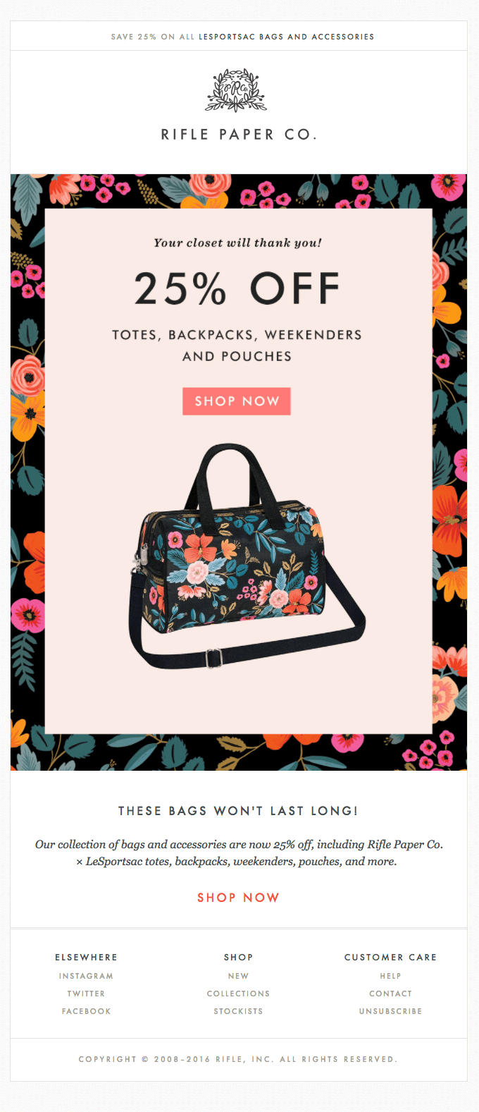
Discounts or deals play a key role in eCommerce email marketing. Where you like it or not, online shoppers are now conditioned to expect it from brands regardless of their niche or brand name. About 93% of shoppers use a coupon or discount code throughout the year.
After all, we know how well-discounted emails can perform at Wishpond. It’s one of the ways we’ve helped customers earn over 100,000 leads and sales.
Best Practises for a Discount eCommerce Email
1. Be clear about your offer: If you’re offering a discount, state the amount or percentage you’ll be giving shoppers right off the bat. Being ambiguous makes you seem untrustworthy and confuses shoppers on what the offer really is, so write your discount boldly in your subject line and email copy.
2. Show them what they’re missing: Show off your best selling products via text and images in your email to tempt them into using the discount. Dive deep into the benefits of shopping with your brand or purchasing your product/service. Convince and Convert found that 30% of people purchase to gain something and 70% purchase to solve a problem. To solve the problem, take a look at how Rifle Paper Co solves the problem of adding new products to your closet.
3. Don’t overwhelm your readers: If you’re issuing a discount or having a sale try not to overwhelm the reader with other offers or too many offers. Focus on pushing a singular offer so that readers are focused and effortlessly move from email to CTA to check out.
8. Ecommerce Email Examples: Julep
Ecommerce Email Overview
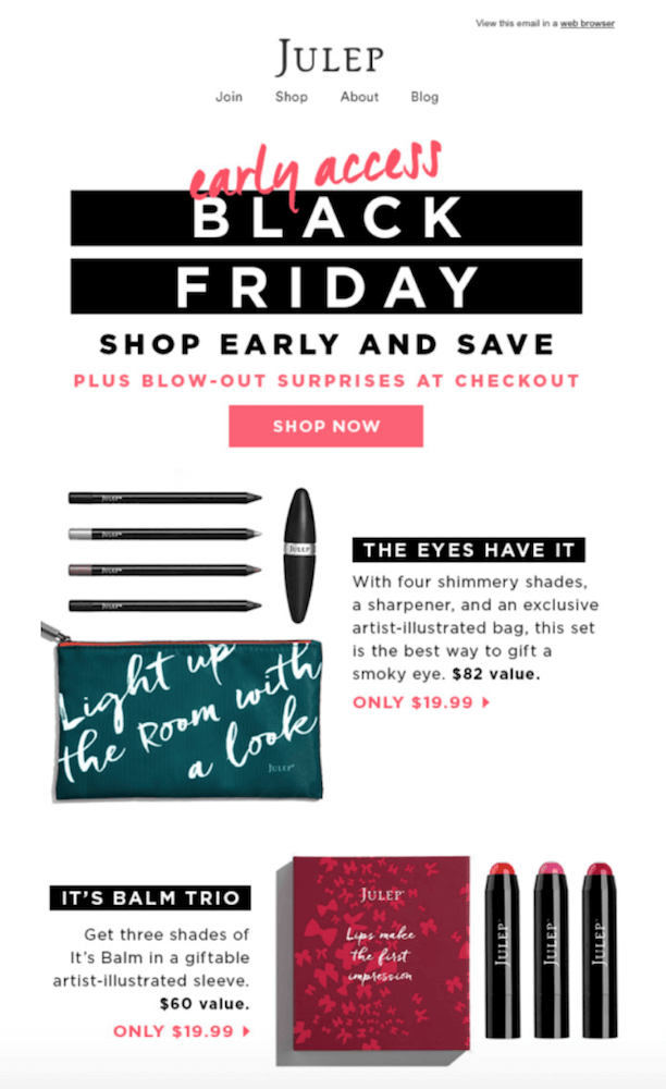
During the holidays, shoppers are looking out for emails far more than they would on a working day. The holiday season is one of the busiest and most lucrative times of the year for many businesses.
Research shows 41% of retailers will use “Buy Now” buttons in their email marketing, making it extremely simple for subscribers to make a purchase.
Julep’s Black Holiday eCommerce email example is just one of the many amazing ways brands capitalize on holidays to boost sales.
Best Practises for a Holiday eCommerce Email
1. Make it festive: Avoid creating boring holiday sales emails. During the holidays, brands are vying for customer’s attention, so they’re bringing their best designs ever, so do you. Your email should still be on-brand, but it should also have the holiday spirit, aka reflect what holiday this sale is representing.
2.: Put your offer front and center: With so many emails hitting subscribers’ inboxes this season, don’t make them hunt for your offer. Feature it prominently in your subject line and at the center of your email.
3. Send last-minute deals: The average shopper had only completed 53% of their shopping list two weeks before Christmas. Ensure that you craft and send out an email for those last-minute shoppers who are lurking for deals and products to get the week before or of Christmas.
9. Ecommerce Email Examples: Yoga Fit

Ecommerce Email Overview
Contest emails have an average rate of 8%, that’s 5.5% more commonly used email marketing campaigns. Pick a prize that’s worth winning. So your email design and layout could make an expert email designer cry tears of joy, great, but the prize you choose to motivate people to enter falls flat on its face.
Yoga fit decided to go the extra mile by giving a yoga retreat for two. The better and bigger the prize, the better the conversions and leads you can generate from it. The same can be said for a bad prize. If you need help with picking a giveaway idea or prize, check out these 50 affordable giveaway ideas you can use today
Best Practises for a Contest eCommerce Email
1. Design and write for your audience, not for you: Before you start writing or designing, take the time to understand exactly who is receiving your emails. Add that to your overarching theme, and you’ve created an email that connects more authentically with your readers.
2. Add lifestyle product images: Showing off your prize, let your pictures tell a story or present a lifestyle that seems appealing to your shoppers.
3. Never forget your CTA’s: Take into consideration that your CTA needs to stand out. Please don’t get so caught up trying to make your email look beautiful that you forget about its design functionality.
Digital & Social Articles on Business 2 Community
(33)
Report Post

