If your site isn’t credible, you’re certainly scaring off a large amount of would-be buyers. But credibility is quite contextual, and sometimes attempts to add credibility indicators can backfire.
How, then, can we create a web page that inspires trust, not skepticism? That aids a purchase instead of deters it?
Credibility is “a measure of how believable and trustworthy your marketing is perceived to be.”
Website credibility is derived from many factors, and these always depend on the context of your audience and your execution.
Credibility is Contextual
There are things that I find untrustworthy that you might find totally okay. For example, I don’t think anything resembling “internet marketing” design is credible (big red text, highlighted words, blinking arrows, autoplay video, etc).
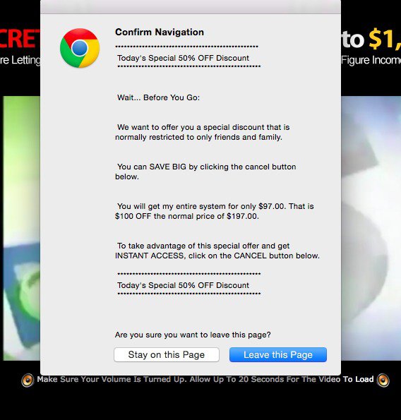
Really, anything that looks like 1990’s spam triggers my wariness. Nothin’ sketchy about this exit popup, right?
This design is usually reserved for information products that don’t offer much value. But sometimes real products use this style as well, probably thinking that it is savvy and converts well (don’t copy your competitors).
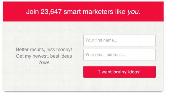
Actually, I consciously decided not to buy an otherwise trustworthy product (Athletic Greens) because I thought their site looked kinda seedy:
“Yes, I want more energy!”
No, I just want to buy the product. Also, I felt weird filling out what looks like a lead gen form instead of something with more of an eCommerce feel. This site wasn’t the worst, but it did tip me to the side of not-buying, when perhaps otherwise, if I’d felt safer, I would have purchased their expensive health products.
But anyway, who the hell am I to critique their credibility if it converts well? I’m not sure if they’re running tests, but if their target audience responds well to this, then my opinion doesn’t matter in the slightest.
In general, though, just as there are attributes that correlate with a trustworthy site, there are elements that consistently scream the opposite. Here are 10 common credibility killers…
1. Bad Web Design
Web design matters.
People judge the book by their cover and your website by its design. Turns out, they judge quickly too (first impressions matter). It takes about 50 milliseconds for users to form an opinion about your website that determines whether they like your site or not, whether they’ll stay or leave.
Dr. Brent Coker studied the impact of attractive websites on human behavior. This is what he said:
“As aesthetically orientated humans, we’re psychologically hardwired to trust beautiful people, and the same goes for websites. Our offline behaviour and inclinations translate to our online existence.”Websites that are more attractive and include more trimmings create a greater feeling of trustworthiness and professionalism in consumers.”
So, Stanford has a checklist for website credibility. It includes many factors, but one of them is to “design your site so it looks professional (or is appropriate for your purpose).” Here’s how they explain:
“We find that people quickly evaluate a site by visual design alone. When designing your site, pay attention to layout, typography, images, consistency issues, and more. Of course, not all sites gain credibility by looking like IBM.com. The visual design should match the site’s purpose.”
Some general credibility killers for web design are:
- Hype with no backup
- Blinking banners
- Clashing bright colors
- Autoplay animation
- Gratuitous popups
If your site looks like a Christmas tree, you need to change that. Hire a professional.
2. Lack of Social Proof (or Negative Proof)
Social proof is not an unknown technique. In fact, you can’t visit inbound.org without seeing a new article about how to better implement social proof. But there’s a reason for the popularity: when done right, it really works.
Popularized by Robert Cialdini in Influence, social proof is when people do what they observe other people doing. It’s a principle that’s based upon the idea of safety in numbers.
Remember the McDonald’s sign? If that many people have been served, it’s gotta be good:

Nobody wants to eat at the empty restaurant, and the nightclub with the crazy line must be awesome. Similarly, nobody wants to take a chance (and risk losing money) on working with a business with no clients.
How To Implement Social Proof The Right Way
No social proof is obvious. It’s simply the lack of social validation indicators on your website. That’s not to say lacking blatant social proof on your site is always a bad thing. There’s always external social proof as well (influencer recommendations, word of mouth, good PR). Good example of a company with great external social proof but a lack of blatant on page proof is Southwest:
But if you’re like most companies, you’ll benefit from a few indicators of social proof on your page. Featured in the NY Times? Have tons of high profile customers? Let the world know. YouBar does a good job featuring a positive quote from the NY Times as well as showing other huge publications they’ve been featured in:
Negative social proof can arise in a variety of ways:
- You have a blog, but haven’t written an article in 2 years.
- You have a Facebook page, but haven’t posted in forever (plus you only have 58 fans).
- You have social share counters, but nobody is sharing.
- Your testimonials are blatantly fake or overly positive.
There are a lot of ways social proof can go wrong or seem disingenuous. But, of course, there are a lot of ways to do it right. Here are some of them:
- Show your client list, especially if they’re high profile. Nobody wants to be the only idiot buying your product or service.
Use testimonials. Testimonials work well if they’re by real people. Real people means that there are photos, full names, what they do, their employer. Well-known people are even better. Video testimonials are the best.
- Put customer reviews on your site and elsewhere. People still trust them. It’s the upper hand Amazon has on everyone else.
- Mention the number of your clients. If you have an impressive number of customers, say it out loud for social proof (e.g. “30,000 happy customers”).
- Show a link with a reputable organization. Are you somehow connected to a university, a governmental agency, a research lab, or another reputable organization? Perhaps you’re service provider, reseller, partner, sponsor, advisor or what not. If yes, tell the world.
3. Lack of Security/Trust Symbols
I’m lumping a few different things into this category:
- Trust marks
- Quality guarantees
- Clear return/refund policies
If you have none of these – especially if you’re a lesser known company – it’s going to be hard to convince all the possible buyers of your credibility.
Specifically for clothing eCommerce, don’t you feel more comfortable when there is a clear return policy? There are so many doubts (“will it fit?”, “does it look the same in person?”) that creating a Plan B for the customer can give them a sense of safety.
And while there have been studies cited that suggest trust marks can deter conversions, in most cases they serve as a reminder that the customer won’t be getting ripped off.
So if you take credit cards, prove me it’s safe (256-bit SSL encryption etc). Use The Verisign Seal or equivalent. Have people opt-in to your email list? Put a TRUSTe privacy seal on your site. And so on. Find out what’s a known trust mark on among your customers, and use it.
And of course, a 100% money back guarantee always makes a customer feel more comfortable…
4. Bad Grammar/Typos
Attention to detail matters.
In social media, it seems spelling errors are one of the largest mistakes a brand can make. A London-based digital communications agency surveyed 1,003 U.K. web users last July, and found that close to half of the overall respondents – 42.5 percent – would be most influenced by spelling or grammar blunders.
Similarly, in dating, Colour Works found similar insights. The company did a study of 1700 online daters and found that 43% of users consider bad grammar decidedly unattractive and 35% think good grammar is appealing.
Imagine arguing with the average YouTube commenter. How much stock would you place in their argument if it was filled with poor grammar and insults?
On a website, bad grammar has been shown to reduce sales (at least when the error is obvious and prominent). But more often it seems that bad grammar accumulates subconsciously and results in less trust for the site. Just fix it.
5. Superlatives and Other Vague Language
On the same note, any vague language is hard to believe.
Oh, so you’re the best CRM tool – says who? As important as the first impression is for the user, the burden of proof is on you. So if you say something, backing it up makes you more credible.
Often, though, you’re better off opting for specificity than generalities. Not only do people believe you if you’re specific, but if you’re specific, then you can usually better position yourself as unique to the competition.
There’s also the case that people tend to believe precise numbers more than rounded numbers. That’s why you see things like this (from Neuroscience Marketing):
Roger Dawson, a negotiation consultant, gave an example pertaining to property and real estate:
“I once purchased a hundred acres of land in the State of Washington. They were asking $ 185,000 for the price of the land, and I asked Marge Winebrenner, the real estate agent, to make an offer at $ 115,050.
She said, “Roger, what’s this fifty dollars? Where did that come from?”
“Marge,” I told her, “I’ve just been buying land for a long time now, that I have a formula that I use. I punched in the numbers and that’s what came out.”
In fact I knew that I was less likely to get a counter offer for a specific number like that. Marge did a fantastic job of presenting the offer, and the seller accepted it. So to build credibility, use precise numbers. Strangely enough, you’re better off to claim that your new word processing machine will increase the productivity of their secretary’s output by 87 percent, than to claim it will double his or her productivity.”
6. Lack of Photos or Contact Information
People need to know you’re a real company. So if you don’t have any photos of real people, or of your office, or of anything that substantiates your existence, how are they to believe you?
The easiest thing you can do is put up an ‘about page’ or a ‘contact us’ page with some warmer information. By that, I mean not just a bland contact form, but a specific service email (hello@company.com), some photos and bios of your staff, and a photo of your office, perhaps even a location depending on the business you’re in.
Cheesy stock photos might be worse than no photos though, if only because it suggests omission of real information. Say no to cheesy stock photos:
7. Technical and Usability Problems
Make sure things works.
Dead links, non-functional forms and everything else that might seem broken will take away from your credibility.
Ignoring all of the greater usability issues present with a constantly broken site, these things (dead links and stuff) add up more than you’d think. They fall under what BJ Fogg calls “earned credibility,” which is your personal experience with the site.
Anyway, as many optimizer can tell you, some of the highest impact and low hanging fruit is to fix usability and technical bugs.
8. Bad Publicity, Untrustworthy Executives, and Other Off-Page Indicators
If you’ve ever attended a university English class, you’re already familiar with Aristotle’s three appeals: ethos, pathos, and logos. Particularly important here is ethos, which according to Wikipedia, is “an appeal to the authority or credibility of the presenter. It is how well the presenter convinces the audience that he or she is qualified to present (speak) on the particular subject.”
Don’t underestimate ethos in making or breaking a reputation.
An example: I basically trust any advice that Tim Ferriss gives on his podcast or blog. I don’t need to dive too deeply in research anymore, even though I did research his advice quite a bit early on. He’s built that trust through sustained and consistent value provided, as well as my belief that he tries out all of it on himself before telling people about it.
A company that has your trust doesn’t need to try as hard to ‘convince’ you.
Ethos can be done in a number of ways. A few examples…
- Holding a prestigious title (e.g. professor, PhD, CMO).
- Working for/with a well-recognized company in the industry (e.g. Optimizely, IBM, Google ).
- Using industry terminology (e.g. CTR, lift, decision fatigue, UVP).
- Being introduced or vouched for by someone with more credibility (e.g. a warm email intro, social proof on a landing page).
The list goes on and on. Essentially, ethos is about demonstrating (a) your authority on the subject and (b) your morality.
How can you project your ethos? Start by not being a terrible, deceitful person (or hiring them). That stuff always comes out. But to signal your authority and character, you can:
- Keep a blog and offer a lot of value in your content marketer.
- Guest write for credible publications.
- Work with reputable people.
- Be transparent.
9. You’re Overdoing It
While a bit paradoxical, you don’t want to overcrowd your page with credibility elements – it will have the opposite effect.
Image hiring a cleaner from Craigslist, and their first words when they arrive are, “don’t worry, I’m not going to steal anything.” What would you think? Of course, your first thought will be, “wait – are they going to steal something?”
The idea is planted, and then confirmation bias takes hold and you seek out information to confirm your theory. Now that cleaner seems untrustworthy because of their tattoos, clothes, etc, etc.
Same thing with a web page, and you can overdo it in a few ways…
Overly Positive Reviews/PR Can Hurt
All publicity is good publicity, right? Actually, maybe.
I had a marketing professor tell us that simply wasn’t true, but according to this study by Berger, Sorensen, and Rasmussen, in some cases negative reviews can increase sales.
Especially for smaller brands, negative publicity can increase product awareness, and it can make claims more believable and accessible.
Don’t get me wrong, bad press can still hurt a brand (of course), but often when reviews or PR is overly positive, it triggers a ‘too good to be true’ effect.
Unbounce wrote about two factors that affect credibility of reviews (and sales): positivity/negativity and linguistic style.
Basically, negative reviews had a stronger impact on sales than positive reviews, but what really mattered was variability in ratings. As they put it:
“In other words, if a visitor sees nothing but 5 star reviews, they get suspicious.
Keep in mind that this is on Amazon, a trusted brand where the default assumption is that the customer reviews are real. This skepticism can only get worse if the user reviews are on a platform they’ve never seen before.
In short, while a plethora of negative reviews is going to sink your product, a collection of excessively happy customer reviews will have your visitors crying ‘Fake!’”
Looking for a way to implement a more transparent review system? Do as MarketingExperiments recommends, and “Give customers real estate on your site to share their stories.” How they put it:
“Today’s customers are more than just a revenue stream …
They are brand advocates who write reviews on sites like Yelp and Urbanspoon that will ring louder than your marketing ever will. The savviest marketers understand offering customers a home to share those reviews and stories can add credibility to your products and services.”
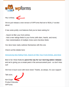
Don’t Write Testiphonials
Guess what? People can spot seedy reviews.
Believe it or not, even a few (a very few) bad testimonials can help. If you read customer reviews, you’ll typically notice that they are a mix of good and bad reviews. When a bad review is posted – it helps to create authenticity for all the reviews written – particularly, the good ones.
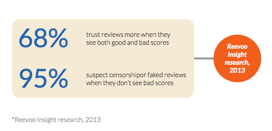
Reevo, a social commerce company researched this theory by analyzing 2.5 million customer reviews. Here’s what they found:
Testimonials, when authentic or perceived to be authentic, boost the credibility of your offer by engaging social proof. It’s more common than you’d think for companies to fake or embellish testimonials. Keep an eye out for that.
If you want to learn how to do testimonials the right way, read this article.
Conclusion
Credibility is contingent on many factors, some of which might be out of your control as an optimizer (not much you can do about the ethos of your executives or the negative press of the company). Some things, however, you can control:
- Make sure your site works. Fix technical bugs and dead links.
- Put real photos and contact information on your site. Let people know you’re real.
- Put trust indicators on your site, things that signify safety, like: money back guarantees, return policies, and payment trust symbols.
- Use specific language in your copy.
- Avoid typos.
- Hire a professional to design your site.
- Put some social proof on your site.
- And don’t overdo it. Too many blatant ‘trust symbols’ can have a backfire effect where people wonder, “why are they trying so hard?”
Finally, and most importantly, just be good, genuine and honest. No amount of trust symbols or social proof can save your company if you’re a group of deceitful people. That stuff always comes out.
Digital & Social Articles on Business 2 Community(85)
Report Post


