Unless you’re in email marketing, chances are you don’t give much thought to confirmation emails. But you should.
That little automatic email some might consider a throwaway can actually be leveraged into a powerful tool to bring in more customers. Read on to learn how you can create confirmation emails that work for your business.
Table of Contents
- What’s a confirmation email?
- What can confirmation emails do for you?
- Different types of confirmation emails
- Tips for designing better confirmation emails
- Some final FAQs
- The bottom line
What’s a confirmation email?
Confirmation emails are what we get when we buy something. They usually include a quick thank you, an order summary, and an order number.
In this article, we’ll go over:
- Why confirmation emails are important to your email marketing plan
- Reasons you should send confirmation emails
- Best practices for confirmation emails
- Different types of confirmation emails
- Examples of effective confirmation emails
What can confirmation emails do for you?
People’s inboxes are one of the few places you can get in touch with them directly. Confirmation emails usually land in the primary inbox and not the spam folder, so they get seen more often and are more likely to be opened.
Confirmation emails contain important information people need to keep for later, so the click-through rate on them is higher. This is especially true if you provide a link to track the shipment of purchases.
But that’s not all. There’s a whole host of other reasons creating confirmation emails is important.
Start a conversation
Confirmation emails have an average open rate of 42.51 %. Every time someone clicks into your email is an opportunity to start a conversation.
You can include a short, voluntary survey asking people why they chose to buy the product they did, or what their experience was like shopping with you. That gives you valuable information on customer preference straight from the source.
You can also let them decide which emails they want to get from you in the future by letting them set their preferences. That takes the work of segmenting them off your shoulders, and your customers only get the emails they want. A win-win.
Even the action that person took to trigger a confirmation email is market research! It shows you what they cared about enough to do and/or buy on your site, and you can pool that data with other people who have similar preferences.
Communicate at critical sales funnel points
Communicating with people throughout their customer journey is important, whether they made a purchase from you or just signed up to receive email coupons. A well-written confirmation email can make someone feel welcome after making a purchase, or bring them back if they haven’t visited in a while.
Track valuable data
In addition to their insights on customer action, confirmation emails help you track other kinds of data you can use for your email marketing campaign. That includes both qualitative and quantitative data like:
- How well your subject lines perform
- Which day of the week has higher open rates
- Click-through rate
- Conversion rate
- Reading time
- Revenue per list subscriber
- Lifetime value of each email subscriber
- How many times an email is forwarded
- Customer responses to your email
This information helps you tailor your confirmation emails and add the human element you get from direct subscriber feedback. The result? Getting the right messages to the right people at the right time, while providing the information they want and need.
Use CTAs to boost conversion
When someone receives a confirmation email, they’re already actively engaged with your brand. They’ve agreed to buy something from you, sign up for updates, or let you into their inboxes in some other way.
As such, a confirmation email can be a good time to cross-sell or upsell products that would pair well with what they just bought. People are also expecting them in their inboxes, so confirmation emails are extra relevant.
Consider providing product suggestions in your next confirmation email with clear calls to action (CTAs) people can follow. Be sure that this is included after the main body of the email, which should have the relevant information about their order.
Differentiate your brand
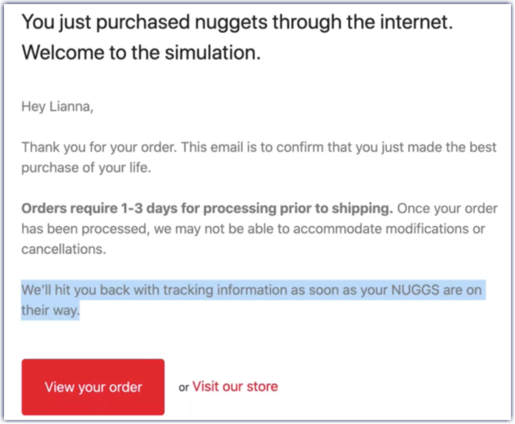
As with every other customer interaction, creating confirmation emails gives you an opportunity to display your brand voice. Nobody expects much from a confirmation email, but if you deliver something surprising like a little bit of humor, people will remember you for it.
Nuggs does exactly this in the confirmation email for their vegan chicken nugget products:

Nugg’s order confirmation email shows their brand voice with sly humor and casual wording. Image source: thegood.com
Different types of confirmation emails
Confirmations are some of the only emails people actually look forward to getting. They also serve as a receipt in case anything goes wrong.
Confirmation emails are usually sent out in the following cases:
- Booking confirmation. Sent after someone books a hotel, flight, or reservation.
- Newsletter confirmation. Sent after a newsletter signup, also called a subscription confirmation.
- Order confirmation. Sent after a purchase with the details of the order and expected arrival date.
- Content download confirmation. Sent after someone requests to download gated content.
- Appointment confirmation. Sent after booking an appointment with all the relevant details.
- Shipping confirmation. Sent when an order ships, usually with summary and tracking number.
- Event registration confirmation. Sent after buying tickets or registering for an event and includes event details.
Each of these email types can be improved by including more than the basic information. What you add will depend on the type of email.
For a ticket confirmation, you could include links to useful resources to prepare for the event. In a download confirmation, using minimal copy and a clearly marked CTA button (download now) helps people get to the content they asked for quickly.
Tips for designing better confirmation emails
Quite a few subtle elements go into any bit of marketing copy, especially emails. Here are a few things you can do to improve your email design and boost open and conversion rates on your next campaign.
Optimize your subject line
An email’s subject line is usually what gets someone’s attention and entices them enough to open it in the first place. You’ll have an advantage with confirmations because people are expecting them and will probably want to check the details, but that doesn’t mean you can’t take the extra step to make them interesting.
The best subject lines:
- Use nine words or fewer
- Use no more than one emoji
- Stay under 60 characters
- Use fewer than three punctuation marks
Writing a subject line that sounds like your brand gets people to recognize it, making it more likely they’ll open the email. Personalizing subject lines with a name also goes a long way toward getting someone’s attention.
Invest the time to come up with an email subject line that’s interesting without sounding spammy. And while it may seem strange to incorporate an emoji, you might want to try it out — it can increase marketing effectiveness by up to 70%!
Include everything they need to know
The relevant information needs to be in the email, near the top, and easy to find. That’s what people are looking for, and they’ll get frustrated if their order number is buried underneath a sales pitch.
Include a warm welcome. Then build in details like:
- A confirmation the order went through
- The order number
- Billing summary and payment information
- Images and descriptions of what the customer bought
- Explanation of shipping and tracking
- Contact info in case of trouble or questions
- Expected delivery date range
What you’ll include will vary depending on the kind of confirmation you’re sending, but basically, tell them what they signed up for and provide a receipt.
After that, you have the opportunity to cross-sell or upsell. You can also include tips on how to use the product they ordered if that’s applicable.
If they signed up to get incentives like discounts or coupons from you, include those as well. Buttons to confirm their opt-in and invitations to self-segment are also an option.
Remember, this is a confirmation email, so don’t overdo the sales pitch.
Make a good impression
If there’s something the customer needs to know about their order, make sure to tell them. If you’re anticipating a shipping delay, for example, let them know that and provide contact information for customer service.
People like it when you take the initiative to provide clear next steps for their order so they know what to expect while they wait. Giving people a delivery estimate, for example, lets them know what to expect and plan accordingly. They aren’t left in the dark, annoyed and wondering when their order will arrive.
Start the conversation off with whatever concerns them the most, then provide the confirmation. Once you’ve done that you can add a bit of educational or lead-nurturing content to the tail end of the email.
Next steps are pretty simple when it comes to order confirmations: it’s usually just the relevant details, product images, and a shipping number/estimate. But what about, say, subscription services?
You can still let people know what’s coming next. Give them a general idea of what they can expect after signing up for updates from you. What kind of emails will they get? How often will they be sent? Will there be any promotions or coupons? Lay it out for them.
Write like a person
You want the copy in your email to be personable, like someone the recipient knows wrote it. You can’t do that by sounding like a machine.
There are certain brands that do this very well. Casper, for example, always has excellent copy in their emails. It’s colloquial, on-brand, and usually sprinkled with sleep puns.
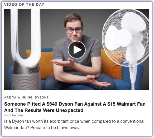
News aggregator Digg is another good example of pithy email copy. Subject lines are usually puns referring to one of their stories, each of which is presented with an image, headline, and short description. The subject line of the email containing this story was “Dyson Another Day”:

Catchy wording throughout keeps with Digg‘s brand voice.
We then get a compelling image, interesting headline, and more puns in the description. It pulls the reader in and makes you want to read every story. Plus, the story associated with the subject line is never the first one listed, which gets readers scrolling through.
Keep everything on-brand
The subtle elements that make up your brand, from design to copy, should be present in everything you put out. That includes confirmation emails.
At a glance, the recipient should be able to see this email came from your company. The color scheme, logo, font, and voice present in your confirmation emails should reflect the rest of your branding.
Make it easy to read
Your copy should be easily digestible, with the important information front-loaded because that’s what people are opening the email to see. People aren’t going to take in every word — they’re more likely to skim, so be sure the pertinent information is easy to find.
Using images and icons, separating text into bullet points or lists, and making the email short all help keep the reader’s attention once you’ve earned it. Larger, minimalist fonts that don’t strain the eye are also a good idea.
And don’t neglect readability on mobile! Litmus examined billions of email opens over the course of 2020 in their State of Email Engagement report and found that nearly 40% of people were opening their emails on a mobile device.
If your images don’t load or your links don’t work or the text in your email loads half on one side of the screen and half on the other, people will delete your message before they read it at all. Always test your emails on a mobile device by sending one to yourself or someone else at your company.
Help subscribers celebrate their milestones
Confirmation emails can be a way to thank people for their loyalty and get them excited to keep doing business with you. Maybe they’ve been a customer for a year or hit a certain milestone in your rewards program and you want to acknowledge that.
It doesn’t take much, just a quick thank you or a funny GIF. You could even provide a VIP discount or deal to show appreciation. Even if someone’s just signed up with you or made their first purchase, a well-crafted email can celebrate that and make them feel part of an exclusive club.
Experiment with CTAs
You can add appropriate CTAs when you create a confirmation email, but be careful. Resist the temptation to jam in a million things just because you know people will be opening it. Being relentlessly sold to will turn readers off very quickly.
It’s better to use confirmations as a jumping-off point with one clear CTA relating to the body of the email. A purchase confirmation, for example, could thank people for their purchase, tell them how they’re making a difference, and then have one “shop now” button to click if they want to go back to your store.
You can also use this as an opportunity to tell more about your company if it has an interesting story. Say you make t-shirts from recycled ocean plastic. Give the short, elevator pitch version in the email, then invite customers to learn more about the process by clicking through to your site.
Additional CTA ideas include:
- Introducing members of your team
- Reiterating your return and refund policies, especially on commonly returned items like shoes or clothes
- Addressing common FAQs about your product
- Offering rewards for first-time buyers or subscribers
- Including tips on how to use your product
- Showing testimonials from real customers who’ve bought the same thing
- Inviting people to sign up for a rewards program
All of these ideas have the potential to keep the conversation between you and the customer going and keep them coming back to you for more.
The key here is not to dispense with the important information in favor of marketing. Always deliver what people need first, then offer to give them more value through an additional, optional action.
Some final FAQs
Now that you’ve got a good idea of what it takes to make a great confirmation email, let’s dive a little deeper into the details.
Will including a CTA violate spam laws?
Not if you don’t go too heavy on the selling. The Federal Trade Commission’s (FTC) official page on the CAN-SPAM Act says that if an email includes both transactional and sales content, the email’s primary purpose is the deciding factor.
The General Data Protection Regulation (GDPR) rules aren’t quite as clear on this yet, but it’s assumed that they’ll be similar. Err on the side of caution and make sure that any CTA you include reasonably ties into the purpose of your confirmation email.
What about A/B testing?
A/B testing is a marketing concept in which you test two different versions of something at the same time. That could be a web page, a social media poll, or a welcome email.
For confirmation emails, A/B testing is fine, especially if you have a large audience. Avoid changing large parts of the email at once, though. Focus instead on subtle tweaks to certain parts of the email, so you can measure exactly what works and what doesn’t.
Should my site have a dedicated email confirmation page?
This will depend on the purpose of the confirmation. If someone quickly signed up for your email list because they saw an entry popup, taking them to an entirely different page afterward might interrupt the flow of their browsing.
If you want to confirm to someone that they signed up without taking them to a new page, you can do it in-line. If someone submits a contact form, for example, you can have the form replaced by a thank you message after they submit it.
For purchases, it’s a bit different. Odds are, people are done on your site after completing a purchase, so displaying a separate thank you page can be an important step in that completion process.
The bottom line
After reading this article, you have plenty of information to take with you into your next marketing campaign — and hopefully a new appreciation for the humble confirmation email. To recap:
- A captivating subject line is always a good idea. Make it short, enticing, and on-brand.
- Your confirmation email should always start off with the relevant information and confirmation before moving into anything else.
- Keep your body copy and email aesthetics (colors, logos, fonts) on-brand. It should be instantly apparent who sent the email.
- Always include descriptions and images of the items someone ordered in purchase confirmation emails.
- Give people a delivery window so they know what to expect, and outline clear next steps.
- Keep the copy easy to read and to the point.
- Keep CTAs to a minimum, and make sure they tie into the original purpose of the email.
- Write like a human being.
Whichever email marketing platform you use will likely make it a snap to create confirmation emails and other branded emails. Experiment with different templates, body copy, and interesting images to really make your emails sing. The extra effort is always worth it.
Digital & Social Articles on Business 2 Community
(56)
Report Post


