There’s a common misunderstanding running amok in the marketing world right now: Brands think it’s okay to post lousy social media images.
These images are either irrelevant, pixelated, wrongly sized, or otherwise unattractive.
More and more marketers are embracing and executing on the winning concept of producing educational, helpful content. They’re pouring endless time and effort into this content, which in itself, is advantageous to the brand it’s posted from. And then they promote it on social media sites.
But what’s the point of the “Content is king!” battle cry if there’s no strong images to back up that excellent, educational information?
Without prominent, quality images, your great content will go unread on social media. This is because:
- Pictures stir emotions, which have a powerful pull. The right picture with your content will be irresistible to those who see it.
- Distractions abound, especially with so much content being produced today. A good image will anchor someone’s attention and hook them to read more.
Marketers must understand and take hold of the fact their content is almost useless without quality imagery. With that in mind, here’s a quick guide to dos and don’ts when it comes to social media imagery.
Normal Social Media Image Usage Types
Self-Taken Images
At one point, self-taken images were hailed as the perfect partner to content of all kinds because of their originality; no one else can claim them, so they must be good. This ideology no longer holds true, (and I’m not sure it ever did). The best iPhone pictures are still just that: an amateur, unprofessional image. It’s just plain lazy to post these kind of photos with your content. They hold no emotional pull over a reader – you can do better!
Stock Images
Coin toss. Most free stock images are created by slapdash photographers or are the above-mentioned self-taken photographs. Stay away from these. There are high quality stock images available that are better to use, even ones that are inexpensive. You should still be cautious about which of these stock images you use, tough, as some look staged.
 Graphics
We’re not talking clip art here, folks. Most of you already know that, (right?). Graphics are a great way to tell the reader exactly what your content covers, while conveying a professional and eye-catching look. Write a blog post with a list in it? Create a simple icon with a few check boxes and make the background a bright color. See what I’m saying? Flat icons and simple designs are all the design rage right now and you can use free tools such as Flat Icons to create your very own original graphics.
Words Over Text
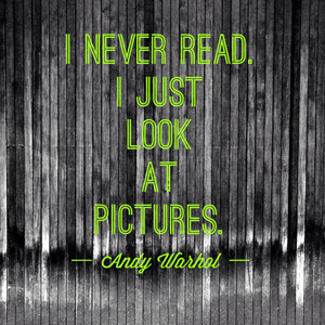
Layering gorgeous text over an equally beautiful image is a sure win to get your content clicked on social media. If you’re any good at Photoshop, this is easily done with an excellent piece of photography and creative typography. If you’re less than perfect at navigating Photoshop like I am, there are other options out there. For example, eyeball this $ 1 customizable text overlay in Canva.

A Word About Sizing
There are many guides available that talk about the optimal sizes for your social media images, so I’m not going to repost that same information here. Please, use these sizing charts. Print them out and keep them handy. Use them every time you post an image to a social media site. If there’s one thing people ignore, it’s a badly-sized photo where a person’s head is cut off or you can only make out half a logo.
Wrapping It All Up
I hope this short guide has opened your eyes to the power of relevant, well researched social media images. Good content deserves to be read, and I hope by using these tips, you’ll gain even more fans for your content.
Digital & Social Articles on Business 2 Community
(275)
Report Post


