Landing pages are the bread and butter of online businesses.
When used properly, you’re able to cater to different audience segments, focus on the right core message, and optimize for specific actions.
The challenge is getting landing pages right.
Almost no one gets it perfect on the first try. That’s normal, but with the right optimization strategy, you’ll be able to consistently build landing pages that grow your business faster.
This article shares a simple framework that’ll help you create high converting pages much faster.
Understand the job to be done of your visitors
The Jobs to be done theory is a product development approach that seeks to understand a customer’s specific goals or needs (which is referred to as a job) and the thought process that goes into selecting a product or service to complete that job.
For example, if someone skips breakfast in the morning and instead opts for a coffee, the job that coffee is doing for them is to fill their stomach until lunch. It’s their breakfast. Many products can perform that job:
- Kale
- A smoothie
- Fruits
The customer chose coffee for a specific set of reasons. Everyone is different but it could have been because of the taste, convenience, an energy boost, etc. It’s the job of entrepreneurs and marketers to understand these needs, segment customers into the right groups, and present the products to fulfill those needs.
Here’s the secret.
You don’t have to create a new product or change the product for every group. You just have to position the product as the solution for the unique needs of specific customer segments.
Let’s say Acme Inc. sells lead generation software that can help consultants, software companies, and bloggers. Each group has a different goal.
- The blogger wants to generate more email subscribers
- The consultant wants to generate more qualified calls
- The software company wants to generate more free trials
The software can serve all of them but if Acme Inc. positions its solution as just a lead generation tool, most people won’t feel it’s right for them. Instead, it creates individual landing pages that address the Job to be done of each customer segment. Here’s a landing page example that illustrates how this works in practice:
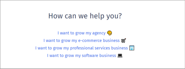
After clicking on one of the options, it takes you to a specific page that addresses the job of that customer segment.
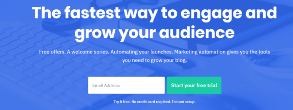
In the example above, the landing page caters to the jobs to be done of a specific group that happens to be bloggers.
Knowing the jobs to be done of your prospects is a great start, it’s just the start. It’s important to create a great landing page as well.
Focus on the visual hierarchy
There are many web and graphic design trends which people adopt to stand out from the crowd and increase their conversions. Some people love brutalism, others appreciate flat design, and still, others go off and do their own thing.
Whatever trend or design style you adopt, keep an eye on the visual hierarchy. It’ll help you communicate the most important information and cut down on confusion.
Many things establish visual hierarchy such as:
- Color
- Size
- Alignment
- Style
- etc.
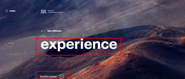
In the image above from refletcommunication.com, there’s a clear visual hierarchy. It uses a combination of font size, placement, fonts, and even the thickness of the text to communicate the most important information.
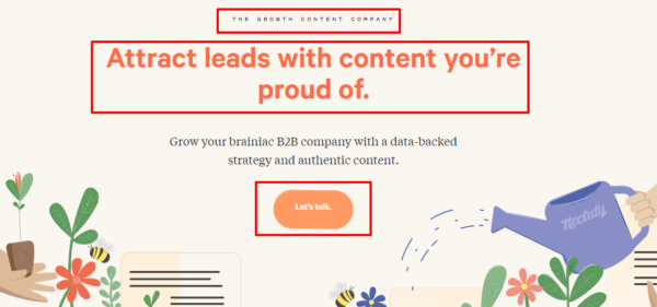
Nectafy also uses visual hierarchy effectively. It starts with a clear headline that focuses on the job that their customers want to accomplish. The button below is the same color as the headline and helps visitors focus on what matters most.
If a company is using multiple platforms to advertise its products, the viewers will be given information and asked to visit a specific page to learn more. Once they arrive there, what should they focus on first?
The landing page should mirror what the ad said about the product. It should have a headline that reflects the major benefit or use case mentioned. Below the fold, it’ll lead the visitor through sub benefits and use cases. All the while, the visual hierarchy will help visitors decide what to focus on.
This applies whether you host a podcast and want to promote your digital product or if you’re a professional service provider.
When you’re creating your visual hierarchy, think about the message you want to convey and the action you want visitors to take. Once you have those pieces of the puzzle, work backward and think about what they need to quickly identify that they’re in the right place.
Spend the most time on your headline because it’s what people will see first.
After that, focus your attention on the CTA button you’ll use.
Don’t test minutiae
Once you’ve determined the job to be done of your prospects and considered your visual hierarchy, it’s time to create a compelling landing page.
No matter how good it is the first time around, there will be room for improvement. There are two ways to go about testing your landing pages to increase your conversions.
The first strategy involves focusing on things like button color, the spacing between elements, the font color, button size, etc.
I refer to this as minutiae because it doesn’t move the needle much and any temporary gains you make will eventually move back to the average. This is the curse of the local maximum and after multiple small optimizations, you won’t be able to increase your conversion rate much more.
Instead, focus on testing significant changes of your pages because no one knows for certain what’s going to have a huge impact on conversions. All we have are best practices to guide us.
What counts as a significant change?
- The headline
- The page layout
- Imagery used
Basecamp is an organization that has built radical testing into the fabric of their optimization strategy. Instead of being content with a certain conversion rate, they’re not afraid to tear a page apart and put it back together.
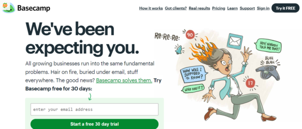
In the above example, an illustration is used to communicate the value proposition and help prospects understand how Basecamp can help them with their jobs to be done.
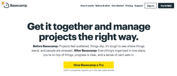
In the second iteration, the illustration is nowhere in sight, the headline has been changed, and even the way the form is presented is different. I can’t speak on the results of these two pages but it’s clear that Basecamp isn’t testing minutiae.
It’s focused on arriving at a new local maximum, then a new one. If it continues on the current trajectory, it may hit a global maximum. This is unlikely because consumer trends shift and what was a benefit before may no longer be important.
That’s why it’s important to continue testing and using surveys (NPS surveys, Likert scale surveys, CSAT surveys, etc.) to deliver messages that renovate with your prospects.
Conclusion
Designing an effective landing page isn’t a one and done event. It’s a continual process that combines your understanding of a market, design best practices, and continual testing.
This article has focused on the three major aspects that’ll help you get beautiful landing pages up and running in the shortest amount of time possible.
Let me know what you think about the landing page optimization framework and don’t forget to share.
Digital & Social Articles on Business 2 Community
(76)
Report Post
