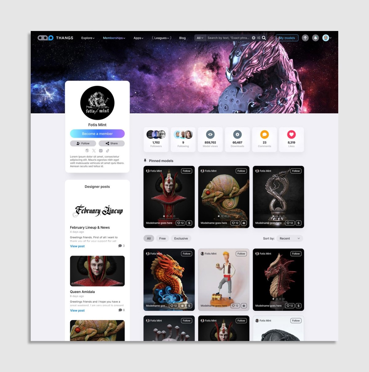
Abigail Brody is a design executive who has spent more than a decade of her design career at Fortune 500 companies, including Apple, where she helped to create dark mode and some of the first iPhone’s design explorations. She leads product design at Physna’s Thangs, the fastest-growing 3D model database.
When did you first know you were interested in design?

I’ve been interested in art and science since my early childhood. However, it would take some time for me to realize that design could be a profession. I was born in a generation where the media wouldn’t report about design apart from fashion or furniture design. You wouldn’t commonly hear about product design itself as a career path.
One summer, I read this magazine article about ArtCenter College of Design in Pasadena, which introduced me to the intersection of design and technology so compassionately that I dropped everything and decided to put together a portfolio and apply. I opened a door by buying that magazine that fateful day, and my life has never been the same since. Writing about design and about designers in the field can inspire other people.
You worked for many Fortune 500 corporations early on, but you’ve also worked at startups. How does your approach to design differ in these two environments?
Before I joined Apple, I worked for Cooper Interactive under Alan Cooper, who coined the term “persona” and created the goal-directed design process, focusing on personas and how they use products to achieve their goals. My understanding of that human-centric approach prompted Apple to bring me onto their application design team. Throughout my decade working at Apple, Steve Jobs actively reshaped the company, and my approach was transformed by his passion for radical simplicity and design thinking. That’s what drove other companies to hire me later on. Whether they were a startup or big corporation, they always wanted to bring in the human-centric approach and expertise I gained at Apple.
The main difference between working in a startup and a large corporation is the duration of projects and available resources. At Apple, doing R&D for a complex product project for 12 to 18 months and focusing on the big picture is very common. In contrast, at a startup, you typically work in biweekly sprints to concentrate on a minimum viable product feature to be released and then iterated upon rapidly. At startups, you also have to rely more on your product sense, your experience, and your principles to create great products rather than being able to invest in extensive user research and testing when designing a feature when working in a fast-paced product release cycle.

Can you share more about the design work you did for Apple?
It was a fascinating time to join Apple because Steve Jobs had just returned. Apple acquired Steve’s company, NeXT, which shaped the foundation for Apple’s new operating system, Aqua. That was the start of Apple becoming a software-centric company with a soul and a laser focus on simplicity. Before that, Apple was very hardware-driven and had too many products.
My role was to help set up an application design team from scratch because, at the time, Apple didn’t have all the beautiful applications we’re so familiar with today. Apple had to invest in making video, audio, and photo applications and other productivity tools. My job was to shape the team around Apple’s professional applications and perform design R&D for future products for creative professionals. Because creators often work in a dark room, we learned they needed a very customized and simplified user interface, which introduced dark mode to Apple. This work was among the most significant innovations influencing Apple’s macOS (operating system).
I was invited to work on several other projects, including the first iPhone, a highly secret project at the time. Much of my work was based on the dark mode and advanced interface design we did for Apple’s professional applications. I also picked that first clownfish wallpaper for the first iPhone that was unveiled by Steve Jobs.
How do you balance that simplicity with attention to detail when crafting user experiences?
Simplicity, purity, functionality, and delight are part of Apple’s DNA. It’s all about combining an aesthetically pleasing design with a user-friendly experience. Often, visually pleasing products feel much easier to use. Still, you also have to think about the prioritization of key features to simplify a product while also enhancing the user experience.
Looking at the bigger picture, the whole lifecycle of a product and how it’s being used from first contact to end-of-life, that’s all about a holistic design; a seamless experience. It’s essential to understand what makes a product useful, which is a combination of experience, research, user feedback, and iteration.
I appreciated that Apple was a company that would never settle for shipping less than the best. If developing a feature wasn’t possible within a given time frame, they would wait for the next release to perfect it. It’s essential to be able to say no rather than adding everything you can to your design. My design focus is striking the right balance and being deliberate about what you put into a product.
Tell us about your current role as principal product designer at Thangs 3D. What goes into the design of this growing 3D model database?
Because Thangs is a startup, our primary goal was rapidly bringing the product to market and growing it. While listening to our customers, we’re attempting to bring world-class design into the user experience in an iterative fashion. We are all about fostering creative communities on our platform and empowering creators to bring their visions to life in the 3D space.
We’re transforming how users create and acquire this content. Through Thangs memberships and marketplace, creators can list and sell their models to customers with native IP protection features. Our database makes their models easily accessible, simplifying content creation and elevating community engagement. Helping creators protect and monetize their creations is central to our mission. We’re providing creators with a platform for continuous earning from their art while minimizing the risk of someone stealing their intellectual property. We automate many administrative tasks so creators can focus on what really matters— designing remarkable content and nurturing the communities.
How do you incorporate the latest developments in design and technology, like generative AI and Chat GPT, into your work?
That was why I chose design as a field. The industry constantly evolves, encouraging you to be open-minded and receptive to new ideas and perspectives. Design is all about innovation and radically rethinking how a product can be built. As part of my work, I’m always asking, what magic can we tap into to make the ideal experience for the customer and potentially reinvent the whole industry?
I was head of design at YOU.com, a generative AI search engine that uses Chat GPT to put the users’ needs first by personalizing their searches. I designed YOU.com’s Chat GPT assistant, so I had a lot of exposure to how AI is being integrated into the design and how it can optimize user experiences.
Do you ever receive company pushback on new design ideas?
My teams have all always been very growth-oriented, so whatever new features promote growth in a company are very helpful. Progress can be made as long as there is constant communication with stakeholders and everyone is on the same page. I have definitely experienced situations where I’m told no. I’ve also learned throughout my career that you can’t do everything all at once. Sometimes, you must live with established features and wait until you can transform a design during a later release.
You have to trust the process. Design is all about iteration and evolution.
What do you consider the most important design principles or philosophies that have guided your work throughout your career?
Design isn’t just about the business approach; it’s about how it enhances lives. For the best results, start with simplicity, eliminate unnecessary complexity, and focus on what truly matters. I believe functionality is essential. It’s designed to serve a purpose, so it needs to be intuitive and user-friendly.
I personally don’t compromise on quality. I believe in excellence in every aspect of design, and that commitment to quality has set Apple apart and helped me in my career journey. And last but not least, innovation is about pushing the boundaries of what’s possible. I always strive to surprise myself and my teams with new ways to improve upon products or experiences with innovation.
What are the key trends or emerging technologies that will shape the future of user experience design?
We’re at a point in a design similar to when the internet was born or the iPhone hit shelves. It’s a turning point where we will see real change again with the growth of artificial intelligence and a seamless blend of digital content with your physical space, the interconnectedness of products within our living environments, voice-driven user interfaces, and, of course, the increasing importance of sustainability and eco-friendly design in the wake of the environmental concerns we’re facing.
What advice do you have for aspiring designers and creatives?
Be passionate about the world. Passion is the key ingredient for any career or profession. Design is about caring deeply about the details and relentlessly pursuing perfection. It’s also about listening to your intuition, trusting your instincts, and never fearing the status quo.
We design to make people’s lives better, simpler, and more enjoyable, which is why design has the power to change the world.
(9)
Report Post


