I feel like we’ve been growing apart, lately.
We used to stand for the same things:
- We used to fight clutter together.
- We would hate-laugh together as sites with rotating banners littered the web, with owners thinking letting all the groups have a piece of the home page is a great idea.
- We would cringe as web page owners plastered information on the web, without simplifying options.
We used to be on the same page, you and I.
And then, you started doing this:

So I have no other recourse than to think that you’ve lost your mind.
What we need is a good, old-fashioned intervention. Okay?
Know that I’m coming from a place of love when I say that your brand of minimalism is destroying usability. Let’s get to it.
1. The Lunacy of Hidden Desktop Menus

I get it. You want to look edgy.
All the cool mobile kids are doing it, and they seem to be working well. Usability means keeping the web site clean and clutter-free, so you think you’re just following established usability principles.
Here’s the thing: on desktops, you have room to display the primary navigation of the site. What that means for your users is that they can take a quick scan of your site, and decide whether one of your categories fits their need.
When you hide the menu even when you have room, you are breaking one of the core principles of usability: discoverability. Users need to be able to discover what your site has and does not have, quickly.
To ensure good discoverability, you need to optimize the space you have to work with. You can get rid of the clutter without removing things users actually need, like primary navigation elements.
On mobile, where the content to chrome ratio needs to be different, you can continue using the hamburger menu.
2. The Preposterous Return of the Splash Screen
In the early days of the web, there was this really strange concept – the splash screen.
Before we could get to the content, there’s this introduction to the web site featuring content no one wanted. It is a credit to humanity that it went away because splash screens just got in the way of user tasks.
Now, while Flash splash screens are dead and buried, they seem to be making somewhat of a return in another form:

You’ve seen this. Heck, your “minimalist” site often brags about the video playing in the background as you have just a CTA near the bottom of the page.
What you’re actually doing, by going for this much pizzazz, is delaying the user. That’s against another core principle of web usability called learnability.
Functional minimalism doesn’t mean taking away elements that actually help users learn about your site – it means removing the elements that are irrelevant to user tasks.
Your site’s main selections are the opposite of irrelevant – they should still be at the body of the page.
You need to keep the bare essentials for a site to work well.
3. The Insanity of Ghost Buttons
Here’s what should have set off gongs a long time ago, when your designer uttered the words:
“For our call to action, let’s use a GHOST button.”
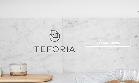
Ghost. As in a being defined by semi-transparency and being difficult to see. The suggestion is, “let’s take the most important part of our landing page, and make it difficult to see!”
So you get pages like this:

If your designer said that in 2009, there would have been strange looks, possibly followed by a firing. But you’re using this more often now than ever, and frankly, it needs to stop.
This breaks readability, one of the things that you should really be more concerned about.
Making the Bare Essentials Work
Okay, look – we like you, minimalism. Sites without clutter definitely look more elegant, and in many cases, they tend out to be more usable.
The problem is when you get carried away with it, we start worrying about you throwing the baby with the bathwater.
There’s room for minimalism on web sites where …
- the primary navigation elements are still there
- the body contains more than a video and some cryptic words
- the call-to-action is still readable
So just don’t go too crazy cleaning up useful elements, okay?
Digital & Social Articles on Business 2 Community(67)


