— January 31, 2019
SaaS websites need to be special.
There’s always a temptation to focus heavily on what your software does: the technology used in your processes, the features of your offering, etc. Those things are great – and they can serve as validation of your offering’s value.
But it’s important to put your own preconceptions aside when you’re designing your SaaS website. If you don’t intentionally work to view your website from an objective perspective, your site will almost certainly have too much jargon, be too complicated to navigate, or even miss your target demographic entirely.
With that in mind, here are four questions to ask when designing and building a website for your SaaS company. These questions will give you the perspective you need in order to find out if your website design is optimal.
1. Does your SaaS website make a great first impression?
Here’s a fact that keeps web designer up at night: from the first click a user makes onto your site, you have between 50 milliseconds and 6 seconds to create a positive first impression. Clearly, that’s not a ton of time. How are you going to impress that visitor in such a short time span?
Here’s how:
- Top-notch (and best practice) design
- Consistency in brand and messaging
- Simplicity
And here are three examples I like:
bambooHR
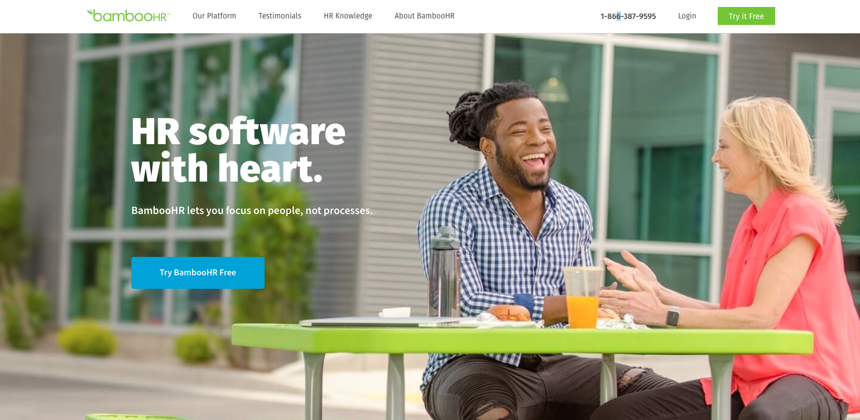
Why I like it: it’s simple and it captures the core of the product. The image conveys the brand’s purpose and ethos, and the clear CTAs are focused on a free trial (which tends to be a good hook for SaaS products).
SpringSled
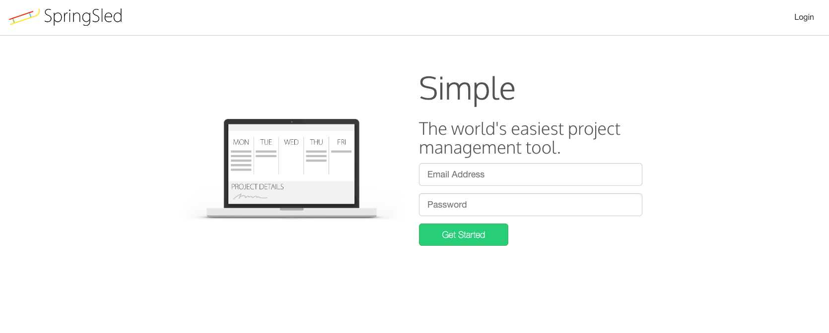
Why I like it: wow, this is simple. It gets the message across so clearly and quickly, and aligns really well with the theme of the product, which is (no surprise) simplicity.
WISTIA
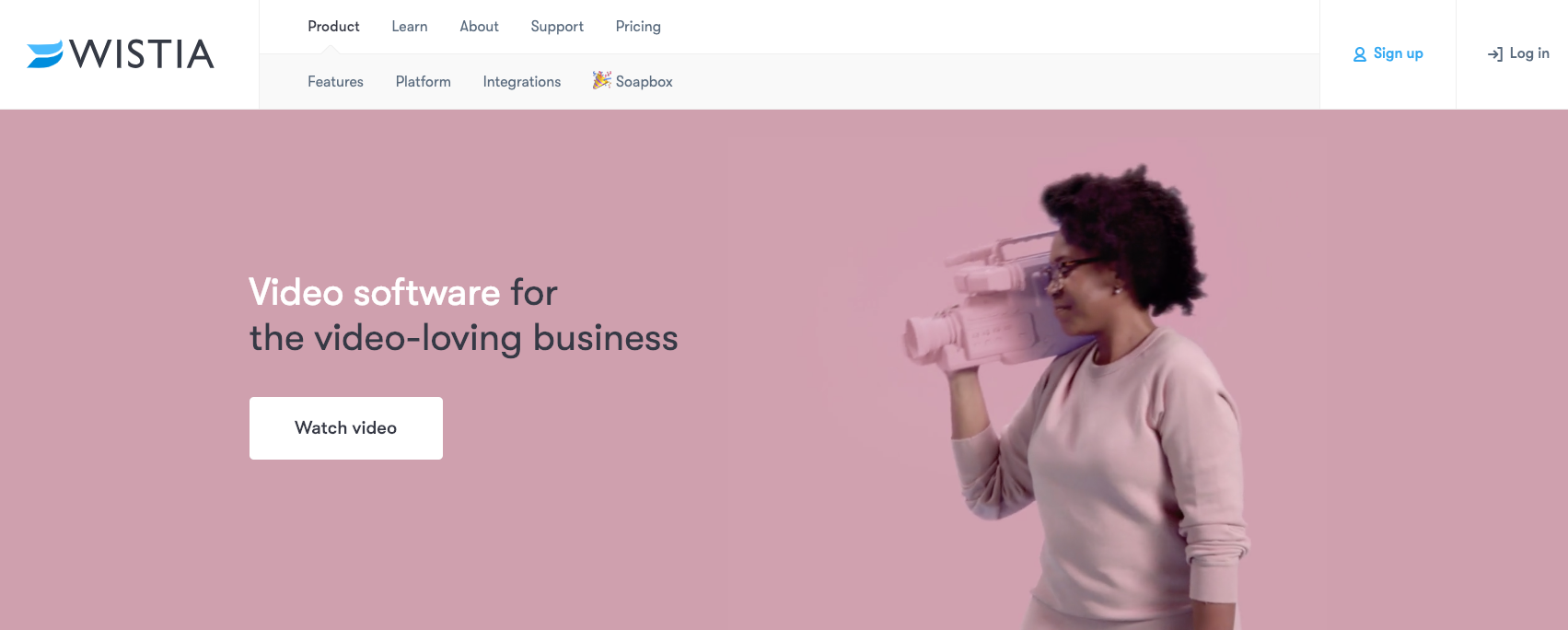
Why I like it: the tagline is really simple, and the messaging is really consistent – from the background video to the fact that, to learn more, you watch a video.
The takeaway: be simple and call users to action.
There’s time to get into the features and details of your SaaS product later. Start with the basics.
And remember: maintain brand consistency.
Not only does creating a web design with brand consistency in mind help create a great first impression, but it boosts your aesthetic appeal as well.
Pro-tip: use the colors in your logo as the color palette for your website.
The colors should already be visually appealing and create a large part of the feel for your company (on the other hand, if you’ve been looking at your logo with increasing distaste for the past three years, this may be an opportune time for a logo-rebrand). Using your logo’s colors in your website design helps to ensure a consistent feel across your brand (and you’ll notice that the sites above tend to do this pretty well).
Get feedback.
Make sure your website is simple and easy to navigate to someone outside your industry – somebody who doesn’t live and breathe your software. Don’t use jargon in your menu items. Don’t pack your homepage with technical terms that only insiders would get.
One way to ensure you haven’t missed the mark is by having friends and family attempt to navigate the website. Or, if you want to go to the next level, install a tool like HotJar and see how real anonymous users interact with your site. Then, optimize on that data.
Feedback is a great way to make sure your website design is on the right track.
2. Do you know your audience?
SaaS audiences obviously vary greatly depending on what’s being produced. Who are your potential users or clients? Don’t assume you know the answer; test your best guesses with data.
We recommend engaging in user and client analysis through tools like client surveys, persona development, and the StoryBrand framework. The better you know your ideal clients, the better you’ll be able to speak to their needs on your website.
Based on those needs, craft your site in a way that puts your clients at the center. This means moving toward client-directed language: “Software to help you do x,” for example.
A few general tips:
- Be clear and concise in your messaging.
- Think through the purpose of each page, and build content to fulfill that purpose.
- Include prominent calls-to-action – free trials, demos, etc. Don’t beat around the bush.
3. Does your website design generate qualified leads?
Targeting potential clients is done best through considered platform usage. That’s another way of saying this: identify (through data / research) the marketing channels where your audience lives, and then build your online presence accordingly. For example, you may be best able to reach older clients via email. You may be best able to connect with younger clients on social media.
In general, don’t underestimate social media as a way to generate leads for your company. Especially for SaaS firms, the majority of your users will likely be on social media.
Directing traffic from social media to your website can boost your SEO and mobile compatibility, while giving you another outlet to generate leads.
Email newsletters are a great way to nurture your list. Let people know what updates you’re working on and what value your software’s delivering. A newsletter is a great way to show that your product will make people’s lives easier.
Your website should play a major role as you market your SaaS firm – and it should work hand-in-hand with the most effective channels for your audience.
4. Are you using the best technology?
SEO and a mobile-capable website are crucial in excellent website design. That’s as true for software-as-a-service providers as it is for any other industry.
People are more likely to connect to social media through their phone or tablet than their desktop computer. Mobile capability can boost lead generation and add to the simplicity of your website. Most importantly, if your website is not mobile capable, or too complicated to navigate on mobile, you have a large chance of losing leads. This is part of why starting simply is such a big deal in the first place.
For example, here’s bambooHR’s mobile homepage:

Notice how simple it is – and how the CTA is still very effective.
Additionally, search engine optimization is a great way to generate leads and direct more traffic to your website. A great way to tell if you need to boost your SEO is if your company does not appear when you search for your company’s name, or if it’s missing when you search for your products and add your location.
Make your SaaS website stand out.
Despite the constant trends and updates, a SaaS business is a game of consistency. You need a consistently-targeted website that will use the points above to generate growth in your user base.
Digital & Social Articles on Business 2 Community
(104)
Report Post