B2B web designs can be lovely and enjoyable, but they should also be functional. While award-winning websites explore new trends and take us on an artful journey, websites that drive leads maintain or increase revenue.
In this brief article, we are going to share 5 B2B web design tips for lead generation.
Create a Clear Flow in Your Design
Cluttered or crowded website designs are distracting and ultimately, unappealing. If you are looking to maximize lead generation on your B2B website, ensure your design has a clear flow the user can easily navigate. Your website should be organized and only show the essential information a visitor needs when they land on your website. Removing anything extraneous will improve the flow.
Use Design to Guide the Prospect
Think about your local grocery and big box stores. Almost all of them provide clear signs to help you get around the store and get to what you need quickly. B2B web design that sets the stage for lead generation helps to guide the website visitor to what they need. This can include multiple paths or sections of the website. Professional, experienced web designers understand this and incorporate clear elements into the design to help the user along the path to conversion – whether it’s signing up for a newsletter, downloading a resource, or completing a contact form.
Allow Options for the User
Not every website visitor is the same. Providing options for the user through the design of your website ensures each person can get around the site by their preferred method. For example, some website visitors may want to learn more about your company, certifications, or previous clients before they engage with you. Others may only need to see what types of products or services you offer to get in touch. Still, others may want to spend time perusing your thought leadership content to see what types of strategies you recommend or who they will be working with at your firm. Strong web design allows the user multiple options for moving along the path to conversion.
Make It Easy to Find Things
We’ll be plain in this section. Don’t bury important information, gate everything, or make essential information difficult to find. Also, be sure to do UX testing to ensure that your web design functions how you want it to. For example, make sure all buttons are clickable, links aren’t broken, and important information or content isn’t obstructed by other web design elements. UX testing doesn’t need to be in-depth to be effective, but navigating your B2B website as you expect users will do can often reveal small bugs or issues that make it tough on the website visitor (and thereby a hurdle to conversions).
Include Relevant Images or Illustrations
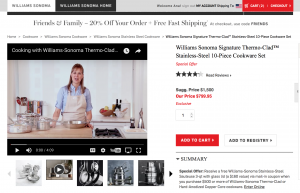
You want website visitors to say, “Hey that’s my company” or “That’s what I need” when they visit your website. Solid web design always included relevant images and/or illustrations. For example, if you are speaking to solar companies, use images from solar farms or solar products. If you are speaking to professionals working in an office, use similar imagery. If you are speaking to C-suite professionals, ensure that your imagery resonates with that type of website visitor.
B2B Web Design for Lead Conversion
While the above 5 tips are meant to get you started thinking about optimizing for website conversions, it’s crucial to work with a B2B web design agency that has the same goals. Before you start a project with a new web agency, be sure to ask about lead generation or make it clear that is a primary objective for your firm.
Digital & Social Articles on Business 2 Community
(33)
Report Post


