
The overall design of your email will determine whether the recipient will actually take time to read it or mark it for the junk folder. Here are some of the things you should consider when designing your email campaign.
Overall Layout of Your Email
The type of content you’re pulling into your email design can dictate the overall layout. A single column layout is best for more focused messages (e.g. a call to action for an event) whilst a multi-column layout is better to show a variety of content (e.g. range of recommended products). It’s also better to be consistent with your layout styling, which can enforce strong brand recognition.
Don’t Forget Your Brand
Your brand is very important in building up trust with your email recipients. There should be a strong theme running across your emails that clearly represents your brand. Using an email template is always a good idea to keep you from going astray.
The colours that you use should always harmonise with the brand, too many clashing colours is an eye sore. Think clean like Google Design. If you want to create contrast, keep this for your call to actions to draw the readers attention.
Don’t Forget to Personalise
If an email is relevant to your email subscriber then they’re more likely to engage with it. If you personalise both the subject line and content then it implies that your business is in touch with the customer, which can increase your open and click through rates.
Don’t Overdo the Text
It goes without saying that your email will need some text, but your recipients won’t want to receive an essay. Most people tend to skim read through text and pick out what’s important to them. A small leading line or paragraph is enough to grab the readers interest. If they’re interested they will click through to read more on your website or dedicated landing page.
Be Careful When Using Images
Make sure your email isn’t too image heavy that it bloats the size of the email. Make sure the images you use are relevant and necessary to be included in the email. Don’t forget to use alt text and titles behind your images to ensure that there’s still copy to illustrate your article if the image doesn’t load. You shouldn’t rely on images alone to sell your product.
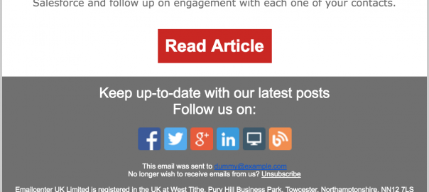
Have a Clear Call to Action
Don’t just present a load of information with no purpose. What do you want the reader to do when they have read your content? Where are you driving them to? Don’t have too many conflicting call to actions, such as an image, link and button.
Be consistent – if a reader is a regular subscriber they will notice a patten with your call to actions and begin to recognise what you want them to do.

Make Sure Your Email is Mobile Responsive
Most people are split these days between viewing their emails on the go or using their desktop. Don’t neglect your email’s mobile view. You may even want to consider designing for mobile first as, according to emailmonday, mobile is turning into the most common way we view our emails.
Luckily, Maxemail’s drag-and-drop email builder automatically has the option to optimise your email for mobile, so this shouldn’t be too much of a hassle.
Don’t Forget to Preview
Your email will most likely be viewed in the recipients preview pane first. You’ll have 600px width by roughly 180px depth. Make sure that your key information and all call to actions are in this space to entice people to open and continue reading the email. Avoid heavy use of graphics that may not load in the preview pane.
Always Test Your Email
Check your email before sending to prevent it from getting filtered as spam or junk. Be mindful of using spammy words or too many images, and always include an unsubscribe link in your email.
Maxemail has a great testing suite supported by Litmus that allows you to check how your email renders in different email clients. It also highlights other errors and lets you know if your email will be flagged as spam.
Digital & Social Articles on Business 2 Community(42)
Report Post