By James I. Bowie
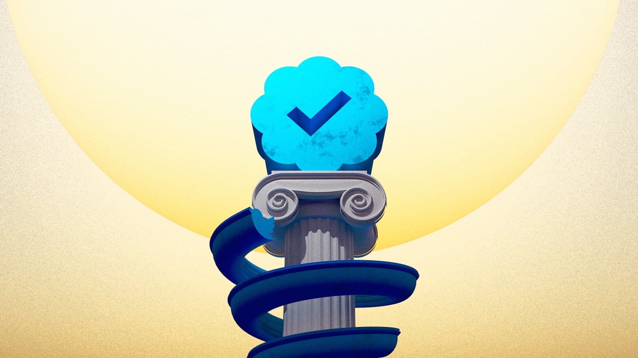
Elon Musk’s newly unveiled plan to allow Twitter users to sport the social media platform’s coveted blue check for a mere $7.99 per month has focused unprecedented attention on the symbol. In some sense, the fate of the company—financially, culturally, and politically significant as it is—hangs on this tiny handful of pixels. But the design of the blue check may play a role in why people have so many strong feelings about it.
Twitter created the blue check in 2009 in response to complaints from Kanye West and Shaquille O’Neal, among others, that they were being impersonated on the platform. The design, which features a white (not blue!) check mark on a blue circle with a wavy edge, was attached to accounts that had been verified by Twitter as genuine. Its design draws upon two separate traditions of graphically signifying confirmation and authenticity.
It’s difficult to trace the history of the check mark, a graphic convention that is well known but simultaneously taken for granted and little considered. A popular theory holds that the mark represents the first letter of the Latin veritas (“truth”), but this sounds like an attempt to impose a facile explanation—much like the canard that tips stands for “to insure prompt service.”
In any case, many companies, from Verizon to Veriff to VeriSign (now Norton), have capitalized on the V/veritas/check mark connection in their names and logos. (Nike’s iconic Swoosh is often mistaken for a check mark.) According to analysis of United States Patent and Trademark Office records, the rate of use of the check mark in American logos has more than tripled since the 1970s.

Interestingly, another theory of the symbol’s origin is that today’s V-shaped check mark is just an easier way of writing an X, requiring one stroke of the pen instead of two, and there’s ample evidence that the letter X was thought of as a check mark in the past. The long-standing appeal of X as this sort of all-purpose symbol, whether for marking the spot, standing in for a signature, or representing an unknown quantity, may help explain Musk’s infatuation with the letter. After naming both companies and children after the letter, he’s expressed his desire to create an “everything app” called, naturally, X. In a way, it’s fitting that the blue check plays into his plan.
The blue blob behind the check mark also carries some historic significance that may contribute to the perception of blue checks. At first glance, it may bring to mind Montblanc’s emblem—the snowcapped mountain peak on the top of the company’s pens, or Salvador Dalí’s undulating logo for the Spanish candy Chupa Chups. But the shape is representative of a seal—an ancient, and today archaic, method of marking a document as official; Twitter cofounder Biz Stone, introducing the blue check in 2009, referred to it as a “verification seal.”

One type of seal was created by making an impression in wax on paper, a process that resulted in excess wax bulging out from around the borders of the usually circular seal. Over time, as physical wax seals were replaced by graphical depictions, this protuberant border often remained as a sort of skeuomorphic reminder of a bygone practice. Such fluted or scalloped borders were particularly popular among 20th-century American university seals.
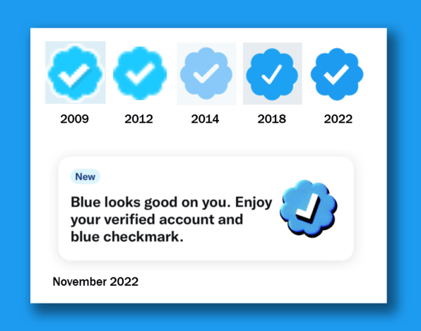
The design of the blue check has changed ever so slightly over time—narrowing and widening, its corners becoming rounded, then snapping back to angularity. The meaning of the check has also evolved, with some harboring growing animosity toward the celebrities, politicians, public figures, and journalists privileged enough to have had the badge pinned to their profile like a tiny blue medal of honor. (Or as Musk deemed it, a “lords and peasants” system.)

This weekend, Twitter’s new CEO rolled out a vibrant and supersize version of the blue check to promote the upcoming paid verification plan, highlighting the symbol’s centrality to the scheme. Now that users have the ability to buy (for a relatively low monthly fee) what had been seen as a status symbol, it’s possible that the meaning of the badge could morph yet again—even possibly coming to indicate a form of “stolen valor.”
Or perhaps the blue check is just a red herring, with the true significance of the new plan lying in its potential to algorithmically boost the tweets of the blue-checked, and quash those of the unchecked. Either way, Musk has already marked his X on the new Twitter.
James I. Bowie is a sociologist at Northern Arizona University who studies trends in logo design and branding. He reports on his research at his website, Emblemetric.com.
(24)
Report Post


