By Prialto, Published October 6, 2014
Your email signature may be the last thing on your mind when sending out sales letters, yet it is actually one of the most cost-effective marketing tools at your disposal. A well-written email signature can increase the response rate and client interaction with your business by adding valuable information, and a sense of trust and professionalism at the end of every message sent. Below are some best practices for an email signature that will garner you more replies, more leads and more sales.
Include the essentials
The main purpose of your signature is for your recipient to easily contact you and get to know more about your company, product or service. Including your business contact details and your website allows prospects to get back to you if they have questions or concerns related to your email. Additionally, it should prompt them to visit your company’s website to learn more. Ideally, from there they could subscribe to a newsletter, sign up for a free demo or download your new white paper, sending them deeper into the sales cycle.
Keep it compact
Short and simple is the way to go when creating your email signature. Choose one contact number, one email address and a website. Aside from keeping the info concise and to the point, see to it that your layout is compact and easy to read. Instead of using a new line for every piece of info, use vertical bars or semi-colons to separate details in a single line. Below is an example of well-utilized space:
Name | Title
Name and address of Company
Phone | Email | Website
Forget about “fake-it-until-you-make-it” locations and phone numbers
Not so long ago, multiple office locations and certain key (212, 415 and anything that required a 011 for international dialing) area codes were a sign of prestige. It gave you and your business a certain heft to suggest you were more dependable to do business with.
Today, however, even the smallest companies can afford to be distributed over a large geographical distance. And most anyone can secure an area code from nearly any location and point it to someplace else.
Having multiple office locations and phone numbers in your email signature does not make one look bigger in this new landscape. It just makes one look dated and out-of-touch.
Link to social media ONLY when appropriate
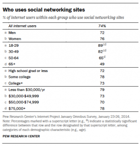
Some companies choose to link to their social media accounts in their signatures. But it’s not for everyone. Linking to social media accounts like Facebook, LinkedIn or Twitter may be a good idea if a lot of your products, announcements and interaction with clients happen on social media. It is best to limit links to such pages if your company isn’t very active on social networks, posting only a few times per month or less.
Include additional details
Without making your email signature too long, it’s possible to include one or two additional details that you want your clients and prospects to see. Perhaps it’s a link to your blog, a newsletter subscription, a product explainer video on YouTube or an offer to download your new white paper. This additional information can change as new sales and marketing campaigns are launched. This can help to drive more traffic to certain pages and boost conversions.
Use images cautiously
Images may look cool, but they can sometimes mean trouble for email signatures. Images add to the size of your email and may make loading your email slow and difficult for some. What’s more, if your contact details are part of your image, it will be difficult for the client to copy and save those details. This creates a hurdle for easy communication between you and your prospect or client.
Your email signature is a great tool to communicate sales and marketing messages to prospects and customers. A good email signature can help to create brand awareness, increase engagement and ultimately close more sales.
Business Articles | Business 2 Community
(332)
Report Post


