As your small business evolves, so does your myriad of marketing materials. From business cards to websites and everything in between, you’ll quickly find that your small business is swimming in marketing collateral. Before you get to this point, it’s wise to take a step back and create a brand style guide to ensure your print and digital marketing assets are coordinated and represent your business accurately and professionally.
What is a brand style guide?
First things first: what is a brand style guide? A brand style guide is a catalog of the elements in your visual identity as well as a list of dos and don’ts for your small business (how and where to use a logo, tone of voice, etc.). This document typically includes your logo, fonts, colors, brand voice, and use case examples for each. It’s meant to give a quick overview of acceptable ways to present your brand in any medium available.
This may sound very advanced, but it’s easier than you think. As a functioning small business, you likely have 95% of the materials you need to put the guide together; you just need to do it! This upfront effort is worth the time as a brand style guide acts a small business’s North Star and makes marketing and branding decisions simple in the future.
A brand style guide also comes in handy if you work with freelancers or third-party vendors. From this document, your partners know where, when, and how to use your brand assets in the right way.
Let’s get down to the nitty gritty so you can put your brand style guide together.
What does your brand style guide need?
Great question! To create a guide that is useful and actionable for your small business, you’ll need the following five items at the ready.
Brand mission
When you started your business, you likely created a mission or vision statement to articulate what your business is about and how it differs from the competition. It’s only logical to include your mission statement in your brand style guide because it sets the tone for how your brand presents itself, what kind of customer you’re trying to reach, and your business’s underlying ideals. Each of these components is an integral piece of your brand identity.
When writing your mission statement, you may have identified your unique selling proposition (USP). This is another piece of the brand puzzle that needs a place in your brand style guide. Your unique differentiator is the crux of your success. Thus, honing your marketing materials, both print and digital, to include your USP in a consistent way means you’re building credibility and ingraining in your brand in your audience’s mind. Branding is all about recognition and your USP plays a big part in establishing recognition.
We realize that your brand mission, values, and USP are not necessarily tangible marketing assets, but they are at the core of every marketing material. They direct the tone, aesthetic, channel, and platform, so they are necessary for a comprehensive brand style guide.
Logo
Your logo is the visual representation of your business brand and holds a top spot in a style guide! Including your logo along with an explanation of what it represents is a good idea. A style guide is meant to be an educational and actionable resource for your internal and external partners, so explanations are always welcome. Leave no room for interpretation when its comes to your brand; this is not the place where you want people to take creative liberties.
Beyond your logo’s meaning, your brand style guide should show approved and unapproved use cases for your logo. For example, providing specific dimension ratios, color inversions, and black and white only logo specs will help keep consistency across your marketing materials. Feel free to have as many variations of your logo as you want in your style guide. This is your catch-all, so be as robust or lean as you’d like.
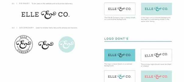
In Elle & Co.’s brand style guide, the logo section is straightforward and easy to understand.

From these two pages, anyone can digest how to use their logo in a brand-approved away. It’s a simple layout that holds a ton of information.
With your logo parameters clearly defined in your style guide, your brand will stay intact regardless if your logo is being used on a brochure or a social media profile page.
Color palette
Outside of your logo, your brand probably has a few (ideally one to three) colors in its defined color palette. Add those colors to your brand style guide! Include the color names (if available), a color swatch, and hex codes (the HTML version of color names).
Much like your logo, using the same exact colors across your marketing materials is necessary for building a reputable brand. Having your approved colors and relevant information in your style guide means there’s less room for errors.
Scrimshaw Coffee made its color palette page aesthetically pleasing and actionable in its style guide. Their five colors are apparent, and they each include the necessary information to be used in a print or digital capacity.

It takes time to find the perfect suite of colors, so use your style guide as a home for your color palette. You’ll save time in the long run by having them in one place and your online and offline brand presence will be cohesive.
Typography
Just like your brand colors, you need to use the same suite of fonts to build a trustworthy brand. Whether it was while designing your business card or website, you chose one or two fonts that felt like your brand; these are your approved set of fonts.
As we know, the more information the better for your brand style guide, so go back to your website builder or brochure design and look up the names of your primary and secondary fonts. Once you have their names and preferred font sizes, add them to your guide. Showing examples of use cases is important as it helps avoid confusion and, again, limits room for interpretation.
Need a visual? Bark! Bakery explained their brand typography in a two-page spread.

The font names, styles, and use cases (main font, headline, etc.) are all noted and easy to reference. It’s a great example of how to showcase your preferred typography in an understandable way.
Imagery
Depending on your industry, your business may be more inclined to use a variety of images in its branding. Regardless, include a set of approved images (preferably original images) and themes that fit within your brand. Outlining appropriate niche areas helps guide future image selection, and you guessed it, consistency across your brand.
Sometimes in brand style guides, inspiration pages are helpful as they act as Pinterest-esque boards, which include images and graphics that reflect the brand’s visual identity. If this seems like a better fit for your business than defining themes, go for it!
GlowSystem used an inspiration page instead of an images section in their style guide.

You can clearly see the aesthetic they’re trying to cultivate, and it is easily understood which types of images work for this brand. That’s exactly the purpose of having an imagery section. You don’t need 100s of images, but a few that capture your brand’s different interests and values will suffice.
Brand voice
Your business voice is not a tangible material – like a logo – but remains an important part of your brand identity. Your brand voice must sound the same across your marketing channels. In this section of your style guide, include sample text (think brochure or website content), keywords, as well as some dos and don’ts for your brand. Including a list of words that are not to be used can be as helpful as the keyword list.
Give as much direction as possible so no matter who is writing for your business, the voice sounds similar.
Start with the basics and build from there. Brand guidelines are meant to evolve as a company grows, so don’t feel constrained to your initial brand guide. It’s a jumping off point that should be revisited often to ensure it remains relevant and useful for your business.
Now that you know what a brand style guide is and why your small business needs one, hop to it! Use this as an opportunity to let your creative juices flow and watch your brand come to life as you piece together the necessary components for a consistent brand both on and offline.
Digital & Social Articles on Business 2 Community(267)
Report Post


