Canva’s radical overhaul aims to destroy Microsoft Office and Google Workspace
Canva is gunning for the enterprise set with new tools and features that are a direct challenge to the incumbents.
BY Jesus Diaz
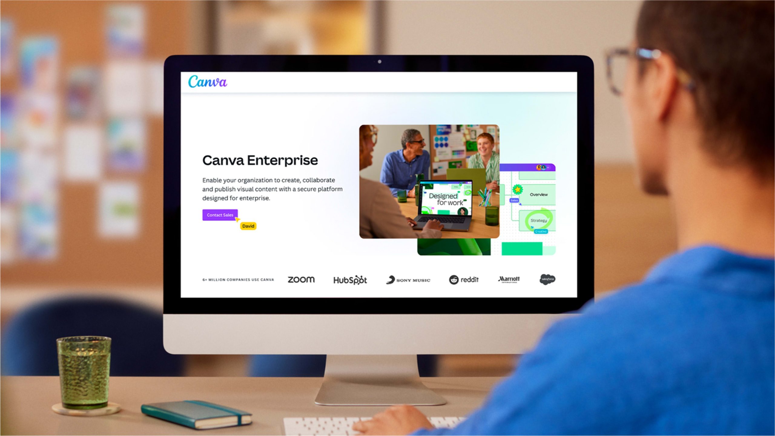
Canva announced today that it has completely redesigned its user experience. The update comes with a revamped interface that adds a staggering number of features for general users and professional workers alike. The company is also launching workspaces specifically designed for the enterprise set: people working in sales, marketing, HR, and creative departments. After a decade of packing its design suite with dozens of features, from animation to video to generative AI tools, this UX update was sorely needed.
But this is not your ordinary “let’s streamline this mess” redesign. The new Canva is the company’s biggest release ever, Canva CEO Melanie Perkins tells me during a video interview. The enterprise-focused release has been in the making for years, and it shows just how much Canva is gunning for gold against Google, Microsoft, and Adobe to become the dominant workplace tool around the world.
The new Canva integrates design, AI tools, and workflow products into one platform that aims to simplify work, Perkins says. “In this next chapter, we’ll take the three fragmented ecosystems that organizations face—the design needs of each professional industry, the AI creation and editing tools, and all the workflow products—bringing it all into one single platform,” she says, all while making the platform even simpler and more accessible. It’s a big challenge, but judging by the streamlined user interface she showed during our talk, it seems the company got it right.
A much needed UX redesign
Canva started in 2013 as a web application for people who needed a quick, decent-looking design job but couldn’t afford to hire a designer. From lemonade stands to mom-and-pop shops, its template-based user experience made it easy to create any graphic, from a poster to a promotional sales sign for a social media post. It was easy to use, and the results looked good, so it became an instant hit, reaching 750,000 users in its first year.
Canva quickly picked up users across small companies, schools, and enterprises of all sizes. Cathy from marketing needed new graphic materials for a pitch, so she used the same program her teacher friend Mike told her about. Then Steve from sales wanted to do “that thing Cathy did” and just like that, Canva went from David to Goliath. Today, Canva is used by 95% of the Fortune 500 and has 180 million monthly users. The company earns $2.2 billion per year.
As these new users increased their dependency on Canva, the company continued adding features to cater to their needs. Canva also saw the generative AI revolution coming before anyone else, forging alliances with startups like OpenAI and creating Magic Studio, a set of tools that would write text, make images, or remove photo backgrounds.
AI is now a pillar of the company as evidenced with this new release. The new suite adds tools like enhanced voice, which clears up background noise in videos with a single click; and image blend, which allows combining images together seamlessly. It has also added other tools, like new AI-generated video mockups and an upgraded Magic Design tool that will create better designs from scratch based on a prompt. Canva even added a new Magic Write mode that uses personalization to learn a person’s specific writing style, enabling it to create content that reads like your own writing.

Simpler, easier to use
The primary focus of Canva’s UX update is on enhancing efficiency and collaboration in professional settings. Perkins wants to make Canva a central hub for organizational design needs, while ensuring it’s also simpler and more powerful for individual users. “Our mission remains the same: to empower the world to design. Our first decade was really about empowering every person, and over this next decade, we’re really excited to empower every organization, as well.”
To do that, the UX design team simplified and cleaned up the entire Canva interface, reorganizing all the elements and letting users customize their workspace so any tool they want is one click away. A new sidebar on the lefthand side allows easy access to the different features and projects. Perkins pointed out a feature of the sidebar where people can quickly organize their favorite tools and assets, whether it is templates or your latest projects. On the enterprise side, company-wide or team administrators can also pin projects or brand templates, as well as third-party app connections. Then the sidebar collapses to provide a clutter-free space to create.
This Canva workplace—which the company calls Canva Glowup—is where you create whatever you want. It comes with a word processor that has new highlight and formatting tools that challenge Microsoft Office and Google Docs. It also has new enhanced, highlight-based video editing, presentation creation, website design, whiteboards, and print design tools that rely heavily on newly redesigned templates and AI tools.

Both the templates and the AI tools are based on “best practice principles,” Perkins says, which means they guide users to make sound design decisions without limiting creativity.

Canva’s focus on the enterprise
In addition to this streamlined interface, Canva has also added a number of specialized workplaces for different types of teams at the enterprise level.
The new toolsets include Canva for Sales, Canva for Human Resources, Canva for Marketers, and Canva for Creatives. All of these spaces can connect to other enterprise software. Canva for Sales, for example, feeds into Salesforce to provide real time updates on the latest company data for a pitch. HR teams can create courses and also integrate their documents with information from their HR tools. The update also introduces Canva Courses, which the company explains as sequenced sets of learning materials that a team can go through at their own pace.
Perkins says her team has invested “really heavily” in best practice templates for all these groups to help them save time on creating content. The difference is that the templates are tailored to the specific needs and language of those segments. A marketing team, for example, can speed up its entire process. Using the tool Bulk Create, Perkins says these teams can upload the content they want to communicate to their audience and Canva will produce output quickly and easily. At the same time, the templates are integrated into a marketing team’s entire workflow, which includes campaign management—connecting with Meta, Google Ads, and Amazon—lifecycle marketing, and social media.
Grouping all of these new tools into a simplified interface was a massive undertaking. It was a strategy that could have easily backfired for any software company, but especially for one with such a dedicated, passionate user base. To do it right, Perkins says her team was laser focused on its users. She claims that they tested everything “very deeply with all kinds of focus groups.” From students, teachers, and shop owners to small companies and large enterprises, “we shared the product with them, got their feedback, and refined the product in a UX testing process that has been going on for quite a number of months.”
The true test will be when this massive overhaul rolls out to Canva’s new set of users, who have had few choices when it comes to the software they use day and day out. Canva’s new work tools feel like they could be the first true challenger to the enterprise incumbents, and it’s about time.
ABOUT THE AUTHOR
Fast Company
(10)
Report Post


