— June 1, 2018
Data is persuasive stuff. It lends authority to the marketing content you write, increases your (and your company’s) credibility as an expert, and can even convert skeptics into believers.
In fact, a recent Buzzsumo report found that original research (i.e. data you gather yourself) drives website traffic and social shares.
But data can also be very dry and boring. And the most intellectual audience in the world will lose interest in your marketing if you don’t give that data some compelling, valuable context.
Not to mention, few people want to share plain ol’ data with their friends, peers, colleagues or leadership.
Enter: infographics.
An infographic is a visual presentation of information or data.
It includes minimal text and a whole lot of imagery (charts, graphs, illustrations, icons, etc.) — and it’s usually simple and relatively short.
Some studies show that infographics get shared more, liked more and even viewed more than other types of content — and it’s easy to see why.
These pictures really are worth a thousand words. They help the user understand complex information quickly and easily.
The Big Benefits of Infographics
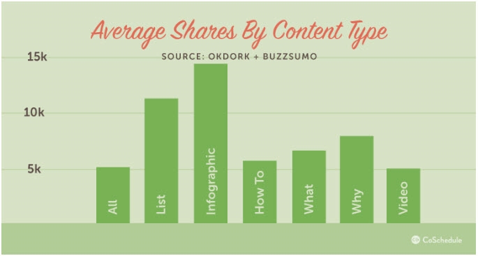
We already mentioned that infographics are more sharable than some other types of content. Infographics are liked and shared on social media three times as often as any other form of content.
This is partly because of their visual and compact nature, I’m sure — but I also believe infographics are more sharable than other types of content because they make the sharer look like a smart cookie.
That’s human psychology at work: We want others to believe we’re smart and capable.
Here’s a sharing breakdown from CoSchedule that’s pretty compelling:
Infographics also supercharge link-building activities.
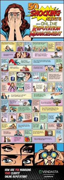
Vendasta Technologies earned hundreds of backlinks from dozens of different domains when they began creating infographics and making it easy for other sites to post them. Here’s an example of one of their infographics in the wild.
The company encourages people to download the infographic for their own use — and as you can see, the infographic has Vendasta’s logo and URL at the bottom, so even if the user doesn’t credit the source (shame on them!), viewers see exactly where the infographic came from.
That’s a clear win/win in my book.
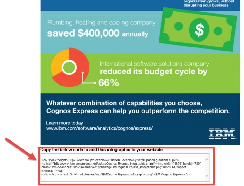
Of course, the best way to share an infographic to gain that valuable backlink is to provide sharing code, like IBM does here.
Unlike some of the text-heavier content assets out there, infographics cater to the visual learners in your audience. Considering people absorb information in different ways, offering a more visual format like an infographic can help you tap into new segments of your target audience.
Finally, infographics have a longer lifespan than some other types of content — producing results for years after they’re published. They’re evergreen until the information they represent becomes outdated.
When an Infographic Works Best for Your Content Strategy
Infographics work best when you have interesting data to share — or you can pull an interesting story out of not-so-interesting data.
In terms of audience, almost any industry can benefit from adding infographics to their content marketing repertoires — and they work almost all the way from the top of the sales funnel to the bottom.
I say “almost,” there, because at the very bottom of the funnel, when the customer has decided that you can probably solve their problem and they’re ready to pull the trigger and buy, they don’t necessarily need their data in a pretty package. They simply need to know the deal, and a few unadorned numbers in a straightforward format would more likely serve them at that point.
So when should you use an infographic instead of another content format? Here’s the short list:
1. When you have data worth sharing
Have you conducted market research or a survey of your audience recently and gained fascinating insights? Insights your ideal customers or clients would really benefit from? Share them in an infographic.
Here’s how Spiceworks did it:

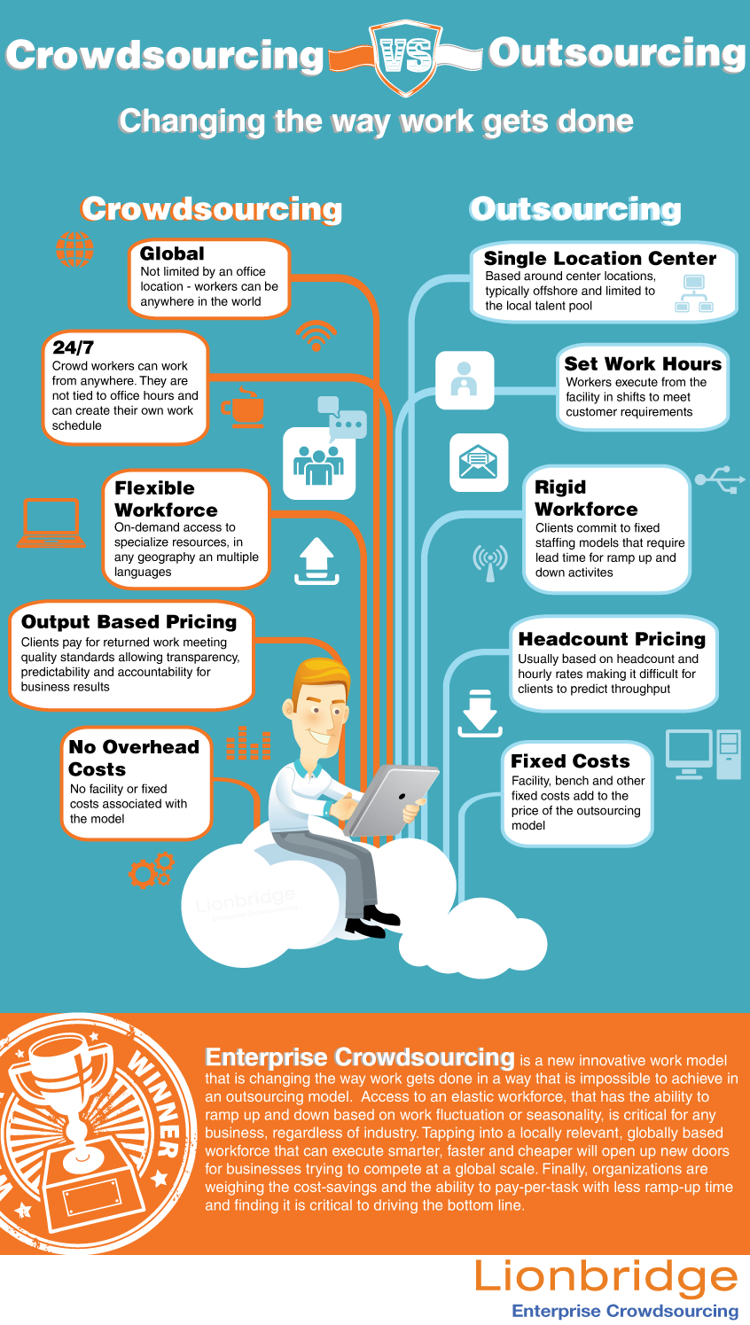
2. To make comparisons
Side-by-side comparisons are can be much more meaningful in infographic form.
Here’s an example from Lionbridge comparing outsourcing to enterprise crowdsourcing:
3. To simplify complex concepts
What to communicate a complicated message, lesson or concept? An infographic might work best. Here’s how Copy Hackers illustrated their point when they explained to their audience how every element on a page and every asset in your sales funnel has one job to do:

Courtesy of: Copy Hackers
4. When your audience likes infographics
Some audiences simply like this format more than others. Not sure if your audience is one of them? Ask.
5. When you can say it better with images than words
For example, showing chronology can be easier with visuals than with words. Here’s how AT&T explained the rise of WebRTC technology in an infographic:

Digital & Social Articles on Business 2 Community
(82)
Report Post
