Look, I’m not a New England Patriots fan. Not by any stretch. But you have to give credit where credit is due – they have been the dominant NFL team for the past 15 years or so.
How did they do it? And what can marketers and business learn from them?
In a league dominated by rock stars – you can watch J.J. Watt and Aaron Rodgers in Sunday commercials in between vignettes of the Patriots winning on the field – the Pats success doesn’t come from stars, it comes from a system.
As USA Today reporter, Lorenzo Reyes described at the beginning of the NFL season, the Patriots were able to win even without their stars. “No Brady, no Gronkowski, no problem…the system is as strong as ever.”
And really, is marketing or advertising or conversation rate optimization that different from the NFL? How often do we rely on star players with that legendary “golden gut” for our landing page campaigns, PPC ads, and website UX and design?
You need a system to ensure consistent results from your own work and from your team, no matter who joins or and leaves.
A system for CRO, landing pages and marketing
In the University of Florida/MECLABS Institute Communicating Value and Web Conversion graduate certificate program, we teach a system aimed at bringing discipline, rigor and sustainable success to the marketing department. Based on almost 20 years of research, the patented (patent number 8,155,995) MECLABS Conversion Sequence heuristic can help you optimize any conversion opportunity and is a consistent way to build hypotheses for your A/B testing.
For today’s PageWiz blog post, I’ll give a quick step-by-step breakdown of the heuristic (which is just a scientific word for process or method) along with some ideas for using it to create high-converting landing pages for your company.
C = Probability of conversion
Any conversion rate optimization work is simply trying to increase the probability of conversion. You’ll never achieve 100% conversion, you’re increasing customer perception of value and decreasing perception of cost to maximize the amount of people who convert when they wouldn’t have otherwise because they now:
- Better understand the value your product provides and how it ties into what they really want
- Have to endure less cost to take that conversion action
m = Motivation of User
You’ll notice there are numbers in front of each letter in the heuristic. These indicate the importance of each element to conversion. As you can see, “m” (for motivation) has the highest coefficient (4) because tapping into the motivation of your customers and potential customers is the most important thing you can do to increase conversion.
By considering potential customers’ motivations, you can put your customers’ needs front and center, a practice called customer-first marketing that produces more satisfied customers. In other words, you don’t have to try to force sell something to a certain customer segment that wouldn’t benefit from your product and can focus on the customers your products can best serve. Think of it as the opposite of selling ice to an Eskimo.
Every product or service that exists has an ideal customer profile (or it wouldn’t exist) and no product is right for everybody.
In a perfect world, if you could nail motivation with 100% certainty and only get in front of the customers you can best serve every time, you wouldn’t have to read the rest of this blog post. Think of it as the product that sells itself.
Let me give you an example. I’m writing this post in MECLABS Institute’s office in Jacksonville, Florida just a few miles from the beach. The beach has plenty of “customers.” And yet, it has no marketing campaign. No advertising. No landing page. Why? Because beachgoers are naturally motivated to go to the beach.
Understanding customer motivations on a grand scale will help you get your product in front of the right customers and therefore increase landing page conversion, however, understanding how customers got to your landing page can also help increase conversion because it will tell you now just about their grand motivations but specifically why they were motivated to visit your landing page.
If you run a PPC ad that promises a free iPad, they clickthrough, get to your landing page, and there is no mention of an iPad – conversion will tank.
Here’s another example from a Canadian window manufacturer who was a MECLABS student. Take a look at the control.
The control

You can look at the above page and find reasons it’s a good or bad page, I’m sure. But first you should ask – what is the customers’ motivation? How did they get to this website?
This is what the company’s direct mail campaign looked like:
Direct mail

When the concept of motivation was pointed out to this business owner, he changed the headline on the page to better tap into the motivation of users by mentioning the three free upgrades from the direct mail campaign.
The treatment

The result was a 104% increase in conversion rate.

v = Force of the value proposition
The value proposition is a pretty complex concept, complex enough that we have an entire course in the graduate certificate program – MMC 5435: Messaging Strategy & the Centrality of the Value Proposition – to teach it.
But at a high level, the value proposition is the answer to this fundamental question: “If I am your ideal prospect, why should I buy from you rather than any of your competitors?”
But that’s the primary value proposition for your entire company. There are also different levels of value proposition based on your conversion goals. Let’s take a look at how each level of value proposition would play out on a landing page in the anonymized examples below.
Primary value proposition – “If I am your ideal prospect, why should I buy from you rather than any of your competitors?”

Prospect-level value proposition – For each prospect, you should answer this question: “Why should [PROSPECT A] buy from you rather than any of your competitors?”

Product-level value proposition – “Why should [PROSPECT A] buy this product rather than any other product?”
Process-level value proposition – This might be any action from providing an email address to following on social media, to reading a blog post, or to clicking on a PPC ad. On a landing page, the conversion action would likely start with clicking on a link or call-to-action button of some sort, and end with a purchase. So, for example, “Why should [PROSPECT A] click this CTA button rather than leave the page?”

i = Incentive (additional) to take action
Some marketers see incentive as the all that marketing is. But incentive is a cheap expensive way to get conversions.
Expensive because you’re buying customers.
Think of GM and Chrysler right before they went bankrupt. They were literally paying people to buy cars. $ 3,000 cash back. $ 4,000 cash back. $ 5,000 cash back. Shockingly, paying people to buy your product is not a sustainable business model.
Cheap, because you’re not doing the real work a marketer should focus on – understanding customers, working within your company to create a product or service with a value proposition for those customers, clearly communicating that value, and creating a seamless experience for customers to get that product.
I like to call incentive the bacon of marketing tactics. If you’re a lousy cook, all you have to do is throw bacon into whatever it is you’re making. Even a plain kale salad tastes better with bacon. But a true marketer, like a true chef, leverages all the tools in his or her toolbox (ie, all of the other elements I’ve mentioned in this heuristic), before trying the cheap expensive way to reach their goal.
You should only use incentive – free shipping, financing, getting something extra for free – as that little extra nudge to overcome friction in the process (which is why i and f are coupled together in the heuristic), not as the main reason for purchasing.
f = friction elements present
Up until now, I’ve been discussing the value elements of a conversion and how to increase customers’ real and perceived value for taking a conversion action.
But there are cost elements as well, and not just the literal monetary cost of a product. Friction is one of those costs, or negative elements that can impede a conversion, which is why there is a minus sign in front of the letter f in the heuristic.
Let’s go back to the beach example I mentioned above. When you initially read it, you might have thought, “Sure there are people on the beach, that’s because it’s free to go to the beach!”
True, there is no monetary cost to go to the beach (at least here in Jacksonville), however, there is still a cost that customers weigh in the cognitive decision-making process that often unconsciously happens when they choose which (if any) conversion action to take.
If you don’t live on the beach or within walking or biking distance, there is the friction of finding a parking space. You might not find a space in a beachfront parking space, so there is the friction of walking a few blocks to get to the beach. And if you’re a parent of young children, you intrepid, hearty beach-going souls know who I’m talking about, you have to schlepp an army’s worth of accessories to the beach to keep your children safe from the sun, sand, and surf.
The same is true of your landing page. If you force customers to create an account, there is a high level of friction that will reduce conversion that has nothing to do with monetary cost.
But not all friction is obvious. Here are a few less obvious elements of friction on landing pages (what my colleague Austin McCraw calls hidden friction – the silent killers of conversion).
Multiple equally weighted objectives

Underemphasizes calls to action

Difficult color combinations

The challenge with identifying this friction is this – many marketers spend hours and hours of their waking lives going through their landing pages and understanding every element by heart. A great way to uncover friction is to engage in user testing, and hear directly from people with a fresh perspective as they engage with your landing pages. Use this feedback to create hypotheses for A/B testing to discover what really works with your potential customers.
a = anxiety elements present
Anxiety is another cost weighing down on conversion. While friction is physical, anxiety is psychological.
To use the beach example again, anxiety is also a cost of going to the beach. You might have anxiety that the weather will be bad at the beach, that you don’t look good in your bathing suit, or that you won’t find a good parking space and will have to schlepp all that junk you brought for your kids (you intrepid, hearty, beach-going parents of young children) for blocks and blocks in the blazing sun.
Even to play off my bacon example, most people might love a kale salad if you add bacon. But if the person you’re serving it to is a vegetarian or keeps kosher, you’ve just increased their anxiety (which is why understanding them motivation of potential customers is important. See how the element of the heuristic interconnect?)
On your landing pages, if you ask for a driver’s license or social security number, customers may have anxiety about what you’re going to do with that information. They’ll have anxiety worrying if a product they buy from you will fit, or if it’s really as good as it seems on your landing page. Anxiety abounds around the return process.
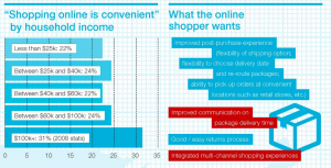
Privacy is a significant customer anxiety as well. The below screenshot is from research by Janice Tsai, Serge Egelman, Lorrie Cranor, and Alessandro Acquisti of Carnegie Mellon University that discovered customers are willing to pay a premium to purchase from more privacy-protected websites.

Now get in the game and use the system
Feel free to use this methodology, this system with your team to consistently create high-performing landing pages. Look at your landing pages through this lens, create hypotheses of what you can change to improve conversion, conduct A/B testing to see if it really works, learn more about your customers from those tests, rinse, wash, optimize, repeat.
Digital & Social Articles on Business 2 Community(76)
Report Post