Driving traffic to your website is one thing, but you also need to ensure potential customers stay there when they arrive; ultimately working to convert visits into sales and customers into repeat customers. Their experience on your website, called a user experience (UX for short) reflects their customer journey from their first visit to purchase. Creating a great user experience means you must optimize your website to ensure you build in a logical structure, that relevant information is easy to find, and that you consider customer preferences in terms of searching and filtering to make it easy for customers to find just the product they always imaged they’d own. With a few quick website upgrades, you can convert visits into sales and grow your business.
Build a UX design that converts visits into sales

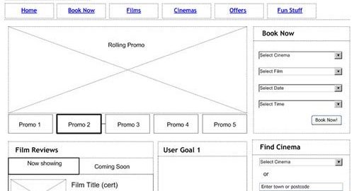
Check out this wireframe to see how you can build a website to convert visits into sales. Note how the wireframe includes multiple promotions to motivate conversion as well as goals featured prominently on the home page. Other elements on this page reflect standard UX design best practices by allowing users different tools to search for just the product they want — in this case a film at a theater. The page also offers a star rating for films to help visitors make decisions about which films they might enjoy.
Every good website starts with a wireframe like this to ensure you include elements that help convert visitors without including distractions or unnecessary stuff that might result in visitors leaving your website without ever learning about all the great stuff you have to offer. We call this bounce rate when visitors leave without delving deeper into your site than a single page. It reflects the attitude of “I came, I didn’t like what I saw, I left” and it not only hurts your conversion rate, bounce rate signals Google and other search engines that your website isn’t very valuable to users and the search engine lowers your rank in search, thus sending less traffic to your website.
If you’ve never built a wireframe, there are a bunch of tools out there, and here’s a list of 8 good wireframing tools. In addition to the benefit of speeding up the process of developing or modifying a website by creating something that gives you a good idea of what the finished product looks like so everyone can offer suggestions, a wireframe doesn’t cost much in terms of time or money, so changing it a bunch of times is feasible. Once you settle on the look and UX design that works for you, show it to a group of prospective buyers to see if it makes sense to them, represents the way they want to search for products on websites, and is attractive. Again, change it up based on suggestions from your target market.
Here are seven secrets to help you convert visits into sales on your website.
1. Logical structure
You need a strong logical structure for your website if you want to entice users through the site. If users can’t find what they want in just a few seconds (currently 15 seconds), a number that gets smaller every year, they bounce. It’s also necessary to optimize your website structure for SEO purposes.
Google search engine bots (as well as those programmed by other search engines) detect how each page links to every other page on your website. It then ranks your site according to your website architecture. Ideally, you want your landing pages and main products pages to link in a flat structure from your homepage (ie. a single click away). You can do this by adding these pages to your main menu so they’re at the top of every internal page as well as your home page.
2. Personalized searches
Today’s customers want more personalized service. You can add search personalization to your site to deliver the best products to each individual visitor. Also, consider how you allow users to search and filter results to make it easy for them to find just what they want with a minimum number of clicks.
For instance, if you sell women’s clothing, you might offer pages for different items such as blouses, dresses, and pants. But, no one wants to search through 100 pages of blouses to find just the right product. Instead, allow them to filter results based on what they’re looking for, which means developing a deep understanding of what your target market wants. Consider filtering by price, color, sleeve length, style, etc. For a different target market, you might filter by designer, occasion, or other filtering tools. Know your audience.
3. Faster and more efficient conversion
If pages take too long to load, users leave without waiting for it to finish. Unfortunately, consumers nowadays aren’t willing to wait more than a few seconds for an entire page to load. Improving your page speed means getting more visitors to stay; visiting more pages until they convert.
Fast load times ensure customers make it to the checkout without getting distracted or annoyed. Focus on your purchase funnel to ensure it’s as efficient as possible and you don’t ask for superfluous information. Allow users to log in to speed up the conversion process by populating standard information such as address and phone number. Every extra click in the conversion process costs you money.
4. Automated customer service
Consider adding automated customer service to your website. While customer service does little to convert visits into sales, it does improve your reputation so that visitors come to your website primed to buy. Great customer service also improves rating for your company on other websites and improves the reviews customers leave for your products on your website.
Sure, you can offer live customer service, but that’s expensive and it’s hard to provide customer service 24/7 with live people. Instead, many companies use a chatbot armed with AI that’s ready anytime to answer a visitor’s questions and they learn over time so their answers get better and they can answer a wider range of questions.
Customers often prefer this rather than being forced to access customer service at designated hours, waiting on hold on the phone, getting an email days later Here are some of the advantages and examples of automated customer service. With automated customer service, your customer support team can focus on dealing with more complicated queries.
5. FAQs and relevant resources
Website users also expect relevant information at their fingertips, so it’s a good idea to set up an updated FAQs page with additional resources. You could include downloadable documents such as menus, hours of operation, product specifications, terms and conditions, or anything you think customers might want. It’s essential to keep your FAQ as detailed and accurate as possible and organize your resources using tabs so that the pages aren’t cluttered with a ton of small text. With tabs, users open those most relevant to their needs. Regularly check and update the questions and change any outdated information. Here are a few examples of FAQ pages that work well, to give you an idea.
6. Engaging content
It’s important to create content marketing that works. Content that’s relevant, informative, and engaging not only attracts visitors to your site, it converts visits into sales.
In addition to posting valuable content on a consistent basis, your content must positively impact your reputation and reinforce your brand. A style guide containing things like brand colors, messaging elements, font, logo, images, and so on helps guide content creation to reinforce your brand.
Consider a variety of content that helps convert visits into sales. You could make how-to videos about your products, or showcase your talents as a craftsman, for instance. It all depends on the type of business you run. The important thing is to create content that appeals to your target audience.
7. Prevent abandoned carts
Abandoned shopping carts are common, with up to 88% of shopping carts abandoned as of March 2020 depending on the industry. A variety of situations account for abandonment, including:
- problems with the checkout page, either loading times, or glitches
- disappointed with the types of payment available
- they simply decided not to buy the item, due to price
- you don’t offer free shipping
Fortunately, there are few effective ways to reduce shopping cart abandonment. One example is remarketing to these customers. With remarketing, you send visitors targeted ads featuring the product they added to their shopping cart but never bought or similar products. You can even offer a discount or another incentive to get them over the hump and make the purchase.
Conclusion
Today, we covered 7 ways to convert visits into sales by making small changes on your website. Give a few of these a whirl and see how your revenue increases.
Business & Finance Articles on Business 2 Community
(39)
Report Post