“Show, don’t tell” is a time-tested rule in writing and filmmaking that helps viewers draw their own conclusions rather than relying on a spoon-fed version created by the author. Yet, when it comes to product demos, many marketers and sales teams fall short in creating demos that convert.
How do some of the most successful SaaS companies approach their demos? In this article, we’ll look at some of the most important components of running a successful demo and what to consider when creating yours.
Case study data collection
Despite the common misconception, the goal of a demo isn’t always to make a sale. It can be an incredibly effective way to qualify your prospects and nurture your leads as well.
While thorough feature pages and detailed pricing tables are great components to have on your website, what better way to qualify prospective customers than with video marketing?
Getting to see the demonstration of a tool you’re interested in can answer so many questions instantly—including some you may not have known you had.
To better understand the current SaaS demo trends, I set out to study subscription-based software websites to see how they treated their demos (or lack thereof). The data in this case study is a group of 78 businesses in all kinds and sizes of niches, including email automation, WFH solutions, accountant tools, e-commerce inventory management, and more.
I tracked everything from the call-to-action (CTA), elements used on the page, what style of demo was employed, and more.
The main questions I sought to answer are:
- How commonly are demos used in the SaaS space?
- What types of demos are used, and are there correlations between B2B and B2C demo usage?
- What are the most frequently included supporting pieces to a demo sign up page?
- Finally, what are some great examples of demo implementations that stand out from the crowd?
Since there are many ways to go about creating an effective demo (and pros and cons to each method), the end goal of all this data is to provide you with objective information and identify potential trends so you can employ a good demo for your business. Ultimately, only you can determine whether a live demo is better than a recorded demo. As with most things in marketing, you can do that by testing different methods.
Breaking down SaaS demo groupings
Before sharing my findings, I first want to walk through the different demo groupings that I noticed during the research collection as well as unique examples of each. The overarching patterns I noticed were:
- Live demos
- Pre-recorded demos
- Real-use demos
Solution 1: Live demos
A live demo is simply a one-on-one demo with a real person from the company’s sales team. These are scheduled, structured interactions, where the prospective customer can ask any questions to the salesperson directly. The sign up flow is typically very simple, with a CTA in the navbar.
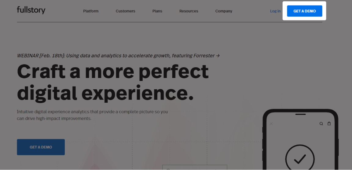
Or hero section of the home page which redirects users to the demo sign up page.
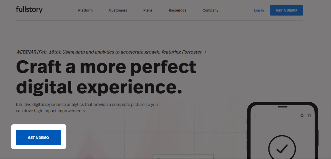
These pages can vary in complexity, but the common element in all of them was some type of sign up form.
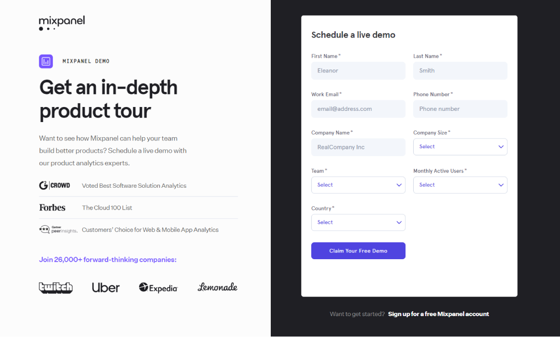
This was either self-service and had users schedule a time directly or noted that a salesperson would be reaching out to them soon.
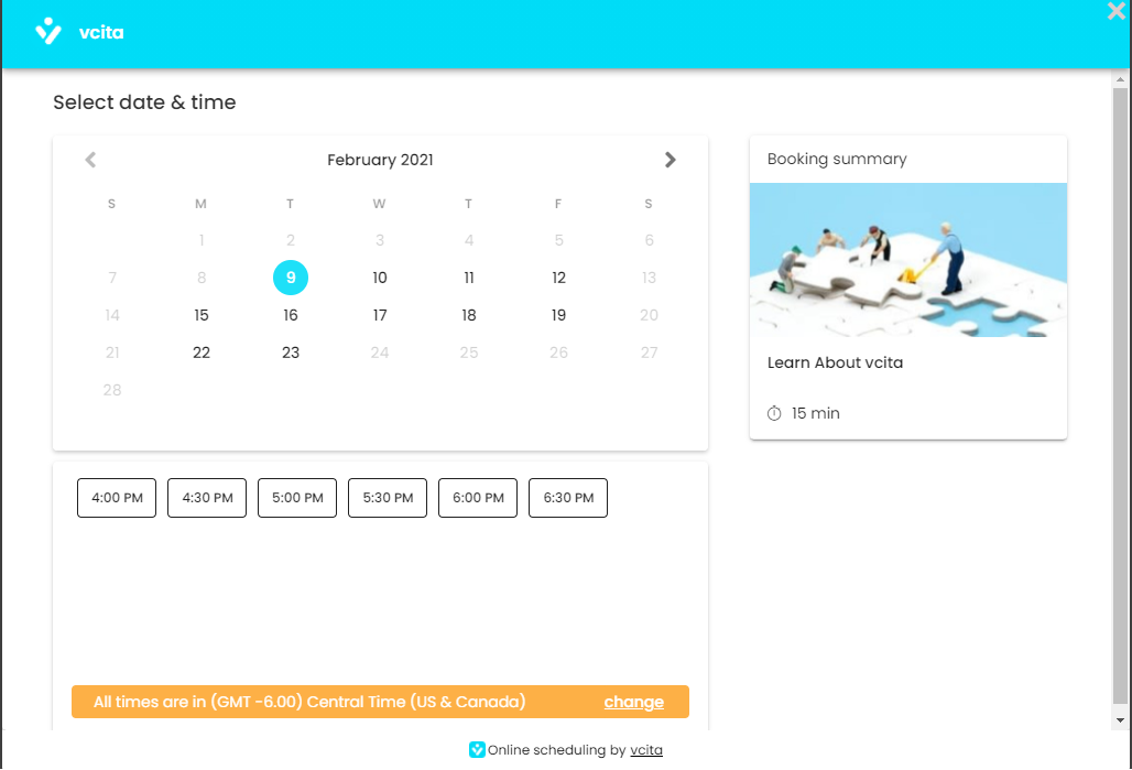
While they varied in length, there are some inputs that were almost always included, which I’ll be sharing later in the data section.
Live demo pros and cons
The advantage of live demos is a high level of one-on-one engagement, but comes at the cost (training, compensation, etc) of having a dedicated sales team and vetting leads.
Solution 2: Pre-recorded demos
Simply, these are walkthroughs that are usually screencast or “floating head” style videos. Similar to a live demo, the presenter shows the possibilities of the product in a normal use-case. Although some had a dedicated page, like Wrike.
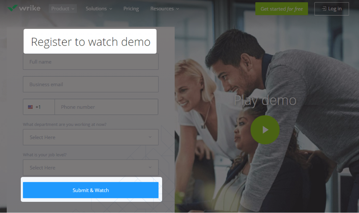
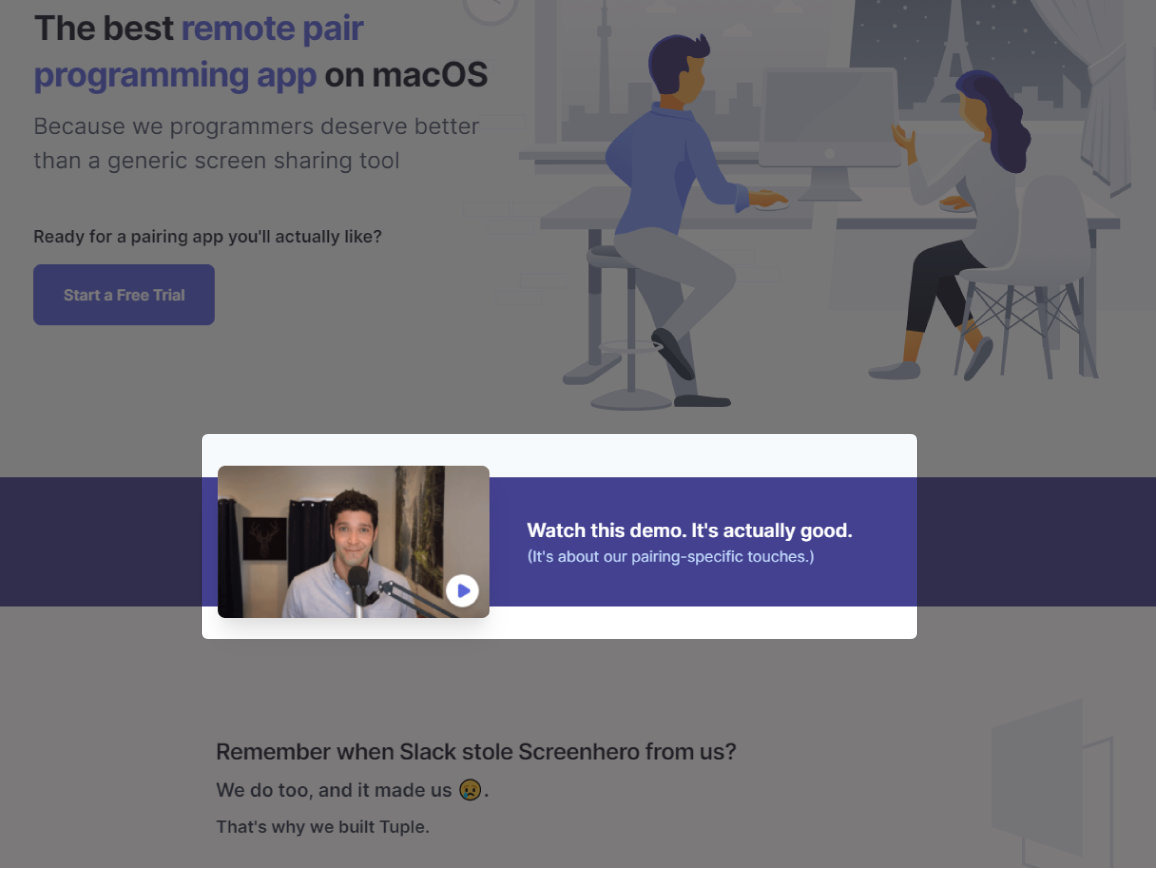
During my research, it was more common to embed them on the home or feature pages of the product. A good example of this is Tuple, which isn’t a very marketing-heavy site, that decided to embed the demo right underneath the hero section of the home page.
Pre-recorded demo pros and cons
The advantage to this type of demo is that they’re relatively easy to produce and scale, but it may not fully answer the objections of a prospective customer the same way a live demo would (though there is a way around this I’ll mention later.)
Solution 3: Real-use demos
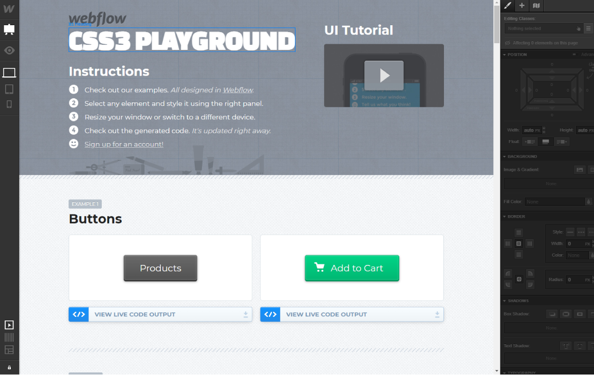
Real-use demos are highly engaging demos that allow users to play around with the product in a sandbox mode. A good example of this is Webflow, which allows people to experiment with the tool to build a dummy website.
Real-use demo pros and cons
The advantage to these types of demos is that they’re not time-intensive for any personal interactions, but they’re still effective at showing what it’s like to use a product on a daily basis.
The caveat is that if there’s a learning curve to using your product, people might not know where to ask for help or may give up completely. It’s also possible that these demos might have an up-front cost to design, code, and deploy.
Demo data analysis
Let’s dive into the data and trends in this case study to help determine what kind of demo and format might be best for your business:
- 71% of the companies in this sample are B2B companies, the remaining 29% being B2C or a hybrid of B2B/B2C.
- Based on the companies in this sample, 59% of the sites exhibited a demo or demo sign up page.
- The two most-used call-to-action texts were “Request a demo” (30%) and “Get a demo” (26%).
- The most common type of demo is a live demo (70%), then the pre-recorded demo (27%), followed by real-use demos (3%).
- There was no significant difference in live demo usage between B2B or B2C companies, being 70% and 71%, respectively.
- Of the schedulable demos, the most commonly included contact information was an email address (97%), a name (74%), a phone number (65%), the contact person’s job title and company (48%), an optional message field (19%), and niche-specific information (42%). The vast majority of sites (83%) mandated name, email, and phone together be required.
- As for the demo pages themselves, 31% of sites included a form of social proof (companies they’ve worked with or client testimonials). 16% of pages had an outline for client expectations of the one-on-one demo, and 14% of sites quickly summarized the core features and benefits of their product on the sign up page.
Trends & application
Let’s break down the raw data and try to establish some applications for your business.
Interpreting demo usage
As you may have noticed, although more than half of the SaaS sites included some form of demo, there was near-identical usage between how B2B and B2C SaaS companies used live versions. This finding surprised me—as I was expecting at least a soft level trend in live vs recorded vs real-use demos across company types.
Attempting to find a different correlation between demo types and companies, I then narrowed in on businesses that didn’t implement live demos. Since live versions have an inherent cost to them (expenditure of time or management of a sales team), I looked through the lens of company size to explain why they might have chosen recorded demos.
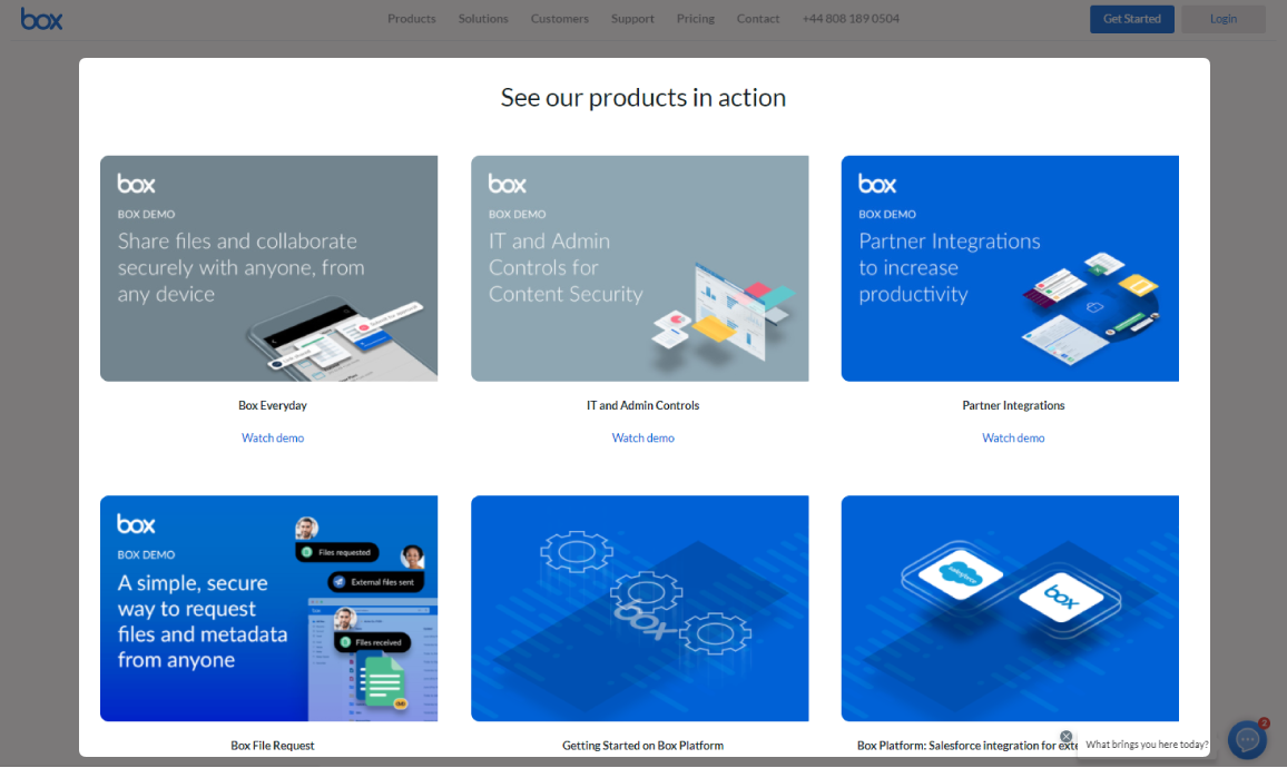
My logic was that smaller companies wouldn’t be able to justify a sales team and would instead opt for recorded demos. Although there were some outlying data in companies that have teams of 4-10, there wasn’t enough proof to establish a trend. For example, Box is a sizable SaaS company that decided to host a collection of in-depth recorded demos on their website.
There seems to be no hard and fast rule when it comes to what type of demo to use. Based on this data, I think it comes down to a combination of the complexity and cost of the product offered, the average objections of the target audience, and the existing infrastructure in the company to handle more complex demos.
For example, a solo founder who is still in the early stages of product development with a relatively competitive price point might want to focus more time on maturing their product quality and opt for a recorded demo. With the data from this case study, it might be important to consider the best type of demo to use on a case-by-case basis.
Trends in form inputs.
Let’s talk about the trends in the forms for the demo sign-ups themselves.
Contact information
Based on the data, the consensus is that name, phone, and email are required together – 83% of forms required all three. A good note here is that most forms also had “Business email” or “Work email” as the placeholder for the input, seemingly to qualify more serious leads and reduce spam submissions.
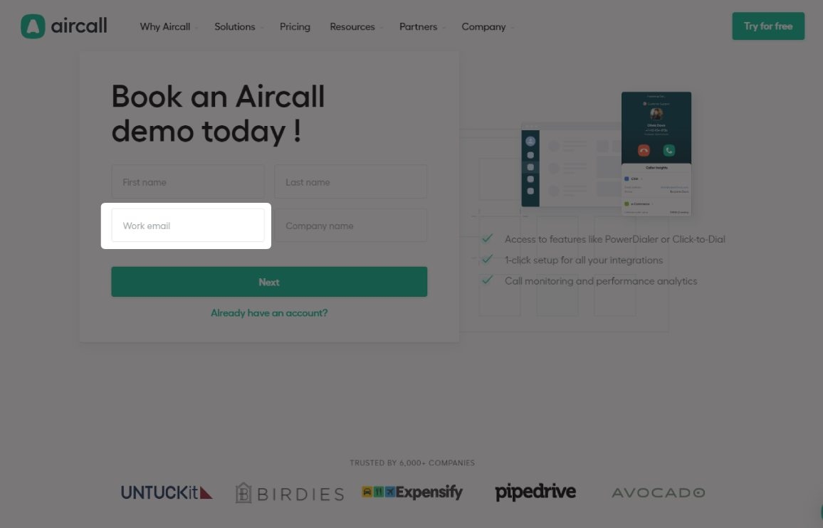
Nearly half of all forms required the contact’s job title and company. Whether or not this is important to your implementation will come down to who the target customer is for your SaaS.
If your ideal subscriber is part of a large business, it may help to qualify them; but I can’t see the advantages of these fields if you’re trying to engage with solo business owners, for example.
Niche information
42% of sites with a demo form included short questionnaires about niche-specific information. These fields were normally optional. For example, Kinsta, a WordPress hosting service, had options to declare the number of websites that need hosting, their average monthly visits, and more.
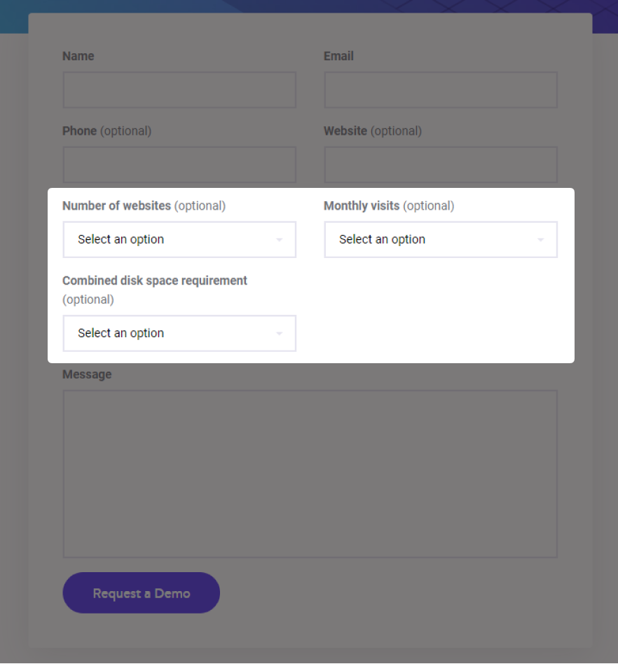
This kind of information is obviously valuable to a sales team so they can tailor the product’s features that solve potential issues of companies that size. It seemed that this sort of information was more important to companies whose pricing models scaled based on client use. If that’s something your company does as well, it might be worthwhile to consider.
Implementing supporting elements
So how did these SaaS companies help convince prospective customers that they should try the demo? Well, 35% of businesses didn’t. Instead, they kept their sign up pages simple with only a form and no other supporting elements.
However, if only having a form isn’t getting the quantity and quality of demos you’d like, I recommend seeing if adding these features helps out. Letting your analytics and demo conversion data help guide your decisions, here might be some things to split-test:
- Expectations outline: 16% of sites included a bulleted list that outlined expectations for the live call. This can be a reassurance that the business takes the demo seriously and that it will be an effective use of the client’s time.
More importantly, it’s a great chance to solve the most common objections people might have with a service. For example, check out how TravelPerk uses an outline to show how the demo will solve 4 core issues their customers need help with.

- Social proof: With 44% of sites in this case study including some form of social proof, it’s important to consider for your implementation. Based on this data set, there were only two ways social proof was used:
Testimonials

Client logos
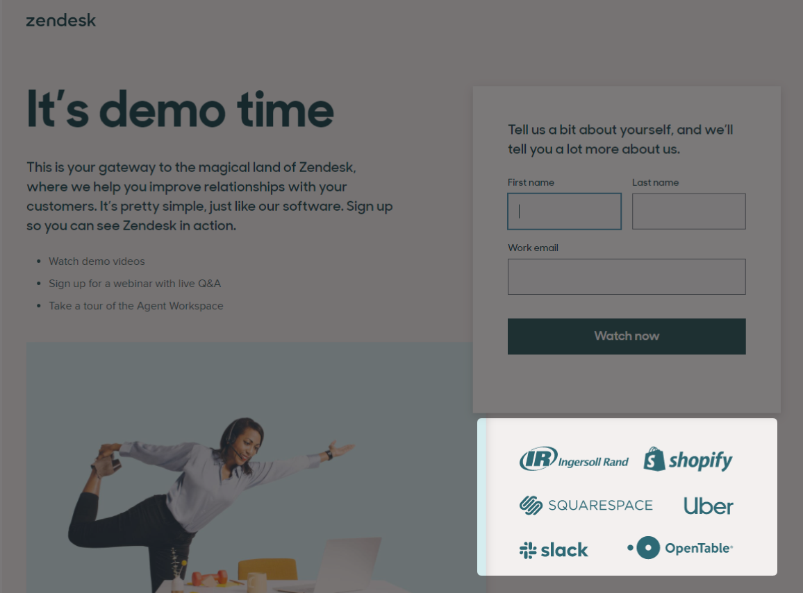
An interesting note is that the quantity of testimonials were used sparingly on the sign up pages (a max of 2, but usually just 1).
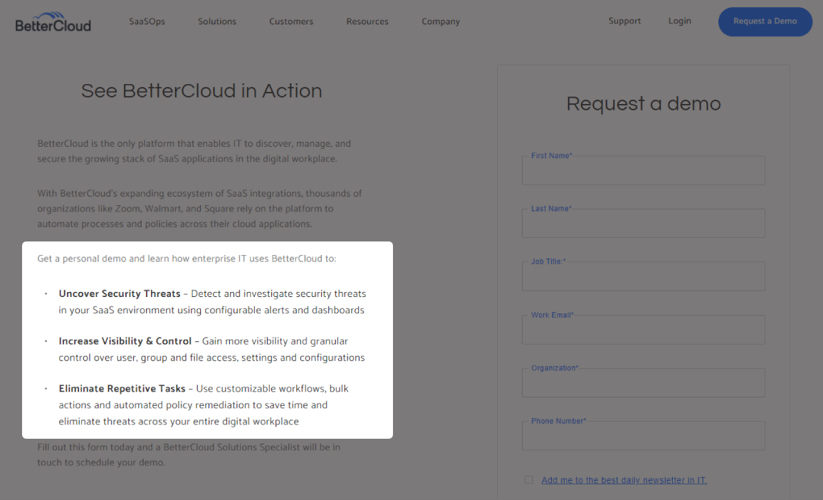
- Product features: A concise list of features/benefits was found on 14% of sites in this study. When used to quickly summarize the key benefits, like BetterCloud did, it can be an effective reassurance to the customer that your product could be the right fit.
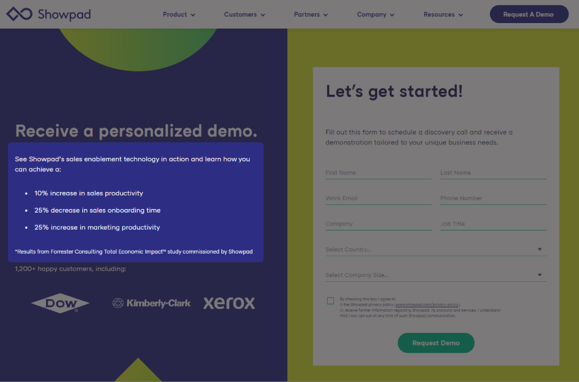
Alternatively, you could use this space to display average, objective gains users can expect from using the product, like ShowPad. Note that it’s probably important to also tell how this data was collected.
Real-life examples of SaaS demo pages
With a good understanding of common features and styles of demo pages, I wanted to break down a couple of fantastic examples for the two most common types of demo (live and pre-recorded). While real-use demos can be great, they’re far less common (remember, only 3%) and usually just include test data of the existing software suite.
Live Demo Turned Coaching Session: Slite
To make the case of a well-optimized live demo, we have Slite. Slite is a remote work solution with a strategy unlike any other site in this case study. Rather than framing their demo as a demo, they personalize the experience by branding it as a “Remote coaching session.”
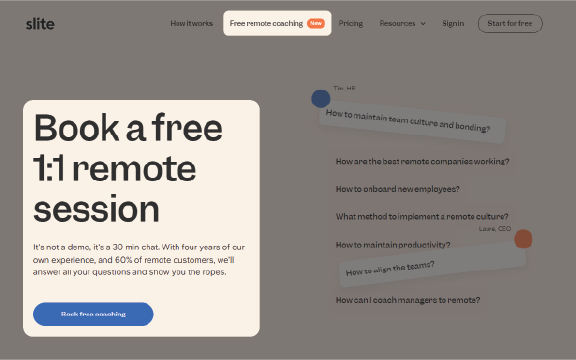
The copy in the hero section emphasizes that this is just a 30 minute chat to answer any questions and “show you the ropes.”
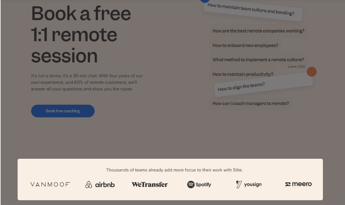
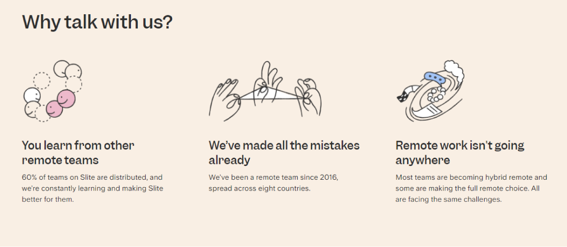
Backed by some social proof in a logo list and a section dedicated to what makes Slite different, they certainly put priority on the benefits the prospective customer will receive.
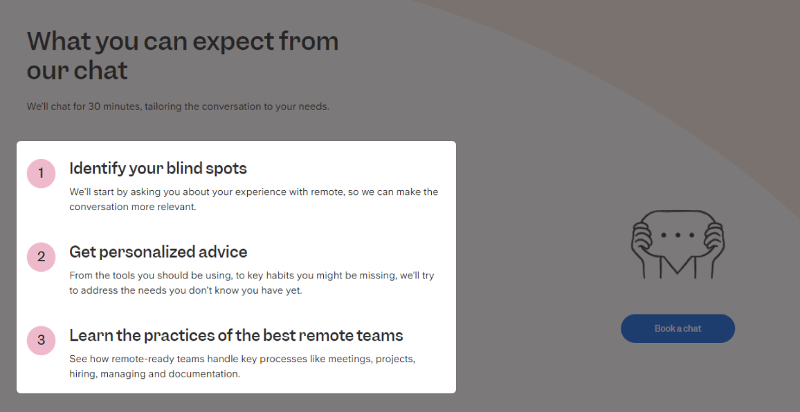
To further clarify exactly what the attendee will get out of the coaching session, they include an outline of expectations.
A nice touch to enhance the “coaching” approach is to include a group of employees from Slite the person signing up might interact with.

Not many other companies did this, and it really stood out as a way to humanize the company and make anyone signing up more comfortable. Ultimately, if people feel more comfortable to ask questions in the demo, the better they can evaluate if your product is the right solution. This is better for both parties long-term.
Lastly, the sign up form is kept incredibly simple with only two steps. The first question aims to identify the main challenges the user is facing, for a tailored experience during the demo.
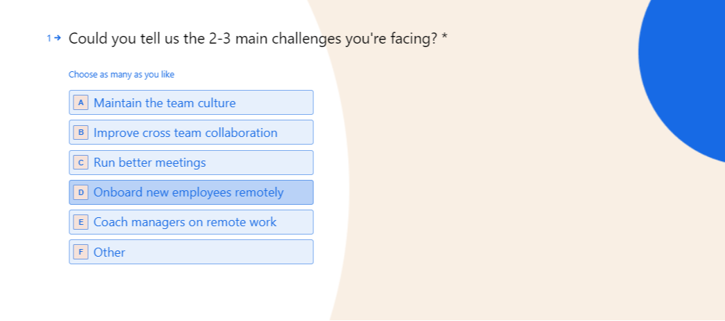
The only other input in the form is the user’s email. It’s relatively frictionless, while still gaining essential information for the sales team.
A Great Way to Educate: Hey
Repping for recorded demo inspiration, we have Hey email, created by the founders of Basecamp.
As a solo founder, a recorded demo was the best solution for my company LeadGeek, and Hey’s demo flow played a huge part in the design process for my own. There’s a lot to learn here about good product education in written and video format.
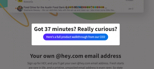
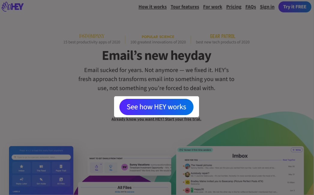
Right from the start, Hey places a huge importance on their demo by making it the primary CTA of the home page.
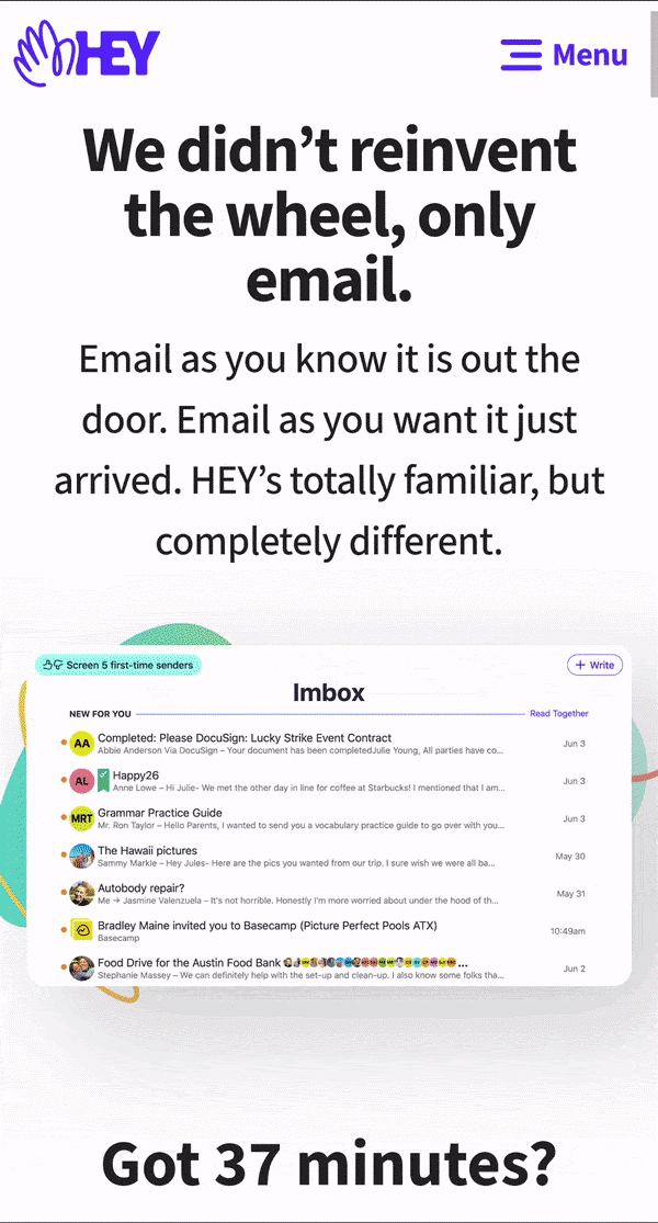
The demo page is relatively lengthy compared to others in the market, with a heavy weight on benefits of daily product use.
What’s interesting about Hey’s treatment of their demo is that they qualify attendees in the CTA itself.
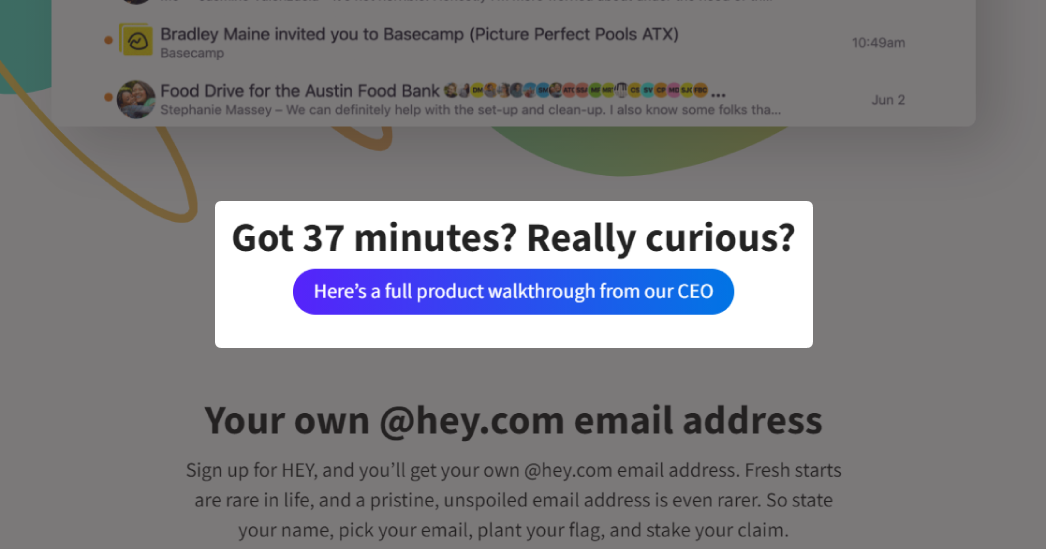
Their approach is more webinar-like than demo—37 minutes is a somewhat lengthy recorded demo to sit through. People are redirected to Youtube to watch the demo; It’s an interesting decision with one major apparent benefit: comments.
While answering questions in a live demo would be the most thorough way to alleviate objections, answering in comment format is the next best thing. As your demo matures and gains traction, it’s likely that the question one person has will already be asked/answered. This serves as a mini FAQ in addition to a demo, which further saves time.
Building your own demo
As you think about how to implement a demo for your own business, it’s important to remember how open for interpretation this data is. Though there are trends, there’s no purely right or wrong way to handle this process.
Factors that might influence your decision are your company size and resources available to dedicate to a demo, current growth or stagnation, and quality and quantity of your customer base. Only you know your business, but this section is dedicated to helping you find answers in your demo execution.
It’s logical that the first question you should ask is if a demo is even right for your business. Many companies in this case study instead opted for a collection of past webinars in lieu of a demo – does that make more sense for your use case?
If you think a demo is the better solution, should you go live, recorded, or real-use? From my analysis, this decision depends on the product itself. Thinking through its complexity, price, and common customer objections will help you decide. Here are some questions to consider:
To implement a live demo:
- Who will be interacting with prospective customers? Is there a team dedicated to this—and if not, is the benefit in time spent potentially worth it?
- What form fields should I include to reduce friction as much as possible without sacrificing customer quality?
- How will scheduling, communication, and follow up be handled?
- Where does the script/structure of the demo come from?
To implement a recorded demo:
- Is my product simple enough to explain in a video format?
- Can I make this interesting/engaging enough to sit through so I can clearly explain the benefits?
- How can I handle the most common customer objections? (email, Youtube comments, etc)
- Does one long, thorough demo or many short, single-feature explainer videos make more sense?
To implement a real-use demo:
- Is this really the best format to showcase my product?
- How will this be created, coded, and deployed? Is it worth that investment?
- Can I make my product clear enough so that someone who has never used it won’t become discouraged?
- How will I handle support and questions?
Regardless of which demo format you choose, some other quick questions to consider are:
- How visible should I make my demo and what should its call to action be?
- What supporting features can I include? (testimonials, outlines, feature lists, etc)
- What should the strategy be to nurture demo no-shows and other leads?
Conclusion
A quality demo is a fantastic way to qualify customers and really get that long-term fit for both you and them. A well-qualified customer is particularly important in affecting the overall business’s CAC, LTV, and MRR; And since retention rate is paramount to SaaS growth, it’s extremely important to consider the best demo strategy for your business.
Here are some of the key learnings from my findings.
- Slite proved that longer form inputs don’t necessarily qualify leads better, although it’s probably important to include options for name, email, and phone. It’s also okay to stray from the pack and tackle demos from a different perspective.
- Hey showed us that while they keep their content engaging, they rely on their customers to do some digging and learn a little on their own.
- Add supporting features as your analytics data suggests. Though most companies may not have the clout of putting top-tier software businesses in their logo list, do what makes sense. Incorporating social proof with even a testimonial can reassure leads that a normal person benefited from using your product.
Constructing a great product demo takes some self-reflection on what you offer to the market, who your ideal customer is, what your ideal customer wants, and how you can communicate that. And while it may take some time to get right, but in many cases it’s well worth the effort.
Business & Finance Articles on Business 2 Community
(60)
Report Post