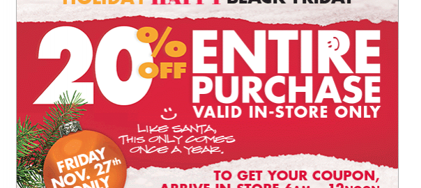
Some things keep coming back faster than you expected them to. As soon as the summer heat starts to fade, stores magically become filled with holiday decorations… and suddenly, you’re thinking to yourself “oh, right, it’s that time of the year again…”. Yep, now’s the time to take your brushes and your tools out to craft your Black Friday and your Cyber Monday email campaigns.
But hey, we know it’s hard to be outstanding every single time you prepare an email campaign -and we know pressure’s high for this specific event, when consumers receive a mountain of emails each day with discounts and promotions from each and every brand they’ve ever subscribed to.
Raise up, email marketers: it’s time to craft the perfect Black Friday and Cyber Monday emails. Just follow our steps and you’ll create a masterpiece.

The Basics: A Good, Responsive Layout
Yes, we’re being Captain Obvious here. But no matter how attractive the prices you offer are, you can’t afford to send out an average looking Sale campaign with multiple CTAs, a festival of different fonts and kaleidoscopical colors. Last Black Friday, we still saw A LOT of these.

A few rules to avoid a design disaster:
- Stick to a simple structure with columns (easier to get your email responsive)
- Keep a fair mix of images and text (about 60/40)
- Align fonts and size of your messages
- Decide which CTA buttons to use and make sure they are clearly displayed in a contrast color
- Have a look at our Design Toolkit to dig further.
Does this sound like Mission Impossible to you? Don’t panic: you don’t need to hire the latest fancy designer in town for that. With a drag-and-drop email editor, like our own Passport tool, you can easily build a nice looking email from an existing gallery of templates. Just throw in the right number of CTAs (that is, not many), add a few carefully-selected images from your brand library and you’ve got a great start.
Be Pretty But Don’t Shut Up
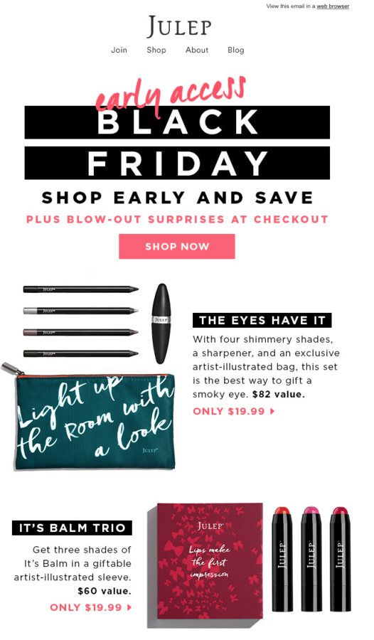
Don’t get us wrong -we just told you to make sure your email looks pretty, but going ahead, you also need to make sure design and content go hand in hand. For the past years, we’ve seen a minimalist trend out there with a lot of really, really beautiful Black Friday emails that just don’t tell you much about the sale, because… they’re just pretty.

Talking ‘bout you, for example…
Sure, a sleek design and a good CTA can go a long way, and some Black Friday emails are real works of art. But think again -this could work fine when you launch a brand new mysterious collection, to tease your loyal customers. But here, we’re talking about THE most competitive time of the year in the inbox; plus there’s little surprise/suspense effect on what a Black Friday offer can be made of.
If your contacts don’t immediately get what’s on sale, it’s double or nothing: either they’ll be intrigued and click to see more, or they’ll be slightly annoyed that you’re asking them to search by themselves what you’re offering and move on to another email. (Yes, your contacts can be lazy: never underestimate that.)
So, be sure to include a few product examples that entice people to use these amazing discounts right away.

There you go.
Don’t Forget Your Signature
We’ve said it before: having a dedicated email voice helps you stand out and be more easily identified in the inbox. It’s even more crucial during a noisy period like Black Friday and Cyber Monday, when all the brands are going to use the same wording and content with percentages of discounts, as well as potentially similar designs. By the way, don’t feel like you have to go black: you can also make color the new black and use a dark touch only here and there.

There’s no one recipe to create the perfect Black Friday email. The main idea is to make sure that your customers recognize you when they receive your email and read it in the crowd of other Black Friday emails. So we recommend that your emails clearly display your brand identity (logo, style, voice, type of subject lines, images…) in order to enhance your chances of capturing your reader’s attention.

This email from Agent Provocateur has it right: the brand colors are all over the email, with a few products displayed as well
Another thing you can do to make sure that your contacts recognize you is to pair your Black Friday and your Cyber Monday emails: similar designs, slightly different messages, like Jonathan Adler.

Hello, beautiful twins
And voilà: now that you’ve got all our master tricks, you’re all set to be the next Picasso of email marketing this season.
Ready to create a masterpiece? On your marks, set, design.
Digital & Social Articles on Business 2 Community(77)
Report Post