By Rebecca Wilson, Published November 12, 2014
If you’ve read my previous post about Building a Branding Identity then you already have an idea of what’s important to focus on as you’re developing a brand. However, if you have more than yourself working with your company’s branding it’s difficult to communicate the guidelines.
The reason it’s important is to ensure the branding stays consistent on all company materials. To combat the issue of an employee possibly using the font Collaborate instead of the company’s branding font, Existence Light, it’s helpful to have a guide for them to follow which clearly outlines the company’s branding. Another instance where branding guidelines are useful is when you have other companies using your logo and additional branding materials.
Here are 4 tips to ensure your branding stays consistent through internal and external use.
Logo sizing
Logos are a good place to start when creating a guide. This is especially true if there are different versions or color combinations available for use. This allows for you to communicate in which situations each version should be used. You can then clarify any size requirements, such as the logo should not be any smaller than 3” wide when used for printing. This will help combat logo distortion due to incorrect sizing. Remember, logos will be used in both print and screen environments so if you have screen size requirements include those as well. You can also specify if there is a preference for file types to be used in print or screen situations.
Spaces and logo misuses
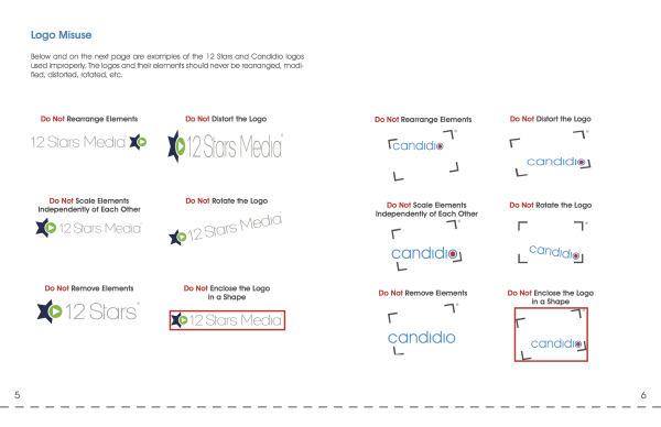
If you have specifications for the spacing between the logo and the other assets on the page you should incorporate those into the guide as well. Another helpful piece of information to put in the branding guide is logo misuse. Here is an example of the page in our guide about logo misuse.
Font examples
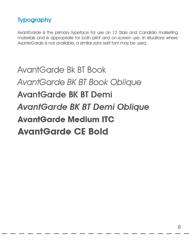
Of course fonts are important to include in your branding guide. If you use a font that has a large array of different weights and thickness, include which ones your company uses. Rather than just listing them, write the font name and then change the font to reflect what is written. Or give the name of the font and type and then list the alphabet, numbers and common punctuation to give the viewer an idea of the visual the font will create.
Here is the page from our branding guide to give you an example of what this page could look like:
Brand colors
You’ll need to include the brand colors, but don’t just include the swatch. Include the CMYK code, RGB code, and Hex code for the color so if something is being designed and they need to use your colors they will be accurate. If your company approves the use of different shades or opacity’s of a color, then list those in the color information as well. It would also be helpful if you differentiate to the viewer what are to be used as primary colors and what are the secondary, or accent, colors. You can also inform the viewer in what situations colors should be used.
Some other things you may want/need to include are:
– Mission Statement
– Values and Messages
– Graphic Elements, such as charts, icons, maps, etc.
– Images
– Page layout
– Business Cards, or other marketing materials
– Language or Lingo used specifically by your company
Below is a checklist to use as you create your branding guide to make sure you don’t forget anything important.
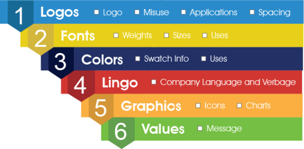
Of course include anything you feel is important information to pass along to readers of the branding guide. Really, there is no right or wrong way on how to put it together as long as it is easy to read and conveys the important information it contains. Hopefully now you feel prepared to create a branding guide that will aid your company and its branding development!
Business Articles | Business 2 Community
(370)
