 There is no perfect formula when it comes to creating engaging social media images, but there are certainly best practices to keep in mind that will put you ahead of your competitors. Read on for our best tips and tricks in creating effective and engaging social media graphics.
Plan your visuals from the beginning.
Put together a social media style guide – a primer to help your team know how your brand should look on social. It shows the right tone, colors, words, and visuals that encapsulate your brand and your audience. Use this guide in tandem with your content marketing strategy to create winning campaign images that will fit your brand every time.
Don’t forget the basics of design.
You’re armed with your style guide, your creative brief and you’re ready to begin. It’s time to plan your composition – remembering some design basics will help you succeed.
- The Rule of Thirds – commonly referenced to in terms of framing a photo, it’s also incredibly effective when creating an image comprised of and image and text. Placing the focus of your subject in one of the left thirds leaves room for your messaging without everything getting too crowded.

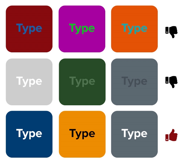
- Make sure there is enough contrast with your text and your background. Contrast provides balance, is easier to read, and is more accessible to users.
- Choose complementary colors. I frequently refer back to a color wheel when I’m choosing colors, steering clear of color combinations that create visual vibrations. Visual vibrations occur when two colors don’t contrast enough and appear to bleed into one another. They actually vibrate on screen.

- Establish a visual hierarchy. Visual hierarchy is a method of combining elements like color, type size, and position in a manner that conveys importance. Hierarchy gives your images order and helps readers prioritize and understand content much quicker, enhancing communication. Everyone skims on social media (anecdotal evidence) so having a clear hierarchy is incredibly important to get your message across quickly.

Your text should always improve your creative.
Similar to color and photos, typography can also convey mood and tone. Make sure the font you choose is appropriate for your subject matter.
Less is more when it comes to text on an image – in fact, Facebook finds that images comprised of 20% text or less perform better than wordier ones. Text in visuals should always be straightforward, legible, and concise. Make sure that there is enough contrast between the text and the background.

Size your images to the social media channel’s specifications.
Each platform has its own specifications, which seem like they’re always changing. There are many sites that keep track of these dimensions for you. Making sure that you create your image in the respective channels’ dimensions ensure that your image doesn’t get stretched when uploaded. Some platforms will automatically crop images based on aspect ratio, which could result in an unfortunate crop or omit crucial information. Creating each campaign image to the social channels requirements ensures this doesn’t happen.

Don’t forget your logo.
If your image is shared or pinned, the origin can easily be lost. You can avoid this by including your logo in all of your social media creative. Including your logo will also help reinforce your brand over time. The more times people see it, the more recognizable it becomes. It shouldn’t be obtrusive or distract from your message. Having your logo in the corner of your creative is usually sufficient.

Be aware of representation.
Do the images you’ve chosen represent your audience? Are you reinforcing gender or racial stereotypes? These are questions you should consider every time you make visual content for social media. It’s not just socially responsible, it’s a smart strategy. Using images that represent different audiences allows those users to picture themselves using your product far more easily when the subject matter reflects them. Look at the demographics of your desired market, or the analytics of your audience and factor them in your creative process.
Look for inspiration.
While you’re scrolling through your various social feeds, take note of the ads that catch your eye. If they caught your eye, it will have been for one of two reasons; the ad is either really well done, or really poorly done. No matter the reason, you can learn from it and either see what do to or what not to do.
Digital & Social Articles on Business 2 Community
(47)
Report Post


