For many designers creating email is an alien concept. Here are some useful tips for creating your email design brief.
The basics
There are a number of constraints a designer will have to contend with. These are namely the width, with 600-650px being the recommended suggestion for the majority of devices and viewing panes. There is also the consideration that the email will need to be turned into HTML so overlapping elements and other quirks can mean the designer has to live within limits.
Messaging hierarchy & above the fold
The very top is far more important than any other area of the email. Designers will be used to craft something that is equally attractive across all parts. However with email, that top part is the money – get it wrong and the email won’t engage or encourage the scrolling. Additionally, with the sheer volume of emails flooding into inboxes on a daily basis, there is also the idea that recipients will not read your email but scan it – so your copy should be laid out accordingly in a logical order the eye will follow, and not scattered across different areas.
2-second rule
According to research by Litmus, 50% of those opening the email will do so for less than 2 seconds. This has a dramatic impact on design, but having this shocking statistic in mind will focus your designer.
Add more links
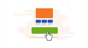
Designers won’t think about links like the email marketer will. Emails need links not just to specific products, but also, more generic places like product categories. These will actually get far more interest and clicks than specific products, and therefore, you will increase your click rate.
Mobile
Responsive design might be a bit much to understand for a first-time email designer, but they do need to be aware and have mobile in mind. This means thinking about button sizes and whether text is legible on the small screen and other intricacies.
Digital & Social Articles on Business 2 Community(49)
Report Post


