In a recent post, we talked about the elements involved in writing creative, customized copy for your landing page.
The creative aspect of writing copy for your landing page involves writing copy that speaks directly to your audience – copy that’s genuine. Customization applies to catering to your audience’s needs and providing them with a solution to their problem – copy that’s informative.
Combining these concepts is how landing page copy converts readers into engaged audience members.
 Copy should speak to the audience and provide them with a solution to their problem
Since we’ve already covered the concept of copywriting and its use on landing pages, let’s explore what it’s like to put these concepts to use.
First, let’s briefly review the steps – from the last post – for writing creative customizable copy that converts:
Step One: Decide How You’ll Solve Your Audience’s Problem
- What is their problem or challenge? You’ll want to hone in on their pain points.
- What do they need in order to solve this problem? Think in terms of informative resources.
- How can you provide a specific solution to their problem? What informative resource can you provide to help alleviate your audience’s pain?
- In what format will you do this? Will you write a book, offer a webinar, or offer coaching services? Consider what would be the best format for your particular audience.
Step Two: Cater Your Copy to Your Ideal Audience
- Your headline draws the reader in because it speaks to his or her pain point.
- The subhead confirms that the reader is in the right place; they believe they’ll actually find an appropriate solution.
- Short descriptions briefly explain what can the reader expect to gain from your solution.
- Body copy offers a more detailed explanation of the benefits of your product or services.
- Images, video, audio messages, or other media should be kept in context in order to emphasize what’s written in your copy.
- Testimonials help the reader let their guard down; since your solution has worked for others, it might work for the reader as well. This is connected to social proof.
- Call to actions can be dispersed throughout your landing page to prompt the action you’d like the reader to take. They should be clear, succinct, and direct.
A Guide to Landing Page Copy Customization
Now, let’s put all of this into action. We’ll use a BusinessSuites case study to put all of this information into perspective.
Company Background
BusinessSuites provides virtual and serviced office space and meeting rooms for business professionals in 30 geographic locations. Their company goal was to increase conversion rates through their landing page.
Following the steps above, let’s lay out the foundation of their landing page campaign tests.
Step One: BusinessSuite’s Plan for Solving their Audiences’ Problem
- Audience challenge: Finding location-specific virtual or serviced office or meeting room space in a high-profile area.
- Audience needs: They need to know where such properties exist. And then they’d need to know how to access them and whether a property fits their space needs.
- A specific solution: BusinessSuites has the office space that professionals need and in the locations they desire.
- Solution format: They offer prospects a quote within 15 minutes of their inquiry. Their website also provides office space listings.
Step Two: BusinessSuites Approach to Catering their Copy to their Audiences’ Needs
This company wanted to overhaul their pre-existing landing page, so they made changes to their copy, web forms, and overall design.
 There are a number of ways that BusinessSuites used copy to speak to their audiences’ needs and offer them solutions.
Headline – Control

Initially, BusinessSuites used the following headline copy: “Lease Executive Office Suites in Newport News, Virginia.” There was a page created for each geographical location.
The copy is direct and descriptive. It let’s visitors know where they can find office suites, but there appears to be one concern.
While large companies and professionals are one portion of their target audience, this headline excludes entrepreneurs and smaller companies that might misinterpret the term, “executive suites,” feeling excluded.
Headline – Treatment

The new headline reads, “Offices Available in Newport News.” This one is even more specific and succinct. It aligns with visitor’s expectations, and it focuses on prospects’ primary reason for visiting BusinessSuites. It comprises all of the suggested components of a landing page headline formula.
Additionally, this copy is all-inclusive. It can be loosely translated, “For those who need offices, there are some available in Newport News,” instead of, “For executives who have the budget to lease office space, we have suites for you in Newport News.”
Again, if the company was solely advertising to business executives, the first headline could have probably remained the same, but since their intended audience wasn’t solely comprised of executives, it was fitting to alter their headline copy.
Subhead – Control

This company’s original landing page design didn’t include a subheading. The set of text beneath the original heading immediately pointed to a BusinessSuites property.
Subheadings should follow these guidelines:
- Clearly express the benefit
- Be no more then one sentence long
- Support the messaging in the headline text
The subheading provides a more detailed summary for the solution you’re offering potential customers.
Subhead – Treatment
![]()
With those points in mind, BusinessSuites’ new subhead meets all criteria, it reads: “Fully-furnished | Move-in Ready | Flexible Terms”
This copy is an extension of the heading and can be translated as, “In addition to offices available in Newport News, they’re fully furnished, ready for you to move in, and we offer flexible terms.”
Those three phrases communicate a wealth of information. Leasees don’t have to be concerned with furnishing their office space; they can simply bring themselves and get to work – which helps them maintain their level of productivity.
And lastly, flexible leasing terms alleviate concern for being locked in a leasing agreement if their company structure changes in the near future.
Short Description – Control

The control version of BusinessSuites’ landing page was designed like a home page. There was a menu bar, overwhelming web form, comparison chart, and links to a map and customer reviews. It’ can be highly distracting to be presented with this much information on a landing page.
Also, beneath the central image was the text: “Which option is right for your business?” Options presented were, “Full service offices, virtual offices, meeting rooms.” If this were a home page, asking that question would have been appropriate, expected even.
Visitors shouldn’t be distracted with information that doesn’t pertain to the primary goal of your landing page.
But landing page visitors are often filtered from banner advertisements, PPC campaigns, and links from affiliates, blog posts, newsletters, and such. They click the link leading to your landing page for a very specific reason.
So site visitors shouldn’t be distracted with information that doesn’t pertain to the primary goal of your landing page.
Short Description – Treatment
 With a narrower focus, the company concentrated on services provided instead of asking their audience which services they needed.
For example, they removed the text, “Which option is right for your business?” and replaced it with snippets of features that accompany each office space.
Using customer-centric copy, site visitors were given a glimpse of what leasing a business suite would entail: private office space, internet access, simple leasing agreements, convenient online scheduling, and a receptionist.
These short descriptions amplified the messages communicated in the header and subheading – focusing on service benefits.
Body Copy – Control and Treatment
When creating landing pages, it’s important that the needs of your audience be kept in mind. Sometimes this means excluding unnecessary sections of the landing page outline. In this case, body copy was plentiful below the fold of the original landing page, but it was excluded from the treatment version of this landing page.
Body copy on the original landing page offered detailed descriptions of services offered by the company and additional information about the geographical location of the office suites.
Alternatively, updated landing pages excluded as much detail in order to direct site visitors’ attention towards the opt-in form to the upper right of the page. This decision contributed to higher conversion rates.
Alluring Image – Control

Although the image posted on the first landing page was in tandem with the headline, it wasn’t a clear visual representation of the services provided by this company.
This company does not lease office buildings; it leases office space. So the first image used wasn’t selected with their intended audience in mind.
Smaller thumbnail photographs of office space were clickable beneath the feature image, but the office space images were barely noticeable and had little impact on a viewer’s first impression when landing on this page.
Alluring Image – Treatment

An image of an inviting office space supports the headline, “Offices Available in Newport News.” This image shows a portion of a furnished office, which keeps the heading and subheading in context by visually communicating that the office space is fully furnished and move-in ready.
Testimonials – Control

Instead of a list of testimonials, the company offered a link to customer reviews beneath an image of 5-star reviews. This potentially offers some level of comfort to future clients, but only minimally.
Testimonials – Treatment

On their new landing page, BusinessSuites includes not only their star rating with its point system and number of reviews, but they also include an Authentic Reviews trust mark. Trust seals usually indicate that customer reviews haven’t been unethically solicited – putting site visitors at ease.
Call to Action – Control

Originally, an opt-in form with six fields was used to gather contact information from potential customers.
The call to action button text reads, “Send Inquiry.” It’s a simple phrase that flows with the overall structure of the form, so in that respect, it works. But some companies suggest you avoid authoritative language when formulating call to action text.
Words like, “send,” “submit,” or “sign-up” are best replaced with verbs that invite site visitors to take part in the process.
Call to Action – Treatment

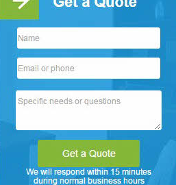
The word, “get” is considered one of the most effective terms to use in call to action button verbiage. BusinessSuites changed their button verbiage from “Send Inquiry” to “Get a Quote.”
They also reduced the number of form fields to three and added the text: “We will respond within 15 minutes during normal business hours.”
This form became the primary focus of BusinessSuites’ landing pages. They reduced the amount of copy on the page in order to funnel site visitors to this form in order to obtain more information on office space rentals.
Landing Page Overhaul Results
And their goal was met. The company experienced an 88% higher conversion rate with their new landing pages over their old ones.
And their average cost per action on their new landing pages decreased by 45%. They also learned that much of the copy they’d used in their original landing page didn’t speak to the needs of their potential clients at such an early phase of their sales funnel.
Creative Copy that Converts
Customizing landing page copy can lead to increased web conversions. But it’s important to note that sometimes results aren’t as favorable the first time around.
There’s often much more trial and error involved in the process. Since this case study was first recorded, BusinessSuites has made additional changes to their landing pages as well. It’s typical to make changes, monitor results, and then apply what was learned to future modifications.
In one study, after a round of six tests, conversions increased by 79.3% by tweaking verbiage, trigger words, images, opt-in forms, the amount of information collected in web forms, and layout length.
Stronger headlines, on-point copy, and copy customized to reach the intended audience, were all influencing factors in increased conversion results.
Patience is a vital factor when testing landing page copy.
Following a thorough customer analysis, altered headline and body copy, and inclusion of video media, the Conversion Rate Experts engaged in a series of landing page tests that increased annual revenue for Moz by $ 1 million.
So patience is a vital factor when testing landing page copy.
Wrapping it Up
Creative landing page copy is less about creative use of language and more about choosing words, phrases, and images that effectively communicate the solutions your company provides to your ideal customer.
As we discussed in the case study above, companies that take their audience’s needs and pain points into consideration often yield higher conversion rates.
How do you carry out the process of writing creative copy for your landing page?
Digital & Social Articles on Business 2 Community
(119)
Report Post