Websites are displayed in web browsers. Browsers, for the most part, agree on how things should work. There’s a high degree of standardisation.
Emails are displayed in email clients. They do whatever the hell they want.
As email developers we need to contend with patchy support for modern web technologies and a shifting landscape of rendering quirks. And then there’s the matter of email clipping. That’s a nice way of saying your email could potentially be chopped in half.
What’s the problem?
Gmail has a 102 kilobyte limit on email code. Let’s round that to a neat 100KB. We’re not talking about images – they’re a separate entity. The 100KB cap applies to the HTML at the core of your email.
Exceed the limit and your email will be unceremoniously sheared. It doesn’t matter if you’re using a desktop or mobile device, via the Gmail web page or the app. The same rule applies across the board.
I’ve knocked together a purposely code-heavy email to demonstrate this process in all its ugliness. Here’s how my mailing should look:

There’s a significant amount of bloat in this email. That includes things like superfluous code, border effects, device-specific imagery, and a drop-down menu on mobile.
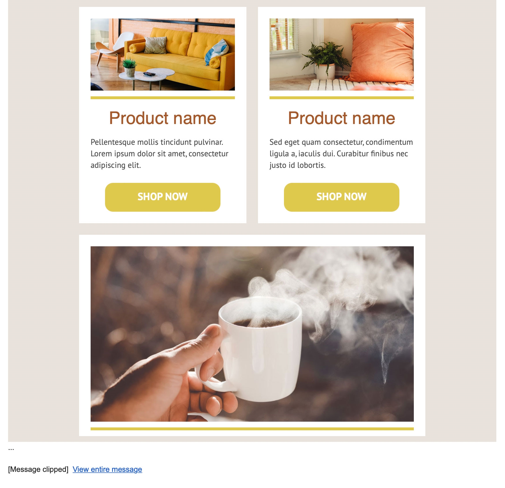
The result is a file weighing in at 120KB. In Gmail it renders up to a certain point and then… stops. This is as far as it gets:

And yes, there is a link to view the email online in its entirety but realistically who is going to press that? I wouldn’t. The damage is already done.
Apart from the obvious consequences of a broken email and wasted content, clipping can also result in the unsubscribe link and terms & conditions going missing. That’s a serious problem.
Let’s find out what we can do about it.
Accept the limit
This is step one. The limit exists and there’s no way to circumvent it.
We also cannot afford to ignore it. Gmail is the world’s second most popular email platform and accounts for a third of the market.
I think it’s important not to think of this restriction as a nuisance. Much better to regard it as a reminder to follow good practice. If your emails are being clipped, that’s your cue to reign in rambling marketing spiel or refine your code or declutter your design.
Respect the limit and your marketing emails may end up all the better for it.
Code efficiently
There’s a single top-level cause of email clipping: the file size is too big. This is caused by one or more of the following factors:
- Excessive content
- Excessive code
- Complex design
Let’s focus on code for now. If an email is being clipped, it doesn’t necessarily mean that its code is bad. It may be error-free and email-friendly in the traditional sense. There’s just too much of it.
We should always strive to find the most efficient way to turn content into code. Some of the most helpful methods I’ve found are as follows:
- Padding on table cells is well supported in email and makes for a lighter alternative to spacers.
- Nested tables are intrinsic to email-coding, but it’s easy to get carried away. See if you can cut back.
- Merge tables where possible. If you can add a row to an existing table rather than creating a new one, do it.
- Be prepared to deviate from the design. A simplified email is eminently preferable to a truncated email.
- Allow some leeway. If you’re scraping under the limit, remember that image references and tracked links could end up longer than they appear in your local files.
- Know your templates. It’s worth reviewing what every piece of code actually does.
If you’re have truncation troubles, it’s not a battle that needs to be fought on a daily basis. Snippet-based development and a template library lets us record and re-use good code. Solve the problem, save the solution.
Show the right products to the right people
I wasn’t kidding when I suggested that Gmail’s code limit is a good thing. Sending huge mailings with lots of products and no personalisation is a haphazard and old-fashioned approach to email marketing. Please buy something, buy anything! A limit on file size discourages that.
Tailored email marketing via strategic segmentation and data-fuelled product recommendations is the way to go. It’s easy to treat personalised content as an afterthought, but personalisation deserves to be at the heart of our marketing programmes. Modern email tools and technologies make that possible.
With a mere 100KB to work with, code is precious. Let’s not waste it on irrelevant content.
Redefine your design
If elaborate design is the root cause of your email clipping woes, then it’s time to go back to the drawing board. As dramatic as it sounds, it can be helpful to re-assess what email actually is.
Consider these questions:
- What’s the goal?
- What’s the functional value of your design?
- Is your mailing truly responsive, or are you splitting content for desktop and mobile?
- Are links applied only to logically-appropriate design elements?
- Is there any need to send your customers a replica of your website header on a daily basis?
Simplified design means a slimmer file. I’d wager that customers are a lot more interested in product and price than borders and background effects. And if you pit fancy design against an email that actually works, there’s no contest.
Out with the indentations
In the real world, this fix is likely to be the first course of action. It can be extremely effective and takes seconds to implement. But I haven’t listed it first here, as it doesn’t reflect the same spirit of best practice as the other improvements above.
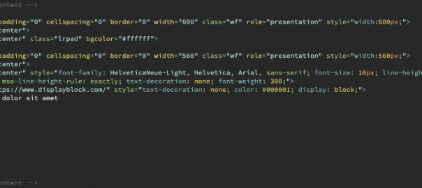
Indentations in code are useful… to humans. A screenful of HTML or CSS becomes a lot more readable when it’s neatly formatted.

But these indentations serve no purpose for a computer, and they account for a surprising chunk of your overall file size. Stripping them is often all that’s needed to save an email from clipping.

The scale of this kilobyte reduction is affected by various factors but it primarily depends on whether your indentations are tab-based or space-based. While tab-based reductions are relatively modest, space-based reductions hover around 20% in my tests. That’s a significant result for such a low-effort fix.
You don’t even need to lose your indentations forever – create a copy of your HTML file for uploading, and keep the original for editing.
Final cut
It’s time to take my Fauxrniture email and rescue it from Gmail’s axe. I don’t want to sacrifice content, so my focus is on improving code and dropping unnecessary extras.
There is huge scope for code refactoring. Several blocks of HTML can be merged, dramatically reducing the overall file size. Plus that makes it even more readable for my human brain.
The application of links to every single paragraph is overkill. The drop-down menu is a gimmick. Alternative imagery for desktop and mobile serves no useful purpose. So we’re saying goodbye to all of those.
The code-based border effects on the main image come with a hefty kilobyte cost, so I’ll incorporate them into the JPEG directly instead.
And finally (although we’ve done enough already at this point) let’s get rid of the indentations for good measure.
The end result is a file that is half the size of the original. That’s so far into the safe zone that we can relax completely. And crucially, nothing of importance has been lost.
The lesson here is that a clip-proof email absolutely does not have to mean a short email. Code efficiently, design for email, and lose the fluff. Now you can concentrate on content creation rather than email truncation.
(23)
Report Post


