I was recently a keynote speaker at a European email summit in Amsterdam and was asked to talk about “Cutting edge email design”. Whilst researching emails for this event it struck me that one man’s junk can be another man’s treasure. The reason I say this is because it depends on your role or skill set as to what you see as cutting edge email design.
I have selected three of the emails I used in the presentation to highlight some design techniques but also to show how important it is to know your audience and to design for them, not you.
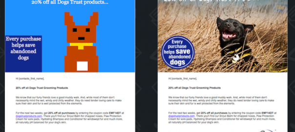
The first email we will look at is a Dogs Trust email designed to look great whether images display or whether your email client renders emails with images off by default (such as Gmail). In order to do this the Dogs Trust has gone ‘old skool’ and used pixel art to draw a dog, to render a badge and to highlight the social media button colours. Going old skool is not a simple process though, this is much more challenging than it looks and very time consuming. It uses complex table cell colours as a background to produce the effect they were looking for. Instead of seeing email clients that render emails with images off as being a limitation, the Dogs Trust see it as an opportunity. Although this process can take a long time and no little skill to produce, the good news is once you have ‘drawn’ your image you can repurpose it fairly quickly, so if you are a retailer selling several brands of the same type of item you can change the colour of the image with a simple code change. Let’s take a look at the email:
DogsTrust cutting edge email
Next up is a Mailchimp user experience email which is subscriber only. Here is where knowing your audience is key. As a sales and marketing guy I didn’t get it, I didn’t want to include it but the email geeks at display block insisted. They shared it amongst each other when it came out, they tweeted about it, they loved it! The reason, of course, is this email was sent to an audience of email geeks, about the removal and reinstatement of plain text email campaign editing. The main article is about plain text, so the email is coded to look like plain text, despite it being in HTML. It was coded in HTML rather than just as a text email to make it responsive so the email still looks great on a mobile device. They have created ASCII character drawings for the diagram and also for the writers ‘pictures’ and, when seen on a mobile device, they swap out the image at the top and put in a smaller more device suitable picture. The video below spotlights some of the techniques:
Finally, the current king of all cutting edge email designs. The resource used to conceive, plan, design, and code this email must have cost B&Q a small fortune. There would likely have had to be a team of at least four people involved for some three to four weeks. The carousel allows the email to move from room to room, a lot of effort and something most people would not have bothered with but which looks fantastic. It uses CSS hotspots before and after pseudo-elements to run the carousel. It also has a really clever use of background images. It has clever fall backs for webkit and non-webkit browsers and also uses webkit-min-device-pixel-ratio: 1 to target webkit browsers when setting up the ‘tapable’ buttons. It is fully mobile responsive, including the carousel and when being displayed on a mobile device with webkit capabilities it adds a layer to the carousel to give you instructions on where you can tap on the email to go to the products on display.
This is the most extreme use of the medium I have seen and, despite being brilliantly optimised, the email is still over 1600 lines of pure HTML/CSS email code. There is a reason they have only done this once but the time they did it they raised the bar for all email marketers.
The display block coding team reverse engineered the code here and are confident we can reproduce something like this, we just need a client with the appetite to take on a project like it!
(200)
Report Post


