In web design industry things always keep rolling. New techniques, innovative styles, elements and concepts are emerging constantly. It’s not imperative to include every new trend on your website, but many of them have the potential to enhance your visitor’s experience. So if you are interested in web design and want to make your website the best it can be, you should stay familiar with the most recent changes or improvements, and be ready for new opportunities.
It might be challenging to decide which new options to use, so we’ve prepared a list of important elements you can implement to improve your site’s performance.
Here’s what you should concentrate on in 2016:
- Responsive design.
- Clean and fast website.
- Individual typography.
- Unique content.
- Large and responsive images.
- Hamburger menu.
- Background videos.
- Semi-flat design.
Responsive design
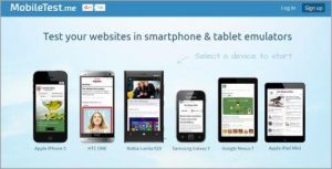
Everyone owns a mobile phone these days. Having a mobile version of your site is a great way to earn additional income and surpass your competition.
Clients should be able to access your site wherever and whenever. If they have an awful experience, they will buy from your competition. So it’s a sure bet, you shouldn’t underestimate mobile-friendliness.
Moreover, Google also supports sites that go through all the trouble and go mobile. You do want to be on top of every search query! Help your site’s rankings!
Clean and fast website
Your website speed and cleanliness should be your major priority in 2016. These trends are the most beneficial for several reasons:
- Google deals better with clean sites that have a healthy backlink profile and other reputable sites linking to them. So get ready for bad links cleaning!
- Websites that have a fast loading speed can bring more visitors and thus revenue. The idea is simple – clients won’t stay if it takes more than a few seconds for a site to load.
Individual typography

Create or choose a particular typography that will help your customers identify your business among competitors. Fortunately, there’s a huge selection of fonts available online for designers. Expressing yourself has been made a lot easier. Your typography can signify who you are, what you do and whether you are good at what you doing.
Ensure your designer considers how to apply your font across browsers and computers. If your website displays clumsily on different devices, you’ll lose a good share of potential clients.
Unique content
Blackhat SEO has become outdated. Google is punishing sites that use blackhat techniques – keyword stuffing and buying links. So how do you deal with that?
It doesn’t matter what your website is about, creating good content regularly is a must these days. It can be a blog where you write about tips and tricks for your customers or how to use your products and services. Help your users become wiser and make their lives easier. The more quality, useful content you provide, the more likely people are to find it while they search for information on a topic that relates to you or your business.
The secret is in using LSI keywords (latent semantic indexing). With LSI you are not using the same keywords over and over again and avoiding keyword stuffing problem. Research what LSI keywords to use by typing them into Google’s search bar.
Large and responsive images

Nowadays large images are usually placed in the background with text on top. This way a user focuses on the image rather than on CTA and other buttons. This allows you to create a strong visual experience and tell your story without relying on the text, encouraging a customer to scroll down.
Take into consideration the fact that your users may be accessing your site from different devices. So the image should be visible from phones, tablets and desktop computers. For an excellent user experience ensure your images are responsive.
Hamburger menu
The hidden hamburger menu appeared in order to change long menus of options that took up tons of necessary screen space. It shows a user a clear way to take. By removing busy navigation, you improve the likelihood that the user will find the information they need faster and hassle free.
Background videos

Videos can allure visitors the moment they open your web page. Video playing in the background can tell story of your brand or explain an idea without having to write tons of text.
People are usually reluctant to read big chunks of text while a video about your company can be consumed and processed very quickly with no effort at all.
Flat design
Many organizations have shifted to flat design. In flat design elements do not include or give the perception of three dimensions. The main benefits are:
- It’s easier for users to comprehend;
- It helps the visitor understand your content more quickly;
- It can load more quickly on websites.
More design trends you can find here.
Digital & Social Articles on Business 2 Community(96)
Report Post


