Your PPC ad attracted the right people to your landing page. Your carefully crafted content presented an irresistible offer. Your visitor is ready to do exactly as you’d like – click that button and convert.
But STOP! First, you want them to “validate [their] humanity,” as Google’s Vinay Shet once described Captcha’s purpose.
The Captcha – or “reCaptcha” Google re-branded its updated version – is the proverbial last mile between your landing page reader and a conversion. The obstacle that bottlenecks people on their path to clicking and depresses your conversion rates. A Moz post from 2009 shared a study on the Captcha effect on conversion rates and reported that when Captcha was turned off, a site’s conversion rate increased by 3.2 percent.

Captchas have gone through some evolution since 2009. So what’s the current state? Have they designed an anti-SPAM filter that provides a more user-friendly experience so conversion rates don’t suffer?
Let’s take a look.
New Ways to reCaptcha
The old Captchas, with their squigglies and distortions, made reading the number impossible for many of us. That’s why Moz’s 2009 research showed zero failed conversions with Captcha turned off, but 159 failed conversions when it was on. That’s 159 people who wanted to say “yes,” but dropped out because the site made that last mile too painful.
Captcha interfaces and technology, including Google’s reCaptcha, have gone through a series of new ways to Captcha intended to smooth the path forward for people while still (ostensibly) beating the bots.

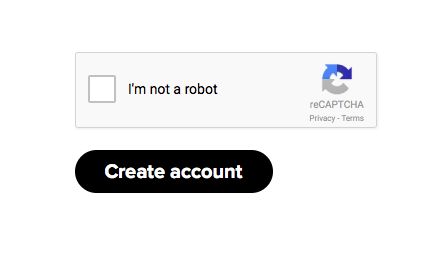
Culminating in Google’s “No Captcha Recaptcha.” No wonky numbers, just a personal affirmation sitting atop Google’s algorithm that susses out whether we’re human.
Unfortunately, it seems this most recent Captcha version may be fairly beatable by the bots as well.
But at least these new types of Captchas aren’t interfering with conversions anymore, right? Right?
Not so much.
A number of subsequent studies still show that requiring your landing page visitors to jump through this last hoop is lowering your conversion rate. Moz revisited the issue in 2013 discussing a Stanford University study on Captchas and conversion rates. This study found Captcha’s remain hard for humans to process:
- Three humans will only agree on what the Captcha says 71 percent of the time.
- Visual Captchas take 9.8 seconds to complete, while Audio Captchas take 28.4 seconds.
- Half of those using an Audio Captcha will quit.
So much for Audio Captchas addressing the issue of excluding the visually impaired from the Internet.
Other studies specifically looking at conversion rates showed similarly discouraging effects.
More Studies Validating Captcha’s Bad Influence
Webnographer conducted an online usability test where only 62 percent of users completed Captcha on their first try. Twenty-three percent gamely struggled through multiple attempts before succeeding, but 15 percent gave up entirely. In fact, their study found that failure rates to complete a Captcha if the first time isn’t successful range between 70 and 90 percent each try. No wonder no one made more than five attempts. They also reference a Reddit study that showed the site increased its account creation rates by eight percent when it removed the Captcha step from their registration process.
Another study, this one conducted by Animoto, resulted in the form without a Captcha step having a 64 percent conversion rate, while the Captcha form had only a 48 percent conversion rate. Nearly one-third more conversions. Who wouldn’t benefit from a conversion rate bump of nearly 33 percent?
Caveat: It’s unclear which specific Captcha technology these studies was using. From their visuals, it may have been reCaptchas that still used distorted fonts even though all these studies appear to have been done in late 2014 or 2015. What about Google’s no Captcha reCaptcha?
When an online accounting software site added the no Captcha reCaptcha found that its number of successful submissions dropped by 73 percent when the Captcha was implemented. More specifically it found:
- The percentage of unique users clicking on its submit button was the same under both circumstances.
- Yet the number of times the submit button was clicked doubled when the no Captcha reCaptcha technology was present.

Gary Robinson, who conducted the study for the site, shares his reasons why the presumably simple “I’m not a robot” checkbox turned out to be not so simple for humans to complete. He suspects that even though the step requested is simpler (no more reading wonky text), poor design makes it confusing enough that people will still give up trying to figure it out.

So What Now?
Looking at the cold numbers, you need to weigh your spam problem (and other options for managing it) against the potential loss of conversion. But I think there are other, less quantifiable yet important considerations.
First, when you implement such an intrusive and user-unfriendly mechanism on your landing page, what are you communicating to your potential customers? That they come second to your need to manage technical issues on the back-end. Design, user experience, and ease of use are increasingly becoming the key differentiators among competitors. Where do you want people in your market to rank their experience with you?
Second, there’s some concern that various Captcha options have their own ulterior motives. Many game and image Captchas are just new forms of advertising. The organization AdTruth suggests that Google is collecting more user information through its Captchas as it found that clicking through a Google Captcha is treated as consent to be tracked by Google cookies.
And last, is there not a certain indignity having to confirm to an algorithm that we’re indeed human. Do we really want to make Google the arbiter that “validates [our] humanity”?
Digital & Social Articles on Business 2 Community(104)
Report Post


