Implement website personalization? You might think “Scale Mt. Everest” sounds like a more attainable goal for you and your team in the second half of the year.
However, like any major initiative, website personalization is best tackled in manageable stages. Developing your personalization strategy may seem daunting at first, but there are a few straightforward rules and best practices that can help you get started quickly.
Optimizely recently hosted the webinar Website Personalization 101: The Essential Elements of Your 1st Campaign. In the webinar, we presented:
- The building blocks of personalization
- Case studies for inspiration
- Tips from the trenches
In case you missed the webinar, here’s a recap of what we covered.
The building blocks of personalization
To implement a website personalization program you have to decide:
- Who you are personalizing for
- What you want to show them.
Sound easy? If you’re an early adopter of personalization, you know how quickly you can become overwhelmed by the multitude of choices available. Here’s how to categorize audiences, prioritize which types of personalized experiences are valuable, and a few real-life case studies on each.
The WHO building block
You can identify audiences based on one of three ways (or a combination of these three):
- Demographic attributes: Who is the visitor and where is she coming from? Where is she located, what is her income, what industry does she work in, etc.?
- Behavioral attributes: What is the visitor doing or what has the visitor done on your site? For example, if she clicked on 5 pages including pricing, she’s showing purchase intent. How do you personalize for that experience? Or how do you re-engage those that are showing intent to leave your site? Site visitors display an endless array of behaviors, and by optimizing for a mix of those, you can get really dynamic with personalization.
- Context: What device and browser is the visitor using? How did he or she arrive at your site? Are they logged in or logged out?
Behavioral example: Brooks Running
Brooks Running focused on the behavior of its site visitors when they began their personalization. The Brooks Running team saw that many people put multiple shoes of the same size or a half size different into their online shopping carts. When Brooks compared this to its product return data, they saw that at least one pair was being returned. Returns are a bad experience for customers and costly for retailers, so Brooks wanted to decrease the return rate for a specific audience: customers with more than two pairs of shoes a half size apart in their cart. To do that, they created a customer-driven, responsive experience as shown below.

When a shopper adds a second shoe size to their cart, a helpful modal asks, “Not sure which size to get?”, offering a fit guide and support line for the customer to call.
With this experience in place for a test segment, Brooks saw an 80% decline in the return rate for this audience. Not only did the experiment offer a positive business impact, but 88% of those customers said they appreciated the customer service offer to help them figure out the right shoe to buy.
Experiences like these offer a win-win for both the customer and the business when targeted thoughtfully at a well-defined audience to address a specific problem. Read more on their story in this case study.
Contextual example: AdRoll
AdRoll is a leading ad retargeting and prospecting platform with over 25,000 global customers. Their Growth team tests constantly to drive user acquisition and increased revenue for the business.To ensure that their customers have the best possible web experience, they’re constantly experimenting with the best calls-to-action (CTAs) to show their visitors.
The AdRoll team knew that they had a diverse set of visitors coming to their website with very different needs. To make the best use of their internal Sales and Support team resources, they honed in on an opportunity to show more relevant CTAs to different audiences. In the example below, they showed a slightly different version of its homepage based on whether the visitor was an existing customer or a prospective customer. Existing customers were encouraged to visit the support center and prospects were encouraged to call the AdRoll sales team. Delicate, detailed changes like this based on context can be very powerful.
AdRoll also changed the main call to action on its home page based on demographic-based audiences. They inferred the visitor type by watching behavioral indicators, specifically, which pages the visitor was viewing. Those from small and medium businesses (SMBs) were shown an offer of a free trial, while enterprises were encouraged to request a demo and talk to a sales rep.
While AdRoll didn’t share the results, they saw a positive impact on key website metrics from these experiments.
Behavioral example: Secret Escapes
Secret Escapes is a European travel company that promotes exclusive access to travel deals. Providing a seamless search and booking experience is a top priority for them.
Originally, their search results page displayed hotel options through a random sort. They realized visitors who arrived from search engines offered a valuable personalization opportunity, because they could personalize the search results based on the visitor’s search intent (the keyword they used). For example, if the person had searched using the keyword phrase “New York trips,” they would be shown NY-related trips once they landed on the Secret Escapes site.

Secret Escapes’ results from this experiment were impressive, and include:
- 22.4% increase in clicks to a specific sale
- 30.4% increase in clicks to the purchase pages
- 210% increase in completed purchases
The WHAT building block
The second building block of personalization—the what—helps you understand what kinds of experiences to show your audiences. To determine the what consider these three factors:
- Page real estate: Do you have enough real estate (and content) to personalize? An effective way of understanding this is to print out enlarged versions of your website and circle the areas on the page you wish to personalize. If you can only personalize 1 to 2 areas of your page you may consider redesigning the page first.
- Location: where on your site/page are you personalizing? Some common areas to personalize include headlines, images, and CTAs.
- Visitor value: Before you decide which areas to personalize think about what unique value you are creating for your visitors. Don’t just personalize because you can.
Personalizing the Optimizely homepage
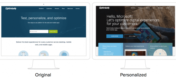
At Optimizely, we recently personalized our homepage for more than 26 audiences, based primarily on demographic and contextual data. As a result of this initiative, we redesigned the layout of our homepage and created more than a dozen areas of the homepage to personalize:
- A hero image and headline that changes based on demographic criteria such as account name, vertical and time of day
- Modules below the hero image are personalized based on both demographic and behavioral attributes for each visitor including areas of the site they’ve visited, location and account representatives
- A social proof module at the bottom of the page that shows customer logos based on the site visitor’s industry.

To measure the impact of the new experience, we tested the new homepage against the old one. In a 50-50 split, half of our homepage visitors would see the non-personalized version, while half would see the personalized one. The goal of this experiment was to test our hypothesis that a personalized website experience would drive higher engagement than a one-size-fits-all one.
We were delighted with the results, which included a 113% increase in visits to our solutions page and 117% increase in clicks on secondary CTAs.
Best practices and tips from the trenches
Ready to get started? Here’s a few tips to make sure you’re starting off on the right foot!
- Don’t slice your audiences too thin. It’s dangerous to only show a site visitor what they are inclined to view and buy. Beware of pigeonholing visitors and industries too much and lowering value with hyper personalization. Instead, give visitors the opportunity to break out of the personalized experiences you’ve chosen for them. This lets them discover new things and gives you the chance to further evolve your personalization efforts.
- Every personalization campaign is a hypothesis that should be measured. Don’t take for granted that all personalization will work. Take a measured and calculated approach and test its impact just as you test other site changes. This is why our product automatically ensures that 5% of your site traffic will see the default version of any page you’re testing.
- Do website personalization because it’s valuable, not just because you can. There is a lot of discussion out there about personalization being “creepy.” Take this to heart as you start designing your personalization campaigns. Make sure you are somehow adding to the visitor’s experience, whether you’re helping them better understand your company or more effectively achieve their goals.
Digital & Social Articles on Business 2 Community
(101)
Report Post


