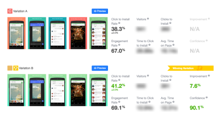
Each time you update your app or submit a new app to the App Store, you need to decide on the most effective store listing. But how does one decide? There are a few options: you can either rely on intuition, obtain an ASO consultation, or run an A/B test and make a data-based decision. These days more and more mobile marketers tend to use the last option. Why? Because you cannot argue with numbers. After analyzing over 700 A/B tests run on the SplitMetrics A/B testing platform, we have managed to determine the most common mistakes made when testing store listings. Here we’ll take a look at some of them and touch on how to A/B test screenshots, icons, titles and descriptions.
Testing Screenshots:
An app’s screenshots are the most critical element of any app page. Screenshots are the first impression your app gives your potential customers, and they make up almost 75% of the app listing in the App Store search result page. That’s why screenshots are the most effective and popular element when it comes to testing. If you are new to A/B testing, it’s highly recommended that you start your testing with the screenshots. Here are just a few things you should know before you create your first test.
1. Don’t test elements that do not affect or only slightly affect the app conversion.
It is not wise to test every single element you see in the screenshots. For example: whether blue screenshot backgrounds are better than dark blue backgrounds; whether a bigger size font may give you a better result or not; or whether bolder captions could engage users in a better way. Along with the fact that each of your A/B tests require investing time and money, any possible result that you may achieve isn’t worth the effort.
Instead, try to think of a bigger change: Test oranges with apples, test one idea against another. The golden rule of any A/B split testing is testing one concept at a time – not testing every little thing you observe on the image itself. After analyzing more than 700 A/B tests, we know that: good screenshot testing often means not just changing a single element, but applying combined changes that follow one targeted idea. Test different ideas, styles and trends. Don’t be afraid. It’s testing, that’s why you’re here.

2. Never use the same approach for testing iOS and Android screenshots.
The second most common mistake is that people often assume that what works for Android will work just as well for iOS, and vice versa. Unfortunately, that’s not true, especially when it comes to testing app screenshots. App Store and Google Play pages both have icons on it, image galleries, app titles, descriptions, ratings and review sections. But the page layout is different, and this hugely influences the way these elements engage and convert users. This also influences the way in which users interact with each element, and the extent to which all elements collectively or individually engage or affect the user’s behaviour. Additionally, there are differences in the user behavior. App Store visitors tend to be more the ones who explore your app page and browse through the screenshots gallery for example, while Google Play users just need to focus on the elements on your page and make decisions about whether to download your app without further exploring.

Android Screenshots Test Results

iOS Screenshots Test Results
Testing Icons:
An app icon is the only graphic asset that’s shown in the search results, on the product page, and on the category page. Although it might be physically small, optimizing the icon will have a positive effect on each step of the user’s journey in the App Store. However, the icon is the most difficult element to test. In most cases, internal branding guidelines prevent changing the icon. A lot of major brands are concerned about changing the way their icon looks due to the fact that it is used in a lot of places – social media, websites, app press releases, etc. That’s why marketers are afraid of even trying.
Don’t be afraid to test your icons. There are plenty of test ideas that one can try.
Even if you must go in line with internal guidelines, there is still room for improvement.
The most difficult part here is generating icon variations. To start with, you can simply review some of the top performing apps across your categories and then pose questions: Which app style is more eye-catching: multicolor or monochromatic? Would a simpler, sleeker icon seem more legitimate? Would a blurred background stand out more against the crowd? With these, you will see a wide variety in the styles of app icons. Try to play with your backgrounds, invert objects, and experiment with colors that contrast with the popular colors used by the majority of apps in your category, etc.

Some testing ideas
Testing App Titles
The perfect app title is one that serves as a ranking signal for App Store Search Optimization (ASO), and as a human-readable title that influences users’ decisions to download the app. If you manage to find a magic formula to elegantly serve both these needs, you’ll win. But it’s not an easy task, especially if you are limited to 50 characters in the App Store and 30 in Google Play. Even experts fail when trying to find the answer to the magic formula.
Don’t invest all your time and money on testing titles.
If there are no clear results after 2 or 3 A/B tests, concentrate your efforts instead on optimizing your title for the App Store searches. If your title tests keep showing no results, it means that the title have relatively no effect on conversion from app download page viewed to download. And this is why you should take this as a signal that you could use the title field mainly as a tool for ASO. So, take your most competitive keywords and place them in the title to increase your chances to rank higher.

Testing App Description
A year ago we analyzed category benchmarks for install rates and found that less than 2% of app store users actually open the full app description. The rest ignore it entirely. No surprise there, because users are influenced faster through visual communication than written communication. But that’s no reason why you should ignore Descriptions Tests…
Don’t underestimate the power of description tests.
The maximum results our clients were able to get with a change in description was 59.57% conversion lift. Sometimes changes as simple as the first 3 words and a stronger call-to-action can make all the difference. But what is not so evident is that your description influences your app store conversions through other channels.
With the recent launch of App Store Search Ads, the importance of testing descriptions has increased significantly. And here’s why: when you create Search Ads you cannot set up and test different ad copy and creatives without changing all of your meta data. Which means updating the app if you want to try a different set of screenshots and descriptions, and a wait before any changes are applied to your search ads. This makes the process of optimizing your search ads screenshots and descriptions extremely complicated and quite risky. But these risks can be minimized through A/B testing. Instead of playing with the App Store listings, it’s better to run an A/B test, validate your ideas and thus optimize your Search Ads for maximum ROI.
Wrap-Up
A/B testing is an easy and extremely effective tool for the landing page optimization. However, there are lots of ways to get it wrong. So, please don’t waste your time and money by making these mistakes. Instead learn from them and start making progress with testing.
Digital & Social Articles on Business 2 Community(108)
Report Post


