— January 5, 2019
User experience is what dictates the modern consumer domain. People are attracted to brands that provide an excellent user experience.
In order to provide a good user experience, it is important to make the user feel valued and comfortable. There are two ways in which you can provide a good user experience in your business emails- personalizing the communication based on behavioral history and providing an easy-to-use interface. While personalized communication is not enough to connect email subscribers with your brand, you need to rejuvenate your email campaigns and create email designs that are attractive while being functional.
Creating a Functional Email Design
The Basic Components of an Email
Before we jump head-on into creating a functional email design, it is important to understand the basic components of an email as well as their functions.
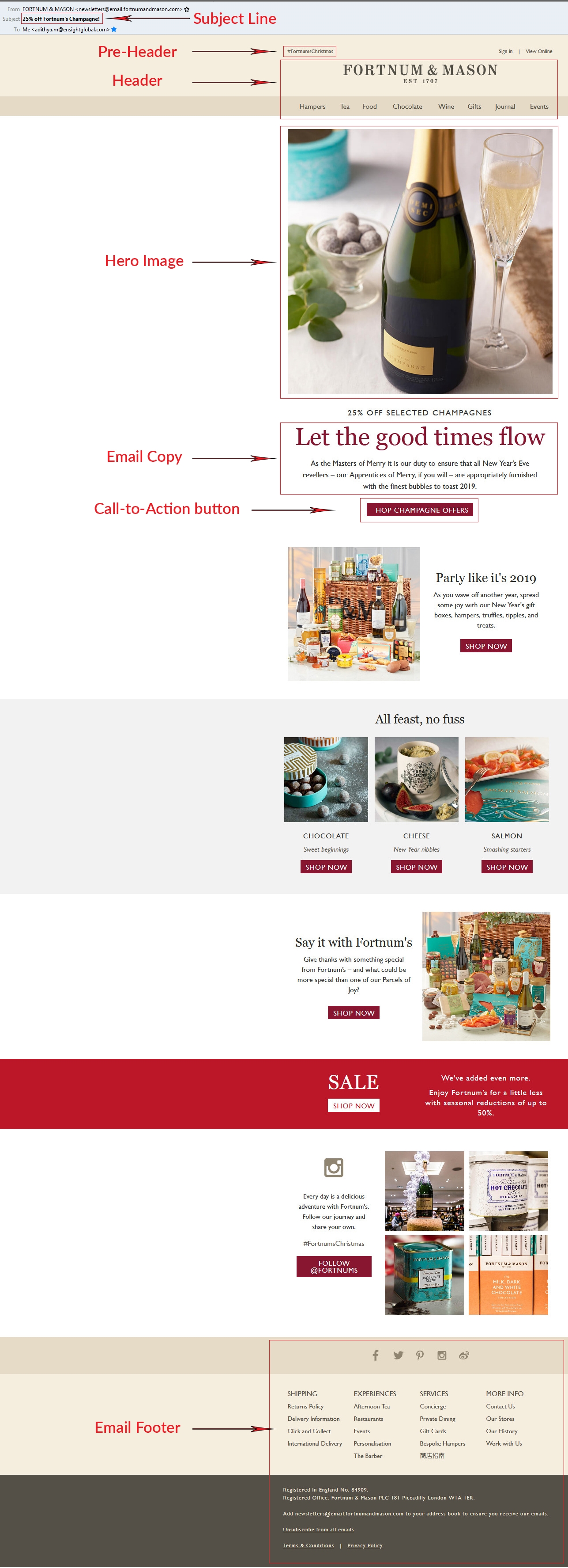
As displayed in the email example above by Fortnums & Mason, we shall be discussing about:
- Subject Line
- Pre-header text
- Email Layout
- Images
- Email Copy
- Call-to-action Button
- Footer
The Subject Line
The subject line is the first point of contact for your subscriber. This sentence of an average 45 characters is where your subscriber decides whether to open your email or not. Your subject line should peak your subscriber’s curiosity which will be fulfilled by your email copy.
While different email clients can only display limited characters, keeping your subject line between 41-50 characters is the best practice. However, this doesn’t mean you need to stuff everything in your subject line.
Pro Tip: As per a press release by Yes Lifecycle Marketing, personalized subject lines can increase open rates by 50%.
Pre-header Text
The pre-header text is the text that is visible after the subject line. What was left in the subject line can be picked up by the pre-header text to further help in building subscriber’s curiosity. The pre-header text is visible in mobile clients and webmail clients like Gmail and Yahoo!.
Rejoiner conducted an A/B Test for Autoplicity.com and a rise of 7.96% in the open rates was observed for the email with a pre-header text as compared to the email with no pre-header text.

Pro Tip: You can make your preheader text actionable with words like “Click here” or with a cliffhanger.
Email Layout
Once your subscriber has opened the email, it’s time for your email design to shine through. Since most subscribers tend to scan through emails for important information, a functional email layout will help them do so.
The most popularly used email layouts are:
- Inverted Pyramid
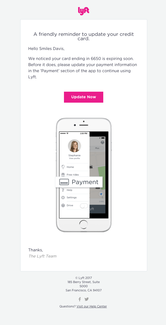 (Image Source: Really Good Emails)
In the above email by Lyft, you can see that the email begins with a bold heading and gradually the scan path reduces to the CTA button and the image. Tracing the path, you can identify an inverted triangle.
- Zig Zag
 (Image Source: Really Good Emails)
By placing the images and associated text in a zig-zag pattern, the overall email length is reduced, and this makes it easy for subscribers to scan the content.
- Single column
 (Image Source: Really Good Emails)
This email by Envato has all the email elements already stacked in a single column which scales based on the width of the screen and doesn’t need to be rearranged for a mobile layout.
Pro Tips:
- Inverted pyramid layout is best for promotional and image-heavy emails.
- A zig zag layout is best used for newsletters.
- A single column layout is ideal for creating responsive emails without jumping through hoops for element re-arrangement.
Hero Image & Other Images
91% of buyers prefer interactive and visual content over traditional text-based media. Hence, email marketers use a bold and attractive image in the first fold (called hero image) to convey vital information. Moreover, with devices having brilliant displays, it is very important to use high-resolution yet light-weight images in your emails.
A relevant alt text for images ensures that subscribers with images disabled by their email client don’t miss the information.
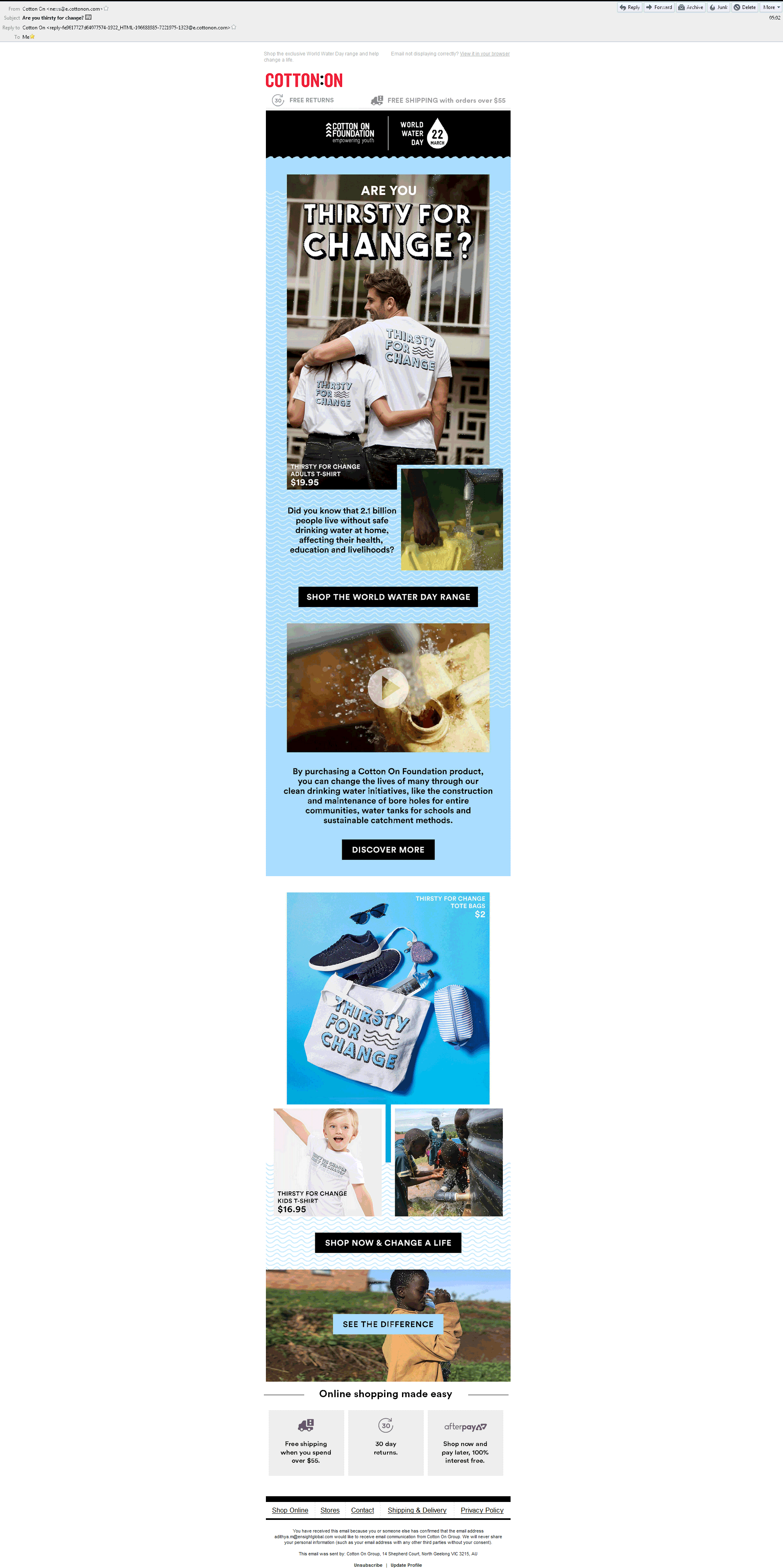
In the above email by Cotton ON, the images have a relevant alt text which is displayed when images are disabled.
Pro Tip: It is very easy to get carried away and create an email that is basically a single image. Avoid this and maintain an 80:20 text to image ratio.
Email Copy
The actual meat of the email i.e. the email copy should elaborate what your subject line (and preheader text) hint at. People don’t have the time to read through paragraphs of text; the text should thus be minimal and properly formatted. Personalization and relevancy play an important role in striking a conversation with your subscribers. Sometimes, how you convey a message is superior to what you convey. So, stick to a tone that harmonizes with your brand personality.
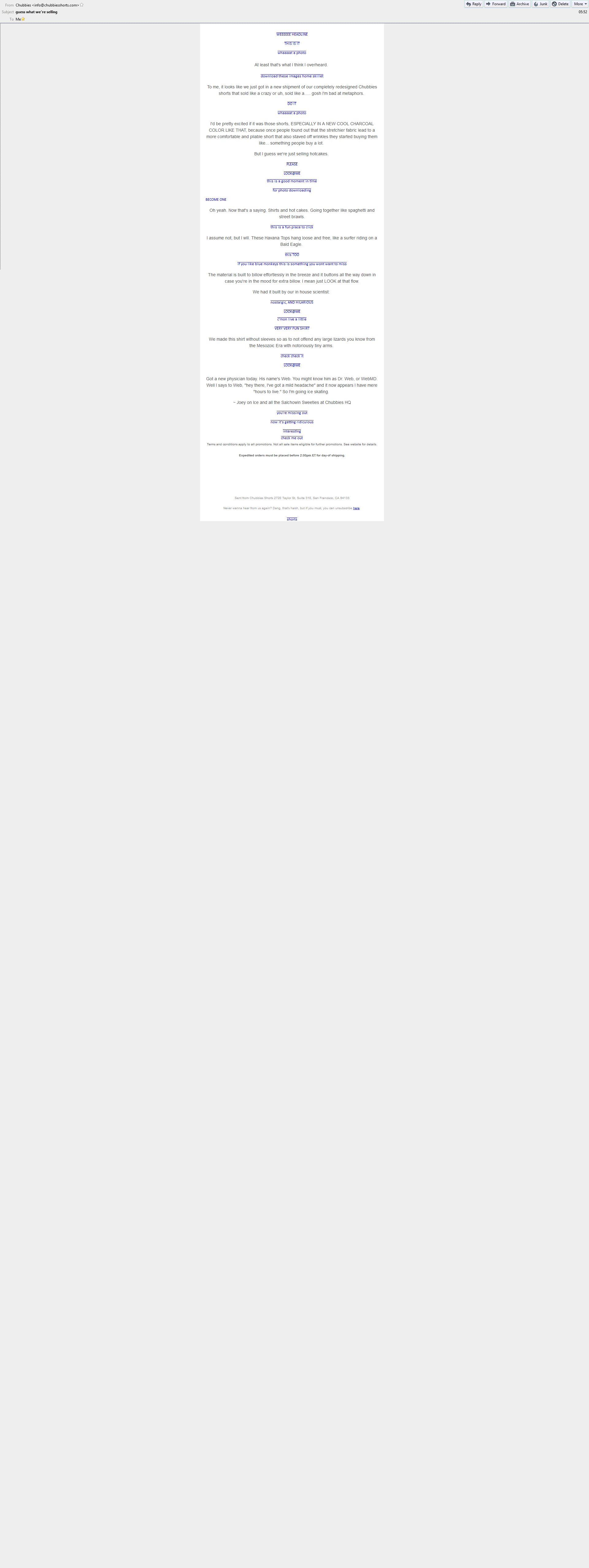
In the above email by Chubbies, the text has its own flair which is enhanced by the images.
Pro Tip: With email clients being updated with new features, you can experiment with custom web-fonts instead of sticking to email-safe fonts.
Call to Action (CTA)
The acid test for the effectiveness of your email campaign is the CTA button. How your email copy successfully converted a subscriber is analyzed through the performance of your CTA. Depending on the objective of the email and the industry your target audience belongs to, you can have multiple CTA buttons, but what matters is that all the buttons need to be distinguishable from the email text.
Your CTA copy needs to be actionable; use words like “Start my trial” or “Add me as your subscriber”. Using the first person narrative in the CTA copy can have a great impact on the click-through rate. By changing the CTA copy from “Start your 30-day trial” to “Start my 30-day trial”, ContentVerve saw a rise of 90% in the click rates.
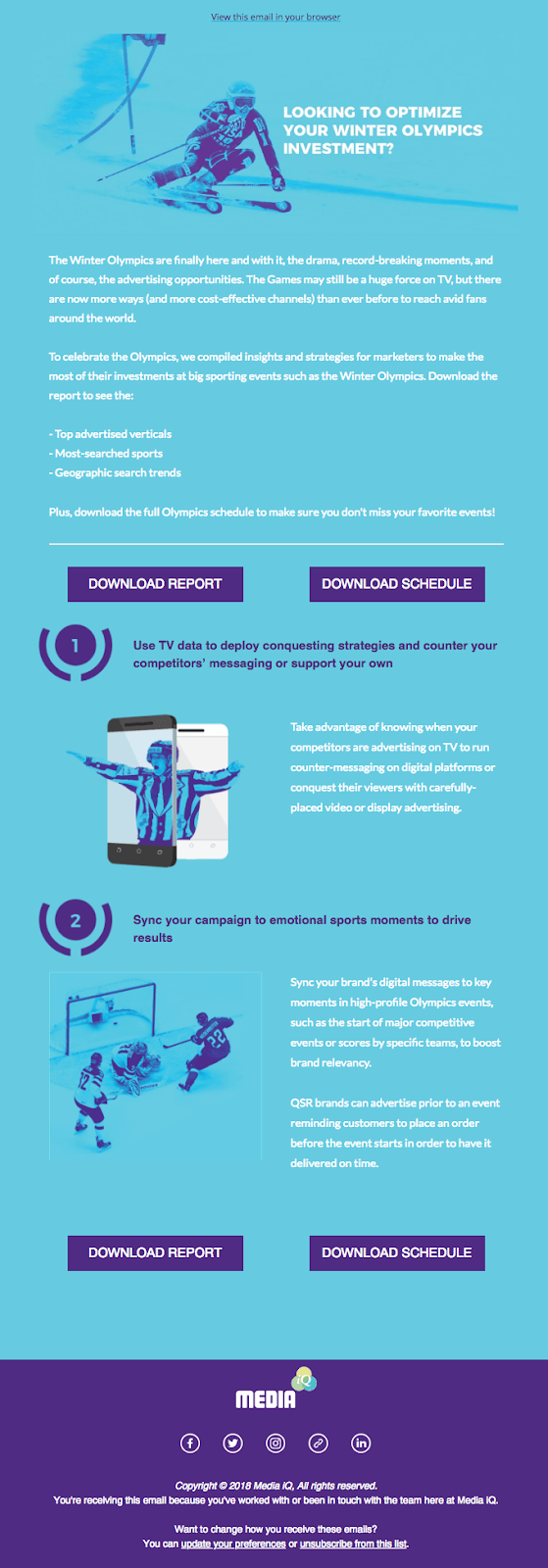
(Image Source: Really Good Emails)
In this email by Media, the CTA button has been repeated once and is in a color that is contrasting to the background color.
Pro Tip: Never use an image-based CTA button since it might be hidden when images are disabled. Always opt for bulletproof HTML CTA buttons.
Footer
The least noticed yet important component of an email is the email footer. Most email marketers use it to add an email signature, unsubscribe link, a physical address in order to be CAN-SPAM compliant and links to social media platforms.
Some marketers tend to replace the unsubscribe link with a preference center link, which is a strict NO-NO if you want your email to be GDPR compliant.
It’s a good practice to include a reminder of why the subscriber is receiving the email.
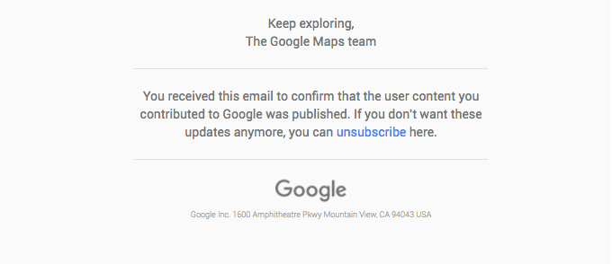
In this Google Review email, the footer has a reminder of why the subscriber has received the email, an unsubscribe link and the physical address.
Pro Tip: The email signature can also be used to display promotional banners of some of your resources.
By including all the above-stated components, you ensure that your emails are opened and subscribers get all the essential information. Their conversion depends on the kind of experience they get from your email. By revealing the email message only when the subscriber interacts with the email, you make them feel included and this improves the user experience.
Now, let’s focus on creating interactive emails.
Enhancing Customer Experience with Interactivity
What Is Interactivity?
Interactivity in an email, as stated earlier, is a great way to improve user experience as the user needs to provide an input in order to view the email message.
The interaction of the subscriber can be as simple as clicking the play button in an embedded video and as complex as figuring out a codex puzzle.
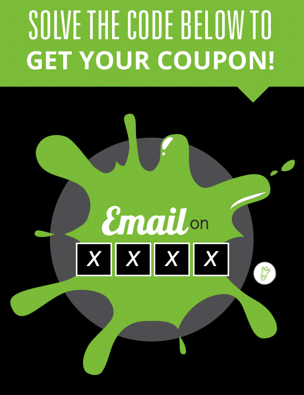
Email on Acid created a CSS-based bike lock puzzle, which is proof of concept about complex interactivity in emails.
Interactivity in webpages is based on Flash or JavaScript enabled code, which is replicated using CSS in an email. That’s because Flash and JavaScript are stripped away owing to security concerns.
Types of Interactivity Possible in Email
The different kinds of interactive elements possible in emails are:
Embedded Video in Email:
Embedded video is one of the simplest forms of interactivity in an email. Embedded video eliminates the need for the subscriber to be redirected to a landing page to view it. The video is playable in the email itself.
Try out the email: https://litmus.com/scope/ojk47ufwaye4
Absolute-Positioning Based Fixed Email Elements:
Taking a leaf from the parallax scrolling of webpages, this type of interactivity has one element static and the entire background moves when the email is scrolled.
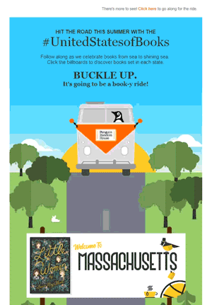
Check out the email: https://codepen.io/reallygoodemails/pen/mBLJLy
In this email by Penguin Random House, the bus remains constant and the entire background scrolls away.
Click-Based Keyframe Animation in Email
Click-based keyframe animation is used to create an ‘experience’ in the email. With this type of interactivity, there is an animation going on in a loop and it changes state only when the subscriber commits a click event. In the below example, depending on the option you choose, the frame advances.
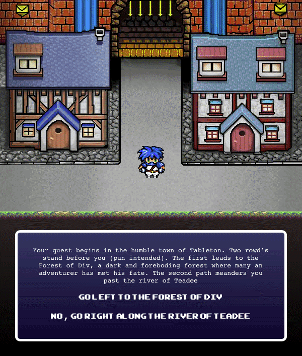
Check out the email: https://litmus.com/scope/ox0w6rg2vfg5
These interactive email designs are just the tip of the iceberg.
Which of Your Subscribers Will Be Able to Experience Interactivity?
Gmail and Outlook are the majorly used email clients that play spoilsport in terms of support for interactive emails.
Video in email is currently supported by Apple Mail, iOS Mail, Thunderbird, Outlook for Mac, and Native Android client (not Gmail).
Keyframe animations are supported in most of the mobile email clients as well as Apple Mail.
Is it worth the effort?
When it comes to including an interactive element in your emails, it takes a great deal of planning and testing to create a flawless experience. Once you see a rise in the click rates and improvement in the conversion, the effort is counterbalanced. According to Litmus’ State of Email Report, out of the surveyed 200 email marketers, 46.3% have a positive outlook towards using interactivity in their promotional emails.
Additionally, for those subscribers who can’t experience the interactivity, there’s still a ray of hope in the form of a ‘View Online’ link. Even though most email clients didn’t support interactivity, people are interested in experiencing it.
Wrapping Up:
Email is the workhorse for every email marketer and even after 4 decades since inception, it is going strong. With the addition of CSS animation in the HTML email structure, what you get is a functional email marketing design and rich user experience. What are your views regarding a functional email design? Share them in the comments below.
Digital & Social Articles on Business 2 Community
(71)
Report Post