You spend hours crafting the perfect email, finally hit send, and then reality hits you. What if your subscribers don’t open it? This is one of the biggest concerns for all email marketers out there. However, if you employ these design tips to boost your email open rates, you’ll be able to get ahead of this problem before it has a chance to happen.
This infographic post from Span Global Services will cover how to design your emails so that they’re more attention-grabbing and provide your readers with enough information that they will want to read through them.
7 Elements of a Great Email Design
1. A Catchy Subject Line
Your subject line is the single most important element in any email you send. That’s because it’s one of the factors that will determine whether or not someone even opens your email, let alone clicks on it to read what you have to say. When designing an email, start by compiling a list of catchy subject lines so you have plenty of options to choose from when things get too tight.
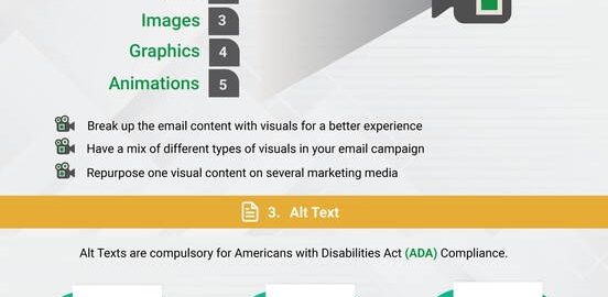
2. Visuals
This might sound counterintuitive, but all those words crammed together on a page don’t actually matter as much as you think they do. That’s because most people scan your email just like they would a website. So rather than focusing on the words you’re using, think about how the layout of your email will affect the way it gets read – making it more engaging and exciting.
3. Alt Text
Ever wonder what the images in your email are actually saying? If you want to make sure that people see what you’re trying to say, use alt text for any images. Doing so will increase click-through rates (CTR) by 6%.
4. Mobile Responsiveness
We’re living in a mobile-first world, which means the way you build your emails should reflect that. That’s why it’s so important to make sure that your emails look just as good on mobile devices as they do on desktop computers. And the best way to do this is to use responsive design techniques.
5. An Organized Layout
Emails are like content marketing campaigns – if you don’t have a clear and consistent theme, things can get chaotic very quickly. That’s why you always want to organize your layout into easily digestible sections even if they only cover one sentence.
6. Personalized Dynamic Content
Customers love to be recognized. That’s why there’s a growing trend in email marketing that revolves around adding a personalized touch by showing off individual customer profiles and buying preferences. Many marketers actually send emails with these features, though without the benefit of knowing who the customers are.
7. Optimized Footer
A footer is actually the last place you want to put important information; after all, most people just skim it instead of absorbing it completely. And that’s why you always want to establish an optimized priority in your emails by putting your most important call-to-actions (CTAs) first in the footer and the least important ones last.

Via: Span Global Services
Digital & Social Articles on Business 2 Community
(30)
Report Post