“Ogres are like onions…we both have layers”, says Shrek in Dreamwork’s hit 3D-animation Shrek. The famous green protagonist uses this analogy to describe his complicated personality. Much like an onion, it can take a while of peeling away frivolous outer appearances to understand the core of who Shrek is. This particular ogre would probably be very surprised by the world of email.
Recently, email design has been peeling away from the more complex textures of the 3D world, towards something called flat design. With 2D flat design, dimensional shapes are few and far between. It doesn’t take very many clicks of the mouse to get the main message. Here’s why everyone’s making the switch and why you should too:
It’s been a long time coming
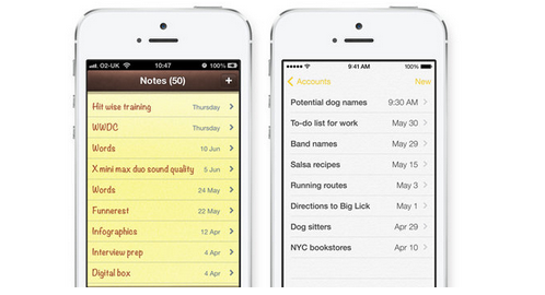
 Think back to the very first iOS notes app. It was a leather bound notebook with yellow paper, lines and all. Resemblant of the real thing, it eased us into transitioning from pen and paper to touchscreen notes. Today’s note app is simply a white canvas.
Flat design is the product of a natural evolution in user experience. As the consumer market becomes more familiar with technology (or in this case, email), there’s less need for visual aids to bridge “action A” to “action B”. A recent study says that just in America alone, individuals spend an average of 11 hours a day on electronic media. To give some perspective, most people average 16 to 18 waking hours a day.
Flat design embraces the limits of the screen instead of embellishing, like its predecessor, skeumorphism. Skeumorphism, seen in the older yellow notepad on the left, resembles a real-life object. If you take a look at the two designs side-by-side, you can see that skeumorphism, layered with details, takes up more screen space. Flat design’s minimal approach lends to shorter loading times and more room for to get creative.
Giving way to content
Flat design also comes out of the realization that content is king. In a noisy digital world, cutting through the inbox isn’t always easy. Removing flashier design elements allows the reader to find value right away.
This welcome email from Invision nails it right on the head. Four introductory videos take the spotlight, with their branded pink weaved through as the call-to-actions. This step-by-step approach is a non-intimidating way for a first-time user to learn more about the product and get started.
Litmus on the other hand, has a well-branded color block layout in their email. It’s a more subtle way to provide context and condition your users to interact with your content in a certain way.
Another email from Dropbox is a great example of how a text-heavy email can be enhanced with minimal imagery. The email uses “negative space” – the white space that the camera and stationary don’t cover – to create balance and draw attention to the personalized message below.
Fit for all screens
As we mentioned before, because flat design works within the constraints of the screen, it makes for a more responsive email experience. Both Invision and Litmus follow today’s widely used one-column email template. The clear hierarchy of the blocks makes it easier to scale an email across various sized screens.
Scrapping cumbersome patterns and textures also saves designers time, they no longer have to worry about how some elements load slower on a cell phone or a tablet.
At the end of the day, it’s a happily-ever-after for your consumers and your design team. Flat design represents the movement to put the consumer first, to deliver quality content in the most digestible way. There’s no saying how long flat design will stick around for, but it will certainly continue to evolve as users interact with new devices over time.
(205)
Report Post


