— August 15, 2019

rawpixel / Pixabay
When you design an email for the campaign you are planning, what is the first thought that comes to your mind? The message, the tone of the email or the email design are some of the first thoughts that you tend to have when creating your email. But, have you ever thought of the email header or the footer design?
While the content and design are important, it is the email’s header and the footer that complete the email and make it whole. The header is the first thing that the subscriber sees when they open your email, and hence it needs to be attractive and well thought.
The footer, though not many people are going to look at it, is important to those who plan to unsubscribe or, wish to see your social media channels.
According to Hatchbuck.com, consumers who purchase products through email spend 138% more than those that don’t receive email offers.
Therefore, it is important you take into consideration all parameters before designing an email.
Here, we will look at the objectives of both header and footer, and the things you need to consider when designing them.
#1 Designing an Email Header
If we were to describe the email header in one line, it is the teaser to the movie that you are about to watch. The header helps set the expectations for the email. The following questions are answered in the header
- What is the email about?
- Which brand has sent the email, and on what occasion?
- What are they offering, and who are they targeting for the particular offer?
The objective of the header is to indicate the various elements of the email and persuade you to read the email and probably take the action as well. In some cases, the call-to-action is present in the header itself.
Why do you need a strong header for your email?
- The header helps the user process the information already available in your email in a simplified way. They can get to know what the email is going to be about and decide whether to read it or not.
- A good header will represent your brand. It will inform the recipient about the sender.
Elements that are present within a header
Now that you know why you need a header, let’s move on to the elements that make up a good header.
- You should have your business name and logo as part of the header. As mentioned, it will help identify who sent the email. It will also help building your brand’s image and retention.
- A good email header should always come with a navigation menu, which will help the users move back and forth within the email to check on the promotions or other offers within the email
- Header that is visual is nature can help with skimming and better understanding. Make sure you make it visually appealing with high quality pictures
- Along with the main line that attracts attention, there should be a secondary preview line that elaborates on the headline.
- Make sure to include the link to “view in browser” as it helps the users to click and see the live email in browser, in case the images don’t open in their email client.
If you have included all these elements in your header, then you are ready with the perfect one for your email template. Make sure you use this header as part of all your email campaigns. The more standardized your email header is, the better it helps with brand retention.
Email design header tips
- Email headers should be personalized for increased effectiveness. If you can include the subscriber’s name in the header, then you can enjoy greater open rates.
- It is important you introduce short, yet convincing headers.
- The message, as to what the email is all about, should be passed on to the readers as effectively as possible.
- Try to abide by the brand’s guidelines while designing the headers. Don’t introduce colors or fonts that don’t go with your brand’s image. If you have always reflected bold personality as part of your brand image, then try to incorporate the same in the header as well.
- Make sure the header design has enough whitespace and integrate the menu feature with the header.
- Finally, try multiple designs before you zero down on a particular header image for the email campaign you are designing.
Some email examples with interesting header

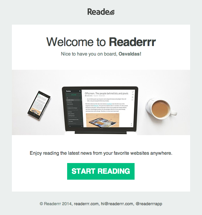
The header includes the brand’s name and it is clear that it is a welcome email and is meant for on-boarding purposes.
This is a Black Friday email from YOCO, which announces the sale in the header itself. You know what the email is about and there is a call-to-action in the header itself.
#2 Designing an Email Footer
The footer is often ignored while designing an email. You tend to forget the footer altogether. However, it is an important email element because you certainly want people to leave your email with a good impression about you.
The main objective of the footer is to give your email a good closure. Your subscriber could gain access to connecting with you in the future or, your subscriber could get details about where to find more information about your brand.
The objective of the footer is to keep up with the interest that the users are showing in the brand. In case, someone does not want to keep the subscription to your emails, then the footer ought to take care of that as well.
Why you need a strong footer for your email?
- A strong footer should give the users an alternative to communicate through different channels, other than email.
- It should let the recipient know about your physical presence and privacy policy. (not to forget, the copyright details)
Elements that should be present in a footer
- The main purpose of the footer is to share information that can help the subscriber contact the brand. So, you need to share your address, phone number and other details in the footer.
- The footer should also let the user know about other platforms from where they can get more information about you. For instance, make sure you add your social media details as well as the link to your blog and website in the footer.
- The unsubscribe link is an important consideration for those who are designing the footer. Make sure you design it in sync with the GDPR and CAN-SPAM legislation.
Footer design tips that leave a better impact
The final impression should be as good as the first impression. So, make sure you follow these tips when designing the footer for your email.
- The idea is to use minimalism when designing the email footer. You don’t need to include everything in the footer. Just add the basic and necessary things and keep the footer information as minimal as possible.
- The information should be represented in chronological order. You need to research and identify what resonates with your user’s needs most and add it to the footer accordingly.
- Choose a background and text font that you believe matches your brand’s image most. You should choose colors that reflect the email’s personality.
Some winning email footer designs
This email by Tattly has the perfectly articulated footer. You will see that the entire spread is chronologically arranged. Although there is ample whitespace, it does not miss out on any important information. Also, there is a link that allows you to unsubscribe to the mail.
Summing up
If you ignore the email header and footer, you might not be able to deliver a memorable subscriber experience. Make sure to use the same header and footer throughout all campaigns. The color, fonts and even the design elements should be consistent so that it helps in brand retention.
In a nutshell, the devil is in the detail and email header or footer are no exception.
Digital & Social Articles on Business 2 Community
(65)
Report Post


