What’s the most important component of a marketing email? Great copy? Imaginative design? Compelling imagery? Although they are all critically important, a solid case could be made that they are all secondary to the Call to Action (CTA).
That’s because every marketing email is sent for the same reason – to trigger costumer action. If it’s not clear to the customer what that desired action is, or it is difficult for the customer to determine where or how to take the action, even the most wonderfully written and designed emails are destined for failure.
Developing effective CTAs is a subject that has gotten a tremendous amount of attention from savvy email marketers, but there is still room for improvement, writes Zachary Yuzdepski, at Vendasta. He notes that although email marketing has been found to return $ 38 for every $ 1 spent, “Rarely do we see call-to-actions that capture tons of clicks and are bringing in endless leads. CTAs are usually simple and go unnoticed; the typical “Sign-Up Now” message just does not resonate with consumers anymore.”
In other words, if email marketers employ more-effective CTAs, the already enviable ROI our industry has achieved will only head in one direction: up.
Three questions to get started
“It’s not enough to send great content and hope that a subscriber remembers you or your website (although that helps). You need subscribers to take action immediately, and CTAs are the way to do that,” writes Jason Rodriguez on the Litmus blog. He advises email marketers to ask themselves three questions before they develop their CTAs:
- What do I want a subscriber to do?
- How will they know what to do?
- Why should they do it?
“Every call-to-action should provide some value for the reader. Whether or not it is explicitly stated, it should be clear to the subscriber exactly what they get for investing their time in your email and landing page. These questions help to clarify that value and, once answered, you can start thinking about how best to convey that value proposition in a call-to-action.” Rodriquez writes.
Crafting effective CTAs
Once you’ve answered those three critical questions, you are ready to starting developing your CTAs. But how can you make sure your CTAs will not be missed, and increase the likelihood that they will be acted on?
Copywriter and marketer Pamella Neely, writing for Practical Ecommerce, has distilled the elements of an effective CTA to seven points:
1. Make it short (no more than five words)
“This is the most common and damaging mistake with email calls to action, or any call to action. The marketer or the writer does not take the time to distill the call to action down to its essentials. Any more than five words in a call to action is too long.”
2. Tell people what to do
“Imagine you are meeting your prospect in the hallway of a busy office. You are holding a large poster board. It’s your email message. Your prospect is on her way to a meeting. You hold the poster board right up to your prospect, at eye level. You now have one short sentence, perhaps just a phrase, to say to her before she has to dash off. What would you say? What do you want her to do? That’s your call to action.”
3. Urge people to respond now
“Fortunately, ‘now’ is probably the most ideal call to action word. It’s super-short, so you can add it to almost any call to action. ‘Now’ is also a common and immediately understood word. It’s about as simple and as clear as you can get.”
4. Have just one CTA (if possible)
Although Neely cites testing that has proven the effectiveness of having just one CTA in a message, sometimes including more than one cannot be avoided. If that’s the case, “Then at least try to give the most important call to action priority over the others. Common ways to do this are to make one call to action larger, or to make one call to action a bold color and the secondary call to action a muted color.”
5. Make the CTA stand out
“The call to action needs to be visible enough that it’s the first or second thing you notice.”
6. Repeat the CTA
“Use a postscript. People read postscripts more often than they read body copy, so adding your call to action a second time as a postscript is a good way to lift response. A twist on this is to repeat your headline in your call to action.”
7. Test everything
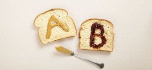
“What is the best thing you can do to write better calls to action? Start testing. Almost every email service provider now offers A/B split testing. It’s a feature you should use. After subject lines, the next best thing to test is your emails’ calls to action.”
It’s all about the buttons
Although most of us probably automatically think of buttons when we think about CTAs, text links can of course also serve as CTAs. There’s a very good reason that CTA buttons are so popular – it’s because they have been proven to be much more effective than links.
According to Aaron Beashel, writing on Campaign Monitor, buttons “increase click-through rates by making it clear to the reader what the next step they should take is.” He backs up his point by citing in-house research “that found that using a button-based CTA increased our click-through rate by 28% over a link-based CTA.”
Buttons are effective in grabbing the attention of people who scan messages (which is most of us these days) rather than reading every word. (We looked at how to format emails with scanning in mind – which is critical, because as we noted, the average reader now spends only about 15-20 seconds on each email they open – in an August post).
Four attributes differentiate buttons from linked text, according to Beashel.
Size
“Often a button will be much larger in size than a linked piece of text, catching the reader’s eye.”
Design
“Buttons often have design elements that links don’t, such as shadows, gradients and other effects. This can make them ‘pop’ off the page and stand out to readers.”
Color
“Often buttons will have a different color to the background and text, and this contrast draws the eye and makes the reader notice them more.”
Whitespace
“When a button is set away from other elements in the email, the whitespace around it creates an area free from distraction – leading the reader right to it.”
Beashel says a button’s effectiveness depends on three factors: copy, design and placement:
Copy
Effective button copy is specific; focuses on the benefit of the action; avoids “friction words” like “download,” “buy,” “order,” and “submit;” and gives ownership to the customer by, for instance, using the word “my.”)
Design
When it comes to design, Beashel advises that buttons must stand out from the rest of the message’s content, such as by use of a contrasting color; should “look like” buttons (no fancy design is required); be appropriately sized for the specific message (too big can be just as bad as too small); and be surrounded by plenty of whitespace.
Placement
Beashel writes that although it may seem to be intuitive (and is often correct) to place a button high in a message (“above the fold”), in some cases lower is better. “If the product/offer is a bit more difficult to understand and the reader may have some anxiety towards taking your offer, then positioning the CTA button high in the email will likely reduce conversions as they will see it before they have been adequately convinced they should be taking the conversion action.”
The bottom line
Your emails must contain effective CTAs to ensure they get the results you want. Put as much time and effort into crafting them as you do developing your design and copy (and incorporate the suggestions above!) to make clicking on them as irresistible as possible.
Digital & Social Articles on Business 2 Community(95)
Report Post


