— August 19, 2019

No matter what you’re doing, you want to give it your best, right? With email marketing, giving it your all will result in higher customer engagement, which means more opens, clicks, and maybe even more conversions. We made a list of email marketing best practices to help you focus your efforts to where it counts.
Table of Contents
- Top 12 email marketing best practices
- Best Practice #1: Double Opt In
- Best Practice #2: Test it out
- Best Practice #3: Keep the spam in the can
- Best Practice #4: Clean your list
- Best Practice #5: On the subject of subject lines
- Best Practice #6: Simplicity is key
- Best Practice #7: CTAs
- Best Practice #8: Adding ‘alt text’
- Best Practice #9: Keep your branding consistent
- Best Practice #10: Make your emails more relevant
- Best Practice #11: Make use of those statistics
- Best Practice #12: Request feedback
- Summing up
Top 12 email marketing best practices
Following guidelines might not be the most fun thing in the world. You might think it puts a bit of a limit on your creativity. But these guidelines are going to let you be as creative as you want, and see the results you want as well. So let’s get into it!
Best Practice #1: Double Opt In
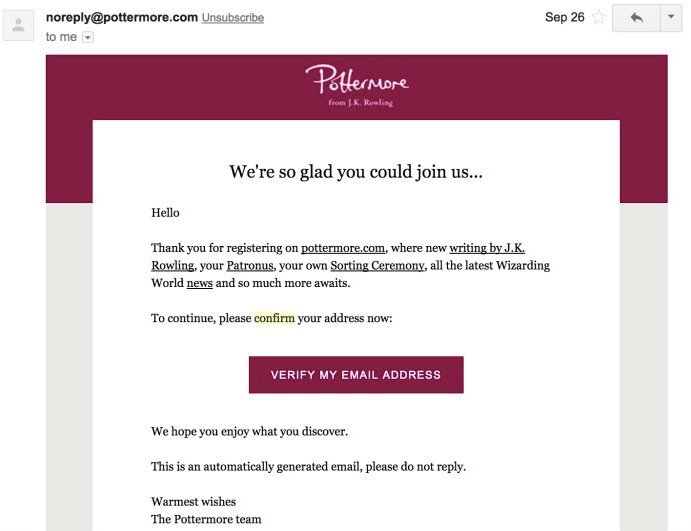
So someone has just signed up for your emailing list…why would you want to send an email to make sure they want to be on that list? Because double-opt in can reduce your spam complaints right down to well within acceptable levels.
A double-opt-in is an email that is sent out to your new subscriber asking them to confirm their subscription by clicking a button within the email. Mailjet lets you build your double-opt in email and helps you send them out as soon as you have a new subscriber.
You’ll want to keep these emails on the shorter side. Make sure you put your CTA, in this case the “Confirm Subscription” button, at the top of the fold. It’s the main purpose of this email, so make it stand out! But we’ll cover this in more detail later. As for the rest of the email? Let your customer know what to expect, and why subscribing was the best decision they made all day.
Best Practice #2: Test it out
Do you taste a little bit of the food you’re cooking before you serve it to your guests, making sure it’s as delicious as you want it to be? Email marketing functions on the same principal: test before serving!
Testing out your emails before you press send will give you the chance to make sure everything is in working order. We all know the feeling of pressing send, and right as starts its journey to your contacts’ in boxes, you spot a typo. And your stomach drops  Testing is going to help you avoid this feeling.
But don’t just check for typos, also give the links a click to make sure they go where you want, check to see that the photos are rendering correctly, and ensure that you’re not missing any data. The list goes on and on.
Here’s a quick checklist of things to test before sending your email marketing campaign:
- Spelling and typos
- Links and CTAs
- Images show up correctly
- Looks great on both mobile and desktop
- You chose the right contact list
- Sending from the correct address
It’s also a good idea to send it to at least one other member of your team. A fresh pair of eyes that haven’t been staring at the same email all day will be able to catch details that might have slipped past you.
At Mailjet, you can preview how your emails will appear on mobile and computers, as well as send out a test email to anyone you want before you send it out to your entire contact list.
Best Practice #3: Keep the spam in the can
Yeah, we know… this one may seem self-explanatory, but you may be doing some spammy things without realizing it. We’ve got a full blog post on how to avoid email spam filters you should definitely it check out, but we’ve summarized some of the big ‘no-goes’ below.
The biggest and most obvious one is purchasing lists – just don’t do it. It is better to build up a contact list that opted-in to receiving your emails so that you have engaged customers that won’t mark your emails as spam.
Next up, make sure the content of your email is relevant. This may seem obvious, but your customers signed up for your emails for a reason and you want to make sure you’re delivering.
Your subject line is also something to keep in mind; practices, like writing it in ALL CAPS or throwing in far too many emojis


 , can make you look spammy in the inbox. There are also some words that you really don’t want to use if you don’t want to sound the spam alarm.
Best Practice #4: Clean your list
It may seem tedious, but routinely cleaning your contact list is another important key to achieving great deliverability.
Cleaning your list means removing bounces, blocks, unsubscribes and inactive contacts from your list so you can avoid being marked as spam by frustrated customers that do not want to receive your awesome emails anymore (they must be crazy  ).
).
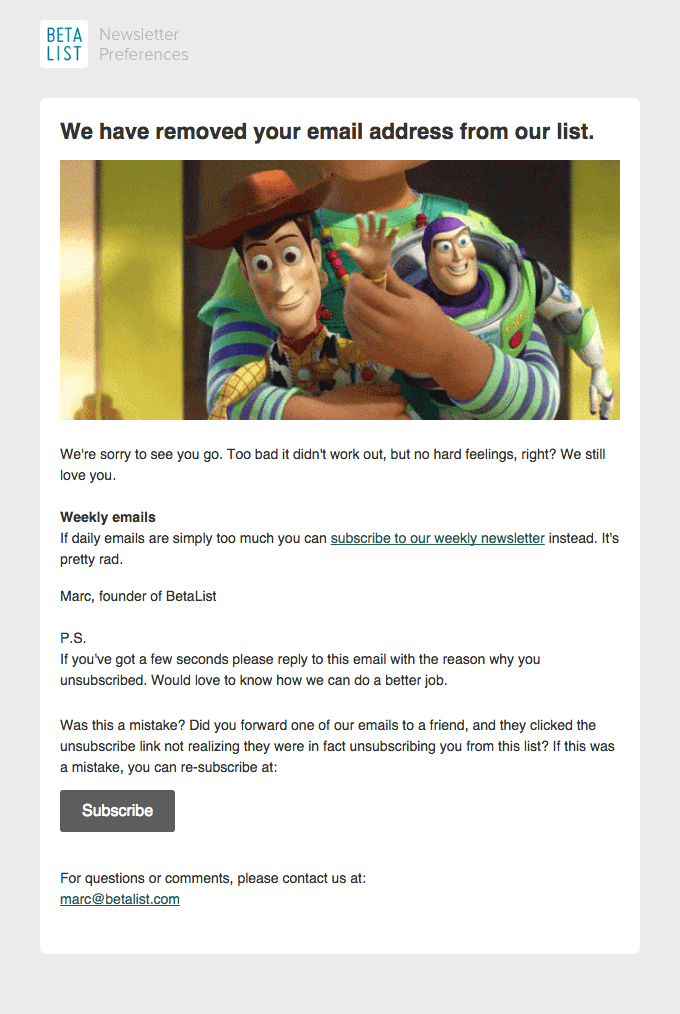
Speaking of unsubscribes, it’s important that you add an unsubscribe link in every one of your emails, and make sure it is visible! We know that you put in a lot of work to add them to your contact list, and this may seem contradictory to your goal, but we promise it’s for your own good.
Customers that can’t find your unsubscribe link may resort to marking you as spam if they can’t find any other way, and rack up enough of those and you won’t be able to reach any of your contacts, including the ones that love your emails. Additionally, an unsubscribe link is mandatory to remain GDPR compliant, which is something we take very seriously here at Mailjet.
Best Practice #5: On the subject of subject lines
As mentioned before, you don’t want your subject line to look spammy – but there is a lot more to them than that. Ideally, your subject line will be short and sweet, but engaging and enticing.
You’ll want to keep it somewhere between 30-50 characters, keep it consistent with your brand image, describe what your email is about, and make it all but impossible not to click on. Tall order, huh?
There are many different ways to make your subject line stand out in the inbox. Just to give you a few ideas, you can add a couple emojis (being careful not to overdo it  ), add the recipient’s name to give it a personal touch, or include action verbs that call on them to interact. If it matches your brand image, you can even keep part or all of your subject line the same every time so your subscribers recognize your email when they get it.
Regardless of which tactic you choose, it’s a good idea to test it out to find out what works best. A/B Testing can help you out with this. You can test multiple different subject lines by sending each one to a small group of contacts, and then the best performing one will be sent out to the remainder of your contacts.
Regularly testing your subject lines will help you find what works with your contact lists and improve your open rates.
Best Practice #6: Simplicity is key
You love your brand, and you want to share as much of it as you can with your subscribers, but you might want to hold back just a little bit. Cluttering your emails with as much content as you can actually be counterproductive to your goal of engaging your customer.
Think of it this way: have you ever clicked into a website and just suddenly been bombarded with images, text, and interactives? You had no idea where to start, so you just didn’t start at all, opting instead to click out and find a new website that didn’t assault your eyeballs. Your email should have enough content to be worthwhile interacting with, but not so much that there is no focus to it.
Best Practice #7: CTAs
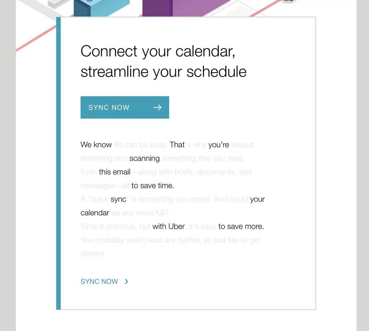
CTAs, or call-to-actions, are most likely going to be the focus of your email. It is what you hope your subscriber clicks on when they’re scrolling through. Because of its importance, you’ll want it to stand out from the rest of the content.
“How do I do that?” you may be asking. Color, copy, design and placement all play a role in this.
The color should fit your brand image, and make it stand out from the background of the email. The copy is both what is written on the button, as well as the text of the email that surrounds it. Again, it should match your brand image, but it’s also a good idea to get a little creative about it. Average, run-of-the-mill buttons like “click here” and “read more” aren’t exactly eye-catching.
When paired with the design of the button, like shape and size, you could really boost your clicks.
When you’re placing your CTAs, there are some things you’ll want to keep in mind. First off, you’ll want one right when the email is opened, with no scrolling required. With this in mind, you’ll also want one at the bottom, particularly if your email is a little on the long side. When your reader gets to the bottom, you won’t want to have to make them scroll back up to click on your button.
Lastly, don’t go overboard! You’ll have to find a good balance between content, images, and CTAs. Too many might muddle the goal of your email, whether it’s to sell products, get people back on your website, or something else.
Best Practice #8: Adding ‘alt text’
‘Alt text’ is like Casper the Friendly Ghost. Invisible to most, but helpful when you need it! Ok, so the comparison might be a little off, but alt text does function just like that.

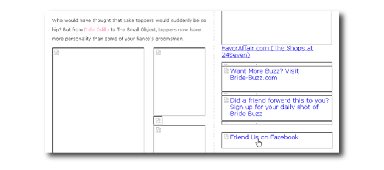
You’ve taken lots of time and effort to design an email you know your subscriber is going to love, images and all. But then, when your customer opens the email in their inbox, the images don’t load and there’s just a big empty spot. Some reasons why your images might not be loading are the email client might automatically block images, or problems converting between email formats. This is where ‘alt text’ comes in to save the day.
When the image doesn’t load, your ‘alt text’ will appear in the empty spot, giving your readers an idea of where they’re supposed to click, instead of leaving them in the dark.
Best Practice #9: Keep your branding consistent
Your brand’s image is important, and you want your email marketing to keep that image consistent. The colors, copy, design and tone should all be kept in mind because you want your customers to recognize your emails week after week.
If you’re working as part of a team, it can be hard to keep branding consistent with so many cooks in the kitchen, so to speak. That’s why at Mailjet, we made it possible to lock sections so that those will remain consistent from one email to the next. You can lock the header and footer, and let your team take creative liberty over all the rest!

Best Practice #10: Make your emails more relevant
We all know humans are better than robots (at least you do if you’ve seen Blade Runner, The Terminator, Ex Machina, Resident Evil…I could go on). Emails with a bit of personalization in the subject line, like adding their name, for example, have a higher rate of being opened.
The subject line isn’t the only place where you can add a personal touch. Beyond even just adding it in the text of the email, you can also personalize by your customer’s behavior. This is where segmentation comes in.
Segment your customers by age, location, or even favorite products, and then build emails that are specifically made with these groups in mind. Of course, be careful not to get too creepy with it (maybe stay away from subject lines like “Talia, we know what you want and here it is” or something like that…creepy  ).
).
Best Practice #11: Make use of those statistics
So you sent off your email, and now you’re done, right? Nope. This is where email statistics come in, and they’re what’s going to help you make the next email you send out even better.
After you send out your email, review the stats you have at the end of the day, the next day, the following week, even over the course of the next few weeks! A lot can be learned from your email statistics about what your customers like, and maybe even more importantly, what they don’t like.
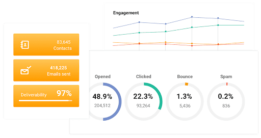
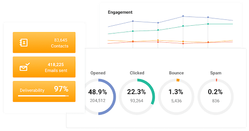
Stats like open rates, click rates and A/B test results are just the tip of the iceberg. Reviewing your statistics routinely, and then creating and narrowing down email hypothesis that you’ve come up with is a sure way to improve your engagement rate.
And besides, look at it this way: coming up with all those hypotheses and giving them a test will make you feel a little bit like a scientist. An email marketing scientist. 
Best Practice #12: Request feedback
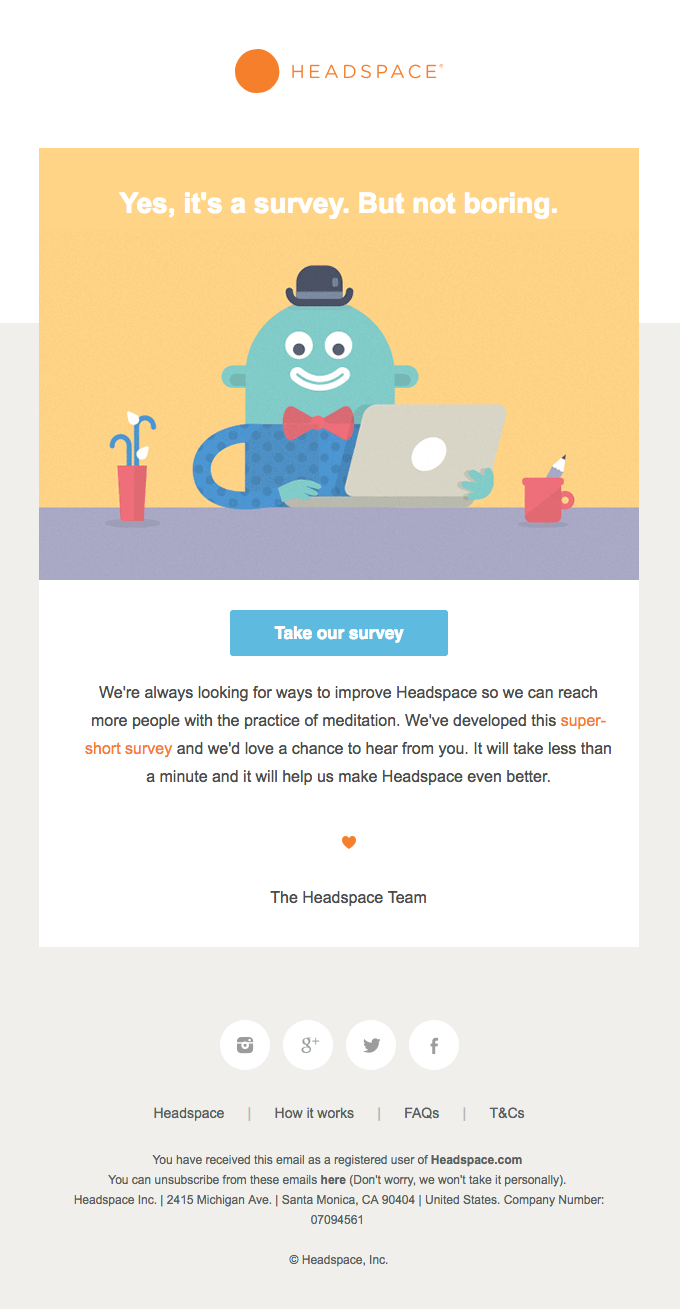
As much as we love statistics here at Mailjet, we also know they can only tell you so much. So how can you dig a little deeper? Why not go ahead and ask your subscribers?
It’s a bit like a quality control test. There are a ton of questions you can ask your subscribers that could give you valuable insight into your sending, and help you understand what you should be placing more focus on. Questions about the kind of content to include, promotions they want to see, products they love and the frequency of the sending are just a couple suggestions.
Summing up
Email marketing can be a daunting task. From the subject line, to the subject of your email, all the way to how to gage how interested your customers are in your campaigns, there is a lot to consider. If you keep in mind these 12 best practices, it will make it easier to know what to focus on, and what to prioritize. From the planning of your email, all the way down to the tracking of the stats, Mailjet can help you make the most of these email marketing best practices.
Digital & Social Articles on Business 2 Community
(54)
Report Post