— March 25, 2019
Whenever we ask our clients the objectives of their email campaigns, the responses are many and varied. Some say, “to sell the products”. Others say, “to provide information” or “to offer services”. All these purposes can be achieved by working on the following aspects:
- Always send an email with a strong purpose.
- Have an interesting subject line and preheader text to make the subscriber open your email.
- Promote an offer that the subscriber cannot deny.
- Share valuable information through the email copy.
- Use relevant and attractive visuals that support the copy.
- Add a clear CTA that gets the recipient to click.
We shall focus on how to make high-converting CTAs and drive more conversions through your email campaigns.
Any button or link prompting the prospect to click is known as a call to action. (CTA)
CTA should let the subscriber know what he or she will get by clicking through the button. It should be enticing enough to prompt the next action from the subscriber.
1. CTA Copy
Persuasiveness is the key to effective CTAs. Your copy should be simple and actionable. Refrain from using cliched words such as Submit and Click here. Instead, try using convincing verbs such as Try, Read, and Get. “Sign up for the free trial”, “Reserve my spot” and “Download my ebook” are nice CTA buttons to drive click-throughs.
You can get inspired from ace & tate and think of creative CTA copies.

Pro-tip: According to Michael Aagaard of Content Verve, first person narratives work the best when compared to second person CTAs.
2. Placement of CTA
Place your first CTA button above the fold so that the user can click-through and take action without scrolling through the entire email. Doing so makes your emails easily scannable and conveys the message effectively.
Udemy sends out an email with single CTA placed right above the hero image.

Also, maintain a proper hierarchy according to the order in which you want the subscriber to take action. The first email CTA should be most prominently placed. If your email consists of multiple CTAs, you should make sure that they do not distract the user from the main action. Keep your email as clutter-free as possible to make it more actionable.
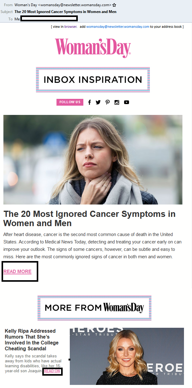
Here’s a nice example by Woman’s Day. The main CTA “Read More” is placed in the first fold with the subsequent CTAs placed after that. The CTAs are written in plain text so that there are not rendering issues.
3. CTA Design
To ensure that your email CTA serves the purpose of bringing click-throughs, it should be visually appealing. Use contrasting colors so that it stands out from the email copy.
Take a look at the CTA button by Email on Acid. It is sure to capture the reader’s attention and entice them to ‘start testing’.
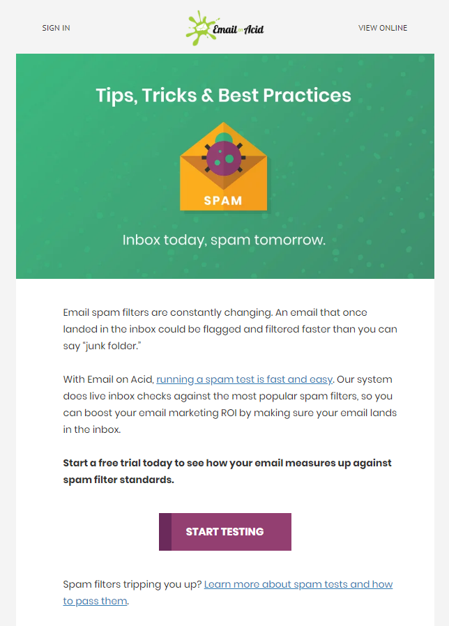
Did you notice the ample whitespace around the CTA that adds to the subtlety of the layout? This is a good practice for mobile users because it makes the CTA easily tappable.
4. Specificity and Value
Your subscriber is probably in the middle of something at the time he or she opens the email. Therefore, you should try your best to be specific and deliver value to the reader.
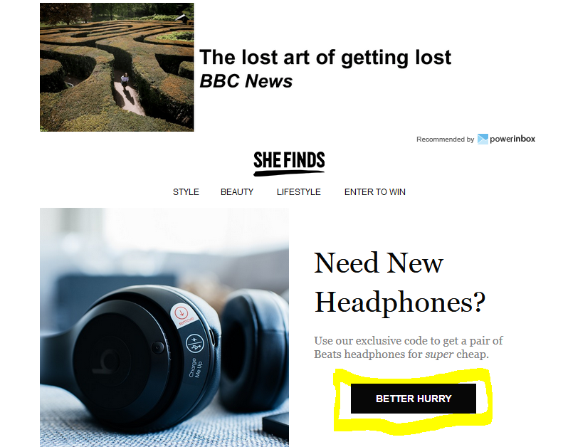
Here’s an example by SHEfinds. They have showcased Beats headphones and created a sense of urgency with their CTA “Better Hurry”. Once you click the CTA, you will be redirected to a landing page that shares the discount code and entices you to make the purchase immediately.
5. Alignment with the landing page
Let’s understand this concept with the help of a unique example.
Check out this email by Moo.
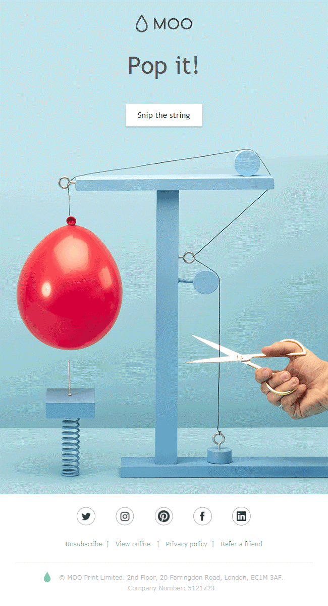
Once the user clicks the CTA “Snip the string”, he or she is taken to this landing page.
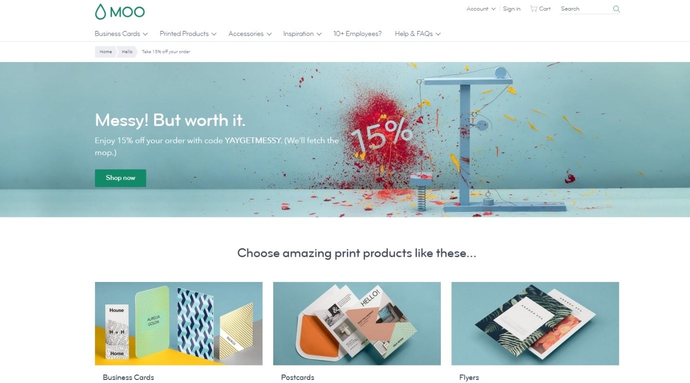
Isn’t it a great concept? You can also try something similar in your email CTAs and make them more creative.
6. Consistent buttons
To create instant brand recall, make sure your CTA buttons have a consistent design and placement. It will build a stronger rapport with the user and increase subscriber engagement. Maintaining similarity in designs also imparts a pleasant user experience with familiar interface.

7. Test the CTA
When in doubt, A/B test…
Following CTA best practices endorsed online is a good idea, but you should always A/B test and figure out whether those tricks are working for your brand or not. Whether it is the CTA copy, color, placement, or design, A/B testing will let you know what kind of effects bring maximum click-throughs for your email.
Create two similar emails with different CTAs and send out to different segments of subscribers. Analyze the metrics and zero in on the campaign that brings better results.
8. Bringing Innovation in CTA Design
Email marketers are constantly striving to make their CTAs more visible and drive higher conversions. There was a time when there were hardly any design innovations in email CTAs.
But advancements in email design arena has made it possible to design better CTAs with additional effects to garner user attention.
We present to you three remarkable examples that have an unconventional design.
- Hover CTAs
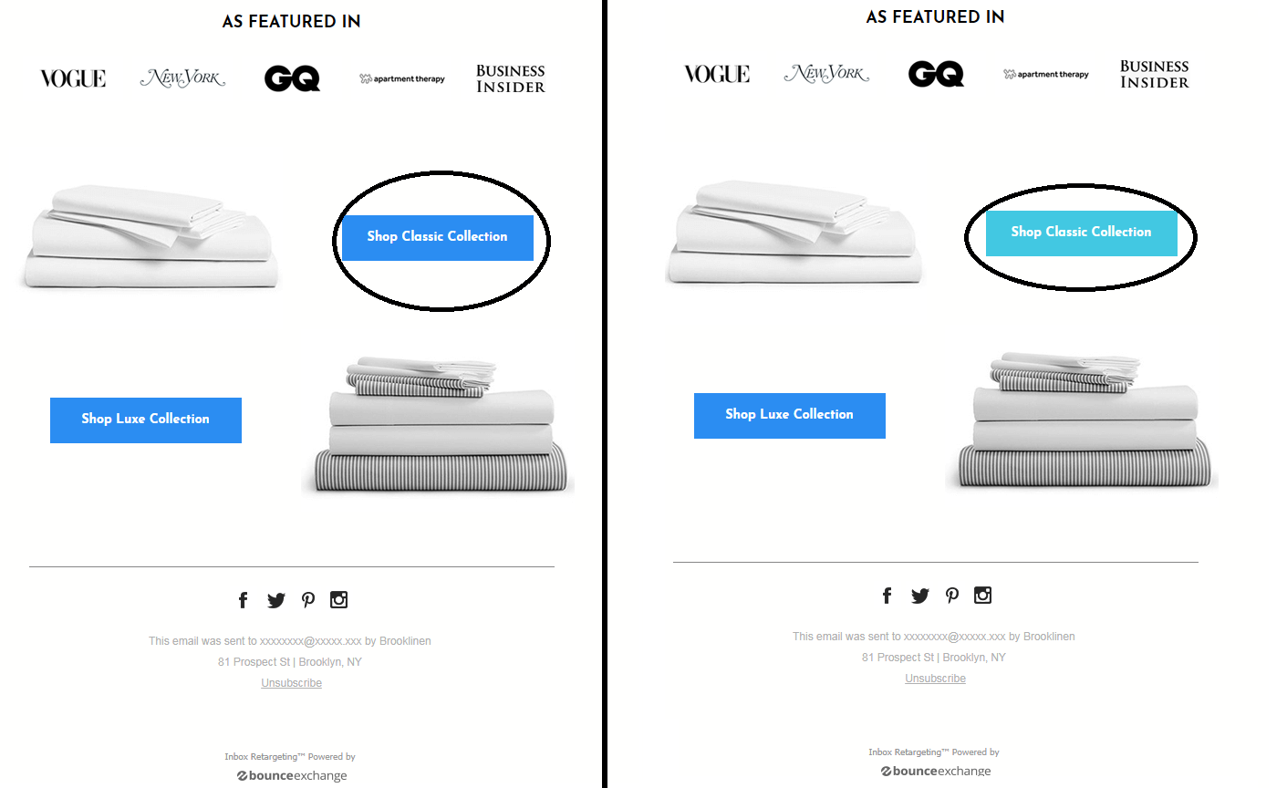
Moo and Brooklinen use hover CTAs that get highlighted and change color when the user hovers the cursor over it.
The first image shown below displays the effect in Thunderbird email client while the second image shows how it will appear when the email is viewed in browser.
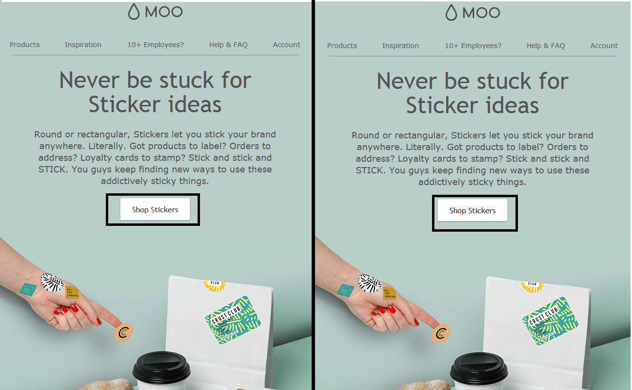
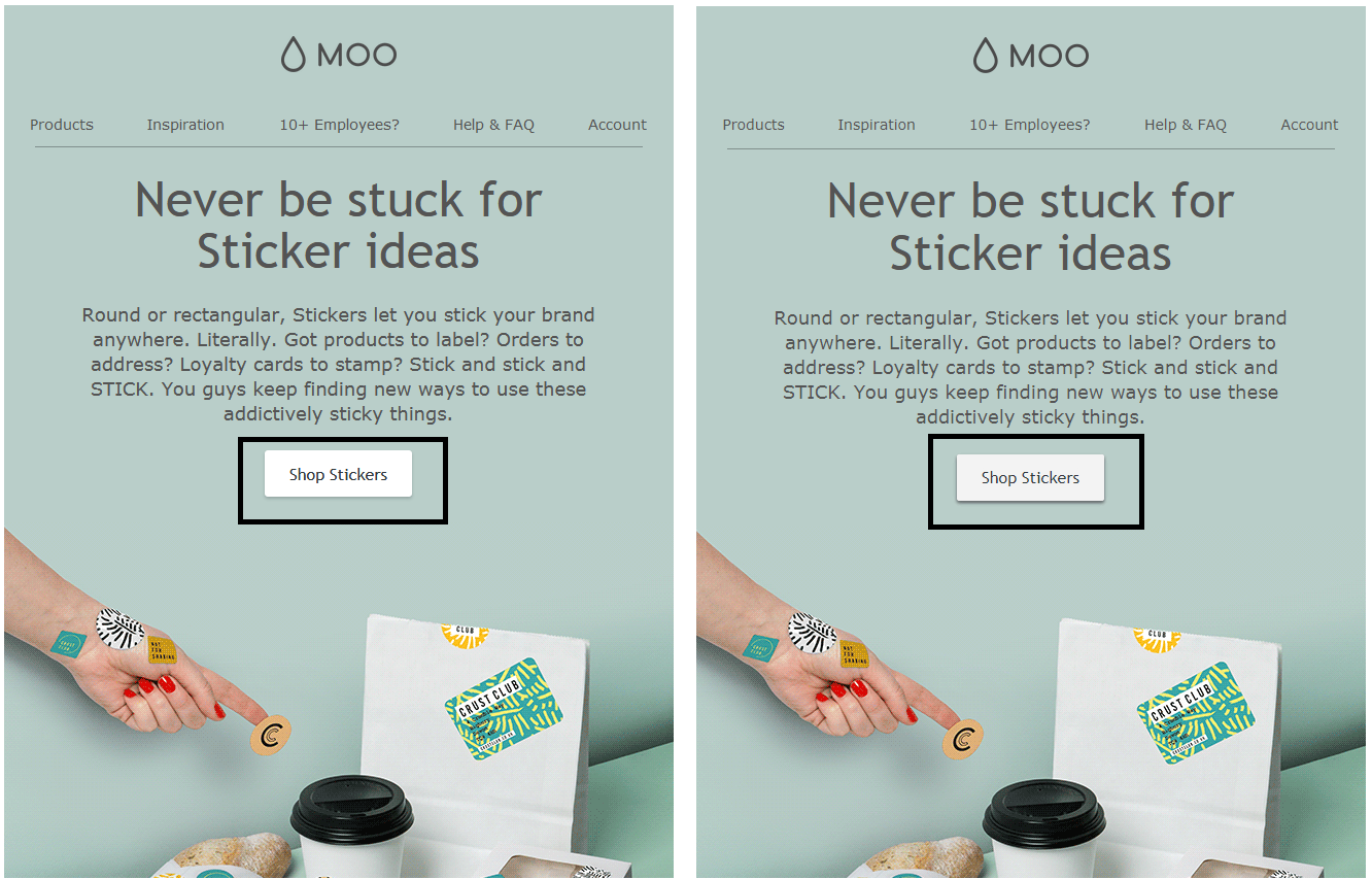
The CTA in Brooklinen’s email changes from blue to sky blue when the cursor hovers over it.
- Pulsatory Movement in CTAs
Hollister uses a pulsatory movement to grab the subscriber’s attention to the CTA. It effectively highlights the last day of the offer and drives conversions by creating a sense of urgency.

- CSS in CTA
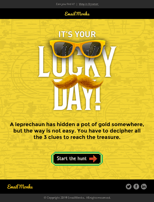
EmailMonks recently sent out an interactive email with a CTA that is animated using CSS. This could have been achieved using GIF too, but it would have unnecessarily added to the weight of the email. Therefore, we decided to go with CSS. Know more about this email here.
Wrapping Up
Irrespective of your business, CTAs can build subscriber engagement and encourage them to take the next action. If done right, they can increase sales, get more visitors on your website, increase your social media followers, and ultimately propel business growth.
These tips will surely help you bring better email conversions from your campaigns.
Digital & Social Articles on Business 2 Community
(53)
Report Post
