Sites that generate high traffic numbers often use sampling to save on processing time, but columnist Brian Massey notes it’s important to know if your sample is statistically significant.

Howdy, ya’ll.
Since before our friends in Alaska became the biggest state (by area), we Texans have been saying that “everything is bigger in Texas.” More accurately, you’re likely to hear, “Eva thangs bigga n Tayuksus.”
I suspect that this conclusion was drawn from a statistically small sample set. This is the “magic” of statistics. If you challenge this hypothesis, that everything is bigger in Texas, you’ll get a litany of evidence from any self-respecting Texan: the state fair’s Big Tex, Dallas big hair, the jumbotron in Cowboy Stadium and former governor Rick Perry’s ego.
And most of the time, this strategy works.
This is a list of four things from a possible dataset of billions. A statistical sample is supposed to predict what the entire dataset is like. However, a small sampling like this is no fortune-teller. It’s a bald-faced liar. The smaller the sample, the bigger the lie.
And Google Analytics (GA) tells lies the size of Texas.
Don’t worry. GA has a “tell.” You see it when you run certain reports, up there to the right.

Are our reports accurate if they are sampled by Google Analytics?
You will see this note if you have a lot of visits to your website and you run a report on an advanced segment of your visitors.
Google does this because it could take minutes to hours for Google to slog through all of the data for a large site to deliver such a report. The default reports in Google Analytics are preprocessed, so they don’t have to be sampled.

Using Advanced Segments on large websites triggers sampling in Google Analytics reports.
So, if you want to do anything interesting with segments, you have to accept results based on a sample of your visits. What Google Analytics does is analyze this smaller sample of your data and extrapolate what the daily data might be for your particular segment. This is based on sound statistical practice. If you have a sufficient sample size, you should get an accurate estimate of the number of sessions, pageviews or events for your segment.
In this article, I will help you answer some questions about these reports.
- What percent of sessions is good enough?
- Would a bigger percentage really be better?
- How do I use lies in my analysis?
- What should I show the rest of the company?
Reality Check
I highly recommend that you start with reality before you believe anything Google Analytics tells you. This would imply that you have some data on your business from a source other than Google Analytics. Some potential comparisons are:
- Compare internal sales numbers to your e-commerce transactions in Google Analytics
- Leads generated in your CRM can be compared to “thank you” page visits or conversion goals in Google Analytics
- Your ad platform’s click data can be compared to the campaign or channel data in GA
- Older companies often have home-grown analytics data to compare to GA
- Data from another analytics tool, like Adobe Site Catalyst, can be compared to GA
You will want to do a correlation of this other data to Google Analytics to see if the two are reporting similar data. I talked about this in my very first column here, Statistical Tricks You Need That Prove You Should Read This Column Every Month.
I recommend pulling 60 or 90 days’ worth of data by day to do this correlation. Here is the scatterplot for 60 days’ worth of data comparing Classic asynchronous Analytics data to Universal Analytics data for the same website.

We would expect sessions recorded by Universal and Classic Analytics to correlate.
The R2 value tells us that there is a 99.8% correlation between the two data sets. They are statistically correlated. However, that doesn’t mean that they are identical.
Here is the correlation of both sessions and pageviews for a site that had tracking tags for asynchronous (“Classic”) analytics on the site twice.

The Session and Pageview data correlates almost perfectly, but the slope of the trendline tells us that the Pageview data isn’t the same.
In this scenario, we would expect Classic pageviews to be double-counted, but sessions to be the same. In the scatterplot, notice that the R2 value for pageviews is almost 1. This means that the two data sets correlate almost perfectly even though the classic data is whacked.
The R2 value doesn’t care if the data is different. It only evaluates how the data changes over time. We can say that the universal and classic data sets are being influenced by the same cause, but we can’t say that they are identical data sets. This means our measurements are precise, but not necessarily accurate.
We can evaluate the accuracy by looking at the slope of a linear trendline for high-correlating datasets. If the slope is close to 1, then the two datasets are reporting similar values for each day. In the case of the pageview data, the slope is closer to 0.5. This is the classic signature of duplicated tracking code.
The R2 value and slope are calculated by Excel and can be turned in the properties for trendlines.
I ran some correlations to see what kind of sample rates delivered believable data that we can base business decisions on. Here’s what I found.
The Amount Of Data Affects Sample Size
It should be no surprise that if you ask for 90 days of data, your sample size will be lower than if you ask for 30 days of data. Remember that Google Analytics is trying to maintain the responsiveness of its interface. More data takes longer, so Google analyzes less of it.
As an example, for 90 days of data for a custom segment, my report was based on 2.85% of the data. For a 30-day report, I my data was based on 7.65%. I could dial these up to 6.20% and 15.54% respectively.
Use Sampled Reports For Large Datasets Only
The accuracy of the data is a function of the size of the resulting data set. To test this, I created an Advanced Segment that mimics the built-in mobile device segment from the Audience > Mobile> Devices report in Google Analytics. Selecting my advanced segment triggers sampling in my custom report (see below). I can then compare sampled data to unsampled to see if they correlate.
For the site I used, there were over two million mobile sessions over 90 days. The custom report correlated well to the built-in report.

A sampled report correlates well to Google analytics built-in report if the resulting dataset is large.
The R2 value of 0.95 and slope close to 1 tell us this the sampled data represents the actual data accurately. However, for a custom segment for one particular mobile device that has only 50,000 sessions over 90 days, the sampling doesn’t deliver accurate data.

For small datasets, the sampled data bears little resemblance to the actual data.
The data delivered by the sampled report is just noise. The bottom line is that sampled reports don’t work for small segments of your database. Stick to the built-in reports for these segments.
Note: Keep in mind that Google Analytics samples sites with a great deal of traffic. The data for your small business is probably not sampled at all, so you can use Advanced Segments with confidence.
Dialing Up The Sample Size Helps
Google Analytics allows you to increase or decrease the sample size when running custom segments by clicking on the ![]() icon above the sample message.
icon above the sample message.

Google Analytics Sample Size selection tool.
Moving this control to the highest precision will often double your sample rate over the default, which is in the middle. This seems to provide little solace, as moving your sample rate from 5% to 10% feels pretty insignificant. It’s not, especially for segments that return smaller datasets.
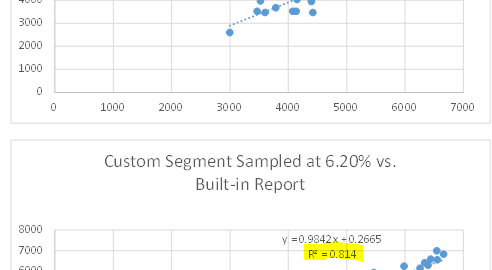
The scatterplot for the following datasets compares a custom segment to the built-in report in Google Analytics. This is based on about 500,000 sessions.

Increasing the sample rate lifted the R2 value from 0.76 to 0.81.
With an R2 value of 0.76, this data is right “on the bubble” of being useful for decision making. By dialing up the sample rate in Google Analytics, we gain five points of confidence in this data. This is the difference between trusting this data and having to disregard it.
I recommend getting in the habit of dialing up your sample rate for important reports.
The Visits By Day Custom Report
To generate these correlations, I use a custom report that gives me the data I need by day. You can use this report to do correlations to your second source data. Here’s a report that gives you the session count by day.

Custom report for exporting segment data to Excel.
You can create the Sessions by Day report in your Google Analytics account. Customize it to add other metrics and metric groups.
When your website generates more than a few hundred thousand visits a month, you will become the victim of sampling if you want to report on any segments other than Google Analytics’ built-in reports. It’s important to know when this sampled data is accurate and when it isn’t.
Don’t be the victim of a big Google Analytics lie.
Listen to this Article
Some opinions expressed in this article may be those of a guest author and not necessarily Marketing Land. Staff authors are listed here.
(Some images used under license from Shutterstock.com.)
Marketing Land – Internet Marketing News, Strategies & Tips
(254)
Report Post


