By November 15, 2014
We all know the important role social media plays in good marketing. A lot of time is spent organizing important posts and managing social media. Our audience is online, so we need to be, too. But how much time do we spend on the details – things like our profile and cover images?
Most often, your profile image will simply be your logo, displayed clearly and bringing attention to your brand. Your cover image should take a little more thought. What is the message you want visitors to understand when they visit your profile?
Also, will your image have text? When it comes to creating your cover images, the responsive design of these sites can make things a little tricky. While most templates available on the web usually do a good job showing where your design may get cropped or hidden behind buttons on Twitter and Facebook, there really aren’t many that explain the difficulties with Google+ covers. It’s important to know how your design will behave when resized for different devices, and to plan accordingly.
One of the best ways to plan the design of your own cover images is to look at some prime examples from other companies. In this blog, I’m sharing a few great examples for Twitter, Facebook, LinkedIn and Google+, and explain why they are so successful.
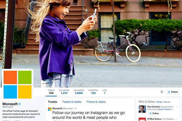
Twitter – Microsoft
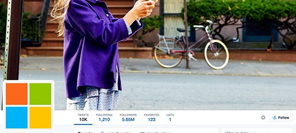
Microsoft is a well-rounded example of good social media cover image design. Their cover images for LinkedIn – and each of their company pages – convey the same message as that of their other social sites, even though they use completely different images for each. Likewise, on Twitter, their different apps have their own pages, but the message remains the same. Using only images, they show how helpful and engaging their technology can be for everyone, everywhere.
Like Starbucks, below, Microsoft takes advantage of the shape of the profile icon and does’t bother giving it any extra white space around it. It doesn’t need it – it fills the space perfectly. They are optimizing their social media to push their brand.
Facebook – Adidas
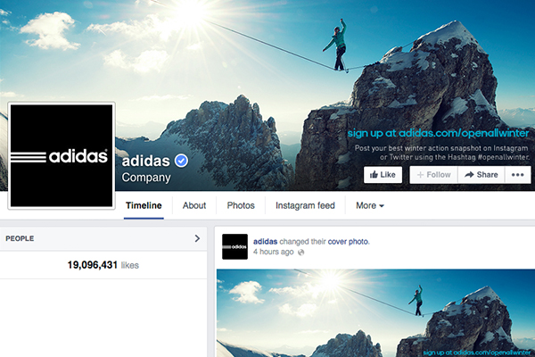 Some companies do use their cover images as more obvious ads or notices for events. While a picture may be worth a thousand words, having actual text on your images can help to focus the point, or in this case, to serve as a call-to-action (CTA).
The photo by itself suggests living life to the extreme, and is a great image for the Adidas brand. But with the CTA in place, it becomes a challenge – daring the Adidas audience to give their contest a go.
LinkedIn – Amazon
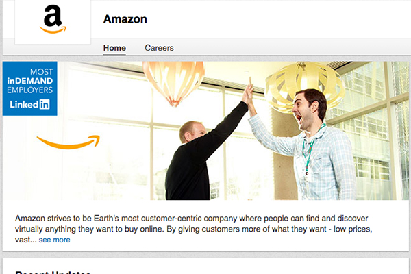
Amazon also uses the text and image combo for their social media. Their LinkedIn profile – more so than other social media – is geared toward reaching current and future employees and other businesses.
So what do they do? They brag.
It’s well deserved, of course. They proudly stamp LinkedIn’s “Most inDemand Employers” title on their cover image to help show what a great employer they are. The image itself shows a positive, amped up and open work environment that seems fun and inviting.
Google+ – Starbucks
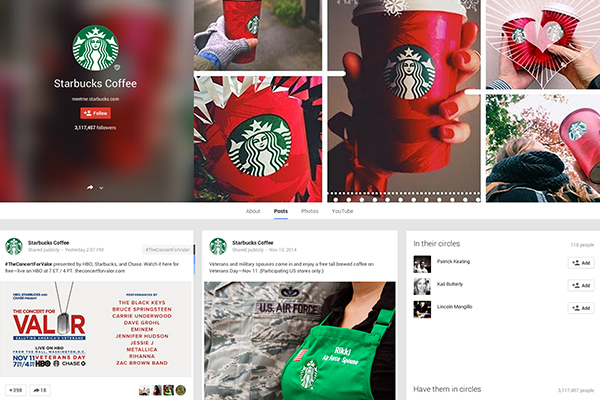
Similar to Microsoft’s use of one large image, Starbucks is using a large collage of images to get their message across without any additional text.
When you don’t use text in your cover images, you don’t have to worry so much about any important info getting cut off by responsive design. This cover image will stay true to it’s purpose, even with different devices and screen resolutions.
Starbucks even lined up their circular logo so that it would perfectly fit within the profile image circle. Not all logos work well with the circular form of the Google+ profile images, so it is neat to see how Starbucks is taking advantage of it for their own logo.
So What Should Your Cover Images Be?
Creating a good social media cover image seems like a simple thing, but a bit of planning can make your content – and your brand – shine even more.
Should you use the same image across all your social media profiles? Should you have text in addition to your image? It all comes down to what works best for your audience and your brand.
Take the time to see what creates a better response from your audience. Make sure you are spending time on the right social media outlets. Large, beautiful images catch a lot of attention, but with the right text, you could take it a step further. Test the waters a bit and always, always try new techniques for your cover designs.
Social Articles | Business 2 Community
(267)
